Front Cover Final Front Cover Preliminary Task
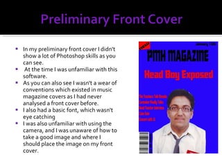
In my preliminary front cover I didn't show a lot of Photoshop skills as you can see. At the time I was unfamiliar with this software. As you can also see I wasn't a wear of conventions which existed in music magazine covers as I had never analysed a front cover before. I also had a basic font, which wasn't eye catching I was also unfamiliar with using the camera, and I was unaware of how to take a good image and where I should place the image on my front cover.
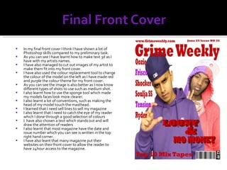
In my final front cover I think I have shown a lot of Photoshop skills compared to my preliminary task. As you can see I have learnt how to make text 3d as I have with my artists names. I have also managed to cut out images of my artist to make them fit into my front cover. I have also used the colour replacement tool to change the colour of the model on the left as I have made red and purple the colour theme for my front cover. As you can see the image is also better as I now know different types of shots to use such as medium shot. I also learnt how to use the sponge tool which made my models faces look more clearer. I also learnt a lot of conventions, such as making the head of my model touch the masthead. I learned that I need sell lines to sell my magazine I also learnt that I need to catch the eye of my reader which I done through a good selection of colours I  have also chosen a text which stands out and will draw the attention of readers I also learnt that most magazine have the date and issue number which you can see is written in the top right hand corner. I have also leant that many magazine put their websites on their front cover to allow the reader to have 24hour access to the magazine.
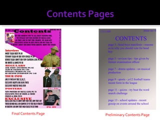
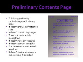
Final Contents Page Preliminary Contents Page
This is my preliminary contents page, which is very basic.  It doesn't show any Photoshop skills It doesn't contain any images There is no main article highlighted It doesn't have any features It doesn't contain a editorial The same font is used as well as colour It doesn't look professional or eye catching, it looks bad.
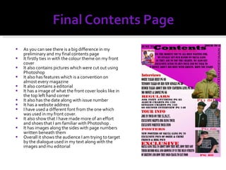
As you can see there is a big difference in my preliminary and my final contents page It firstly ties in with the colour theme on my front cover It also contains pictures which were cut out using Photoshop It also has features which is a convention on almost every magazine It also contains a editorial It has a image of what the front cover looks like in the top left hand corner It also has the date along with issue number It has a website address  I have used a different font from the one which was used in my front cover. It also show that I have made more of an effort and shoes that I am familiar with Photoshop . It has images along the sides with page numbers written beneath them Overall it shows the audience I am trying to target by the dialogue used in my text along with the images and mu editorial
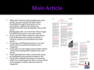
Although I haven't made a preliminary main article, you can still see the skills I have developed through the duration of my coursework. I believe this shows my Photoshop skills have developed a lot as well as my photography skill, as I now know what images would be best to put In my main article. As you can see I have made my main article look professional by writing my article in columns, which is a convention of a main article. I have also used floating quotes in my main article which is another convention of a magazine.  I have also cut out images and put them where I think the would be best suited on the main article. I have also kept the colour scheme the same, by highlighting the questions asked in red.  I have also included some basic conventions which you would expect to see in a main article such as page numbers, title and name of magazine
I believe that I have improved in all my skills, such as learning how to change the colour of images or learning how to upload files on my blog I also learnt how to appeal to my audience. I leant this through analysing front covers of professional magazine covers, analysing contents pages as well. My audience research also helped me in targeting and appealing to the right audience.  I have learnt many conventions of music magazines and how they manage to appeal to such a large auidence.

Question 7 Evaluation

  • 1.
  • 2.
    Front Cover FinalFront Cover Preliminary Task
  • 3.
    In my preliminaryfront cover I didn't show a lot of Photoshop skills as you can see. At the time I was unfamiliar with this software. As you can also see I wasn't a wear of conventions which existed in music magazine covers as I had never analysed a front cover before. I also had a basic font, which wasn't eye catching I was also unfamiliar with using the camera, and I was unaware of how to take a good image and where I should place the image on my front cover.
  • 4.
    In my finalfront cover I think I have shown a lot of Photoshop skills compared to my preliminary task. As you can see I have learnt how to make text 3d as I have with my artists names. I have also managed to cut out images of my artist to make them fit into my front cover. I have also used the colour replacement tool to change the colour of the model on the left as I have made red and purple the colour theme for my front cover. As you can see the image is also better as I now know different types of shots to use such as medium shot. I also learnt how to use the sponge tool which made my models faces look more clearer. I also learnt a lot of conventions, such as making the head of my model touch the masthead. I learned that I need sell lines to sell my magazine I also learnt that I need to catch the eye of my reader which I done through a good selection of colours I have also chosen a text which stands out and will draw the attention of readers I also learnt that most magazine have the date and issue number which you can see is written in the top right hand corner. I have also leant that many magazine put their websites on their front cover to allow the reader to have 24hour access to the magazine.
  • 5.
    Final Contents PagePreliminary Contents Page
  • 6.
    This is mypreliminary contents page, which is very basic. It doesn't show any Photoshop skills It doesn't contain any images There is no main article highlighted It doesn't have any features It doesn't contain a editorial The same font is used as well as colour It doesn't look professional or eye catching, it looks bad.
  • 7.
    As you cansee there is a big difference in my preliminary and my final contents page It firstly ties in with the colour theme on my front cover It also contains pictures which were cut out using Photoshop It also has features which is a convention on almost every magazine It also contains a editorial It has a image of what the front cover looks like in the top left hand corner It also has the date along with issue number It has a website address I have used a different font from the one which was used in my front cover. It also show that I have made more of an effort and shoes that I am familiar with Photoshop . It has images along the sides with page numbers written beneath them Overall it shows the audience I am trying to target by the dialogue used in my text along with the images and mu editorial
  • 8.
    Although I haven'tmade a preliminary main article, you can still see the skills I have developed through the duration of my coursework. I believe this shows my Photoshop skills have developed a lot as well as my photography skill, as I now know what images would be best to put In my main article. As you can see I have made my main article look professional by writing my article in columns, which is a convention of a main article. I have also used floating quotes in my main article which is another convention of a magazine. I have also cut out images and put them where I think the would be best suited on the main article. I have also kept the colour scheme the same, by highlighting the questions asked in red. I have also included some basic conventions which you would expect to see in a main article such as page numbers, title and name of magazine
  • 9.
    I believe thatI have improved in all my skills, such as learning how to change the colour of images or learning how to upload files on my blog I also learnt how to appeal to my audience. I leant this through analysing front covers of professional magazine covers, analysing contents pages as well. My audience research also helped me in targeting and appealing to the right audience. I have learnt many conventions of music magazines and how they manage to appeal to such a large auidence.