Download to read offline


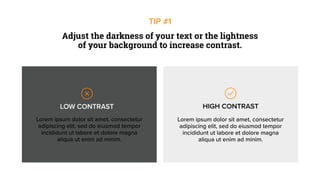
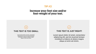


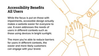


The document outlines seven strategies to enhance website accessibility, emphasizing the importance of making digital content usable for individuals with various impairments. Key recommendations include improving visual contrast, increasing font size, using alt-text for images, and adding captions to videos. Overall, accessible design benefits all users and can improve website engagement and usability.


![WordStream Presents: Bold Tips to Rethink Remarketing [Webinar]](https://cdn.slidesharecdn.com/ss_thumbnails/wordstream-bold-tips-to-rethink-remarketing-webinar-141113142435-conversion-gate01-thumbnail.jpg?width=640&height=640&fit=bounds)


