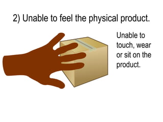
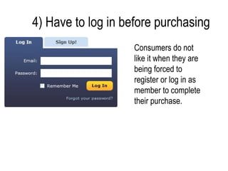
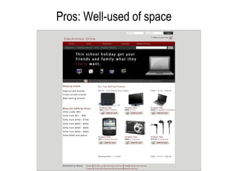
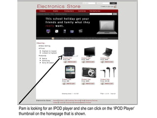
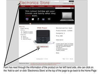
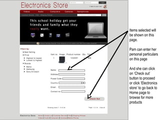
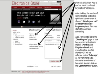
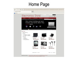
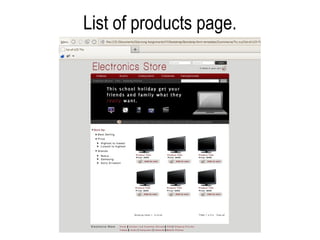
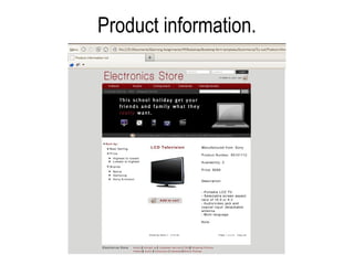
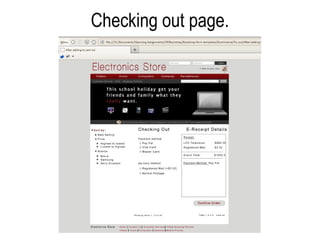
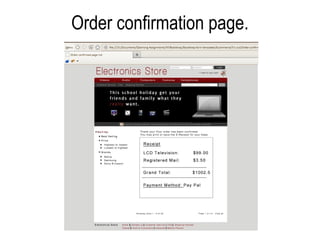
The document discusses the key components and considerations for an effective e-commerce website. It explains that an e-commerce website allows online shopping and acts as a virtual store. Some important elements include driving traffic through search engine optimization, compatibility across browsers, clear product images, easy navigation, an accessible shopping cart, and components like FAQs and company information. The document also outlines problems customers may face like doubts, an inability to see products physically, overly long descriptions, and needing to log in before checkout. It stresses the importance of addressing these issues in the design. Finally, it provides a sample walkthrough of the customer experience from browsing products to checkout and order confirmation on an improved e-commerce site layout.


![Consideration: [Bigger audience]
• Make full use of the search engine enhancement.
• Able to drive traffic by creating relevant content with
important keywords.
• Not to reduce credibility with the consumers by
having wrong grammar in the E-Commerce
website.](https://image.slidesharecdn.com/e-commerce-120730021933-phpapp01/85/3rd-Portfolio-Development-Idea-E-commerce-5-320.jpg)
![Consideration: [Compatible browsers]
• At least when considering designing an E-commerce
website, it has to be able to work on IE (Leader competitor
in browser) or with Firefox.](https://image.slidesharecdn.com/e-commerce-120730021933-phpapp01/85/3rd-Portfolio-Development-Idea-E-commerce-6-320.jpg)
![Consideration: [Images]
• Images are essential in E-commerce website
design.
• Strong tool in aiding the seller with product sales,
including aiding the customers as well.
• Should clearly portray the products sold and
services offered to customers.](https://image.slidesharecdn.com/e-commerce-120730021933-phpapp01/85/3rd-Portfolio-Development-Idea-E-commerce-7-320.jpg)
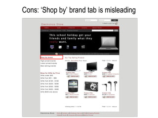
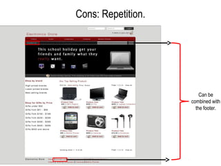
![Consideration: [Having a usable site]
• Easy navigation.
• Stay within the three clicks of different icons in the
website.](https://image.slidesharecdn.com/e-commerce-120730021933-phpapp01/85/3rd-Portfolio-Development-Idea-E-commerce-8-320.jpg)
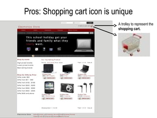
![Consideration: [Shopping cart]
• It is important to include shopping cart in the design
when customer is interested in buying the product.](https://image.slidesharecdn.com/e-commerce-120730021933-phpapp01/85/3rd-Portfolio-Development-Idea-E-commerce-9-320.jpg)
![Consideration: [Easy ordering of
product]
• When the customer is convinced on what he or she
is going to purchase, close the deal for customers
easily.
• Ensure that it does not take more than a click to
allow them to begin their ordering process.
• Every page with regard to the product should have
an ‘Order Now’ or ‘Add to cart’ icon.](https://image.slidesharecdn.com/e-commerce-120730021933-phpapp01/85/3rd-Portfolio-Development-Idea-E-commerce-10-320.jpg)
![Consideration: [Other components like
FAQ etc]
• FAQ, privacy policies and the ‘About us’ page are
essential in the design as well.
• When customers look out for these pages =
credibility we can give to them.
• Inputting credible information that will make you as
a honest trader.](https://image.slidesharecdn.com/e-commerce-120730021933-phpapp01/85/3rd-Portfolio-Development-Idea-E-commerce-11-320.jpg)