This document summarizes key concepts in descriptive statistics, including:
1. Methods for describing data distribution through tables, graphs like histograms and stem-and-leaf plots, and numerical descriptions of center and variability.
2. Common measures of center like the mean and median, and variability like range and standard deviation.
3. Ways to describe the relationship between two variables through bivariate methods like contingency tables, scatterplots, correlation, and regression analysis.
Exploratory Data Analysis for Biotechnology and Pharmaceutical SciencesParag Shah
This presentation will give perfect understanding of data, data types, level of measurements, exploratory data analysis and more importantly, when to use which type of summary statistics and graphs
Exploratory Data Analysis for Biotechnology and Pharmaceutical SciencesParag Shah
This presentation will give perfect understanding of data, data types, level of measurements, exploratory data analysis and more importantly, when to use which type of summary statistics and graphs
Synthetic Fiber Construction in lab .pptxPavel ( NSTU)
Synthetic fiber production is a fascinating and complex field that blends chemistry, engineering, and environmental science. By understanding these aspects, students can gain a comprehensive view of synthetic fiber production, its impact on society and the environment, and the potential for future innovations. Synthetic fibers play a crucial role in modern society, impacting various aspects of daily life, industry, and the environment. ynthetic fibers are integral to modern life, offering a range of benefits from cost-effectiveness and versatility to innovative applications and performance characteristics. While they pose environmental challenges, ongoing research and development aim to create more sustainable and eco-friendly alternatives. Understanding the importance of synthetic fibers helps in appreciating their role in the economy, industry, and daily life, while also emphasizing the need for sustainable practices and innovation.
This is a presentation by Dada Robert in a Your Skill Boost masterclass organised by the Excellence Foundation for South Sudan (EFSS) on Saturday, the 25th and Sunday, the 26th of May 2024.
He discussed the concept of quality improvement, emphasizing its applicability to various aspects of life, including personal, project, and program improvements. He defined quality as doing the right thing at the right time in the right way to achieve the best possible results and discussed the concept of the "gap" between what we know and what we do, and how this gap represents the areas we need to improve. He explained the scientific approach to quality improvement, which involves systematic performance analysis, testing and learning, and implementing change ideas. He also highlighted the importance of client focus and a team approach to quality improvement.
Read| The latest issue of The Challenger is here! We are thrilled to announce that our school paper has qualified for the NATIONAL SCHOOLS PRESS CONFERENCE (NSPC) 2024. Thank you for your unwavering support and trust. Dive into the stories that made us stand out!
We all have good and bad thoughts from time to time and situation to situation. We are bombarded daily with spiraling thoughts(both negative and positive) creating all-consuming feel , making us difficult to manage with associated suffering. Good thoughts are like our Mob Signal (Positive thought) amidst noise(negative thought) in the atmosphere. Negative thoughts like noise outweigh positive thoughts. These thoughts often create unwanted confusion, trouble, stress and frustration in our mind as well as chaos in our physical world. Negative thoughts are also known as “distorted thinking”.
Instructions for Submissions thorugh G- Classroom.pptxJheel Barad
This presentation provides a briefing on how to upload submissions and documents in Google Classroom. It was prepared as part of an orientation for new Sainik School in-service teacher trainees. As a training officer, my goal is to ensure that you are comfortable and proficient with this essential tool for managing assignments and fostering student engagement.
Unit 8 - Information and Communication Technology (Paper I).pdfThiyagu K
This slides describes the basic concepts of ICT, basics of Email, Emerging Technology and Digital Initiatives in Education. This presentations aligns with the UGC Paper I syllabus.
Ethnobotany and Ethnopharmacology:
Ethnobotany in herbal drug evaluation,
Impact of Ethnobotany in traditional medicine,
New development in herbals,
Bio-prospecting tools for drug discovery,
Role of Ethnopharmacology in drug evaluation,
Reverse Pharmacology.
Model Attribute Check Company Auto PropertyCeline George
In Odoo, the multi-company feature allows you to manage multiple companies within a single Odoo database instance. Each company can have its own configurations while still sharing common resources such as products, customers, and suppliers.
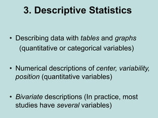
1. 3. Descriptive Statistics
• Describing data with tables and graphs
(quantitative or categorical variables)
• Numerical descriptions of center, variability,
position (quantitative variables)
• Bivariate descriptions (In practice, most
studies have several variables)
2. Frequency distribution: Lists possible values of
variable and number of times each occurs
Example: Student survey (n = 60)
www.stat.ufl.edu/~aa/social/data.html
“political ideology” measured as ordinal variable
with 1 = very liberal, …, 4 = moderate, …, 7 =
very conservative
1. Tables and Graphs
5. Shapes of histograms
(for quantitative variables)
• Bell-shaped (IQ, SAT, political ideology in all U.S. )
• Skewed right (annual income, no. times arrested)
• Skewed left (score on easy exam)
• Bimodal (polarized opinions)
Ex. GSS data on sex before marriage in Exercise 3.73:
always wrong, almost always wrong, wrong only
sometimes, not wrong at all
category counts 238, 79, 157, 409
7. 2.Numerical descriptions
Let y denote a quantitative variable, with
observations y1 , y2 , y3 , … , yn
a. Describing the center
Median: Middle measurement of ordered sample
Mean:
1 2 ... n i
y y y y
y
n n
8. Example: Annual per capita carbon dioxide emissions
(metric tons) for n = 8 largest nations in population
size
Bangladesh 0.3, Brazil 1.8, China 2.3, India 1.2,
Indonesia 1.4, Pakistan 0.7, Russia 9.9, U.S. 20.1
Ordered sample:
Median =
Mean =
y
9. Example: Annual per capita carbon dioxide emissions
(metric tons) for n = 8 largest nations in population
size
Bangladesh 0.3, Brazil 1.8, China 2.3, India 1.2,
Indonesia 1.4, Pakistan 0.7, Russia 9.9, U.S. 20.1
Ordered sample: 0.3, 0.7, 1.2, 1.4, 1.8, 2.3, 9.9, 20.1
Median =
Mean =
y
10. Example: Annual per capita carbon dioxide emissions
(metric tons) for n = 8 largest nations in population
size
Bangladesh 0.3, Brazil 1.8, China 2.3, India 1.2,
Indonesia 1.4, Pakistan 0.7, Russia 9.9, U.S. 20.1
Ordered sample: 0.3, 0.7, 1.2, 1.4, 1.8, 2.3, 9.9, 20.1
Median = (1.4 + 1.8)/2 = 1.6
Mean = (0.3 + 0.7 + 1.2 + … + 20.1)/8 = 4.7
y
11. Properties of mean and median
• For symmetric distributions, mean = median
• For skewed distributions, mean is drawn in
direction of longer tail, relative to median
• Mean valid for interval scales, median for
interval or ordinal scales
• Mean sensitive to “outliers” (median often
preferred for highly skewed distributions)
• When distribution symmetric or mildly skewed or
discrete with few values, mean preferred
because uses numerical values of observations
12. Examples:
• New York Yankees baseball team, 2006
mean salary = $7.0 million
median salary = $2.9 million
How possible? Direction of skew?
• Give an example for which you would expect
mean < median
13. b. Describing variability
Range: Difference between largest and smallest
observations
(but highly sensitive to outliers, insensitive to shape)
Standard deviation: A “typical” distance from the mean
The deviation of observation i from the mean is
i
y y
14. The variance of the n observations is
The standard deviation s is the square root of the variance,
2 2 2
2 1
( ) ( ) ... ( )
1 1
i n
y y y y y y
s
n n
2
s s
15. Example: Political ideology
• For those in the student sample who attend religious
services at least once a week (n = 9 of the 60),
• y = 2, 3, 7, 5, 6, 7, 5, 6, 4
2 2 2
2
5.0,
(2 5) (3 5) ... (4 5) 24
3.0
9 1 8
3.0 1.7
y
s
s
For entire sample (n = 60), mean = 3.0, standard deviation = 1.6,
tends to have similar variability but be more liberal
16. • Properties of the standard deviation:
• s 0, and only equals 0 if all observations are equal
• s increases with the amount of variation around the mean
• Division by n - 1 (not n) is due to technical reasons (later)
• s depends on the units of the data (e.g. measure euro vs $)
•Like mean, affected by outliers
•Empirical rule: If distribution is approx. bell-shaped,
about 68% of data within 1 standard dev. of mean
about 95% of data within 2 standard dev. of mean
all or nearly all data within 3 standard dev. of mean
17. Example: SAT with mean = 500, s = 100
(sketch picture summarizing data)
Example: y = number of close friends you have
GSS: The variable ‘frinum’ has mean 7.4, s = 11.0
Probably highly skewed: right or left?
Empirical rule fails; in fact, median = 5, mode=4
Example: y = selling price of home in Syracuse, NY.
If mean = $130,000, which is realistic?
s = 0, s = 1000, s = 50,000, s = 1,000,000
18. c. Measures of position
pth percentile: p percent of observations
below it, (100 - p)% above it.
p = 50: median
p = 25: lower quartile (LQ)
p = 75: upper quartile (UQ)
Interquartile range IQR = UQ - LQ
19. Quartiles portrayed graphically by box plots
(John Tukey)
Example: weekly TV watching for n=60 from
student survey data file, 3 outliers
20. Box plots have box from LQ to UQ, with
median marked. They portray a five-
number summary of the data:
Minimum, LQ, Median, UQ, Maximum
except for outliers identified separately
Outlier = observation falling
below LQ – 1.5(IQR)
or above UQ + 1.5(IQR)
Ex. If LQ = 2, UQ = 10, then IQR = 8 and
outliers above 10 + 1.5(8) = 22
21. 3. Bivariate description
• Usually we want to study associations between two or
more variables (e.g., how does number of close
friends depend on gender, income, education, age,
working status, rural/urban, religiosity…)
• Response variable: the outcome variable
• Explanatory variable(s): defines groups to compare
Ex.: number of close friends is a response variable,
while gender, income, … are explanatory variables
Response var. also called “dependent variable”
Explanatory var. also called “independent variable”
22. Summarizing associations:
• Categorical var’s: show data using contingency tables
• Quantitative var’s: show data using scatterplots
• Mixture of categorical var. and quantitative var. (e.g.,
number of close friends and gender) can give
numerical summaries (mean, standard deviation) or
side-by-side box plots for the groups
• Ex. General Social Survey (GSS) data
Men: mean = 7.0, s = 8.4
Women: mean = 5.9, s = 6.0
Shape? Inference questions for later chapters?
24. Contingency Tables
• Cross classifications of categorical variables in
which rows (typically) represent categories of
explanatory variable and columns represent
categories of response variable.
• Counts in “cells” of the table give the numbers of
individuals at the corresponding combination of
levels of the two variables
25. Happiness and Family Income
(GSS 2008 data: “happy,” “finrela”)
Happiness
Income Very Pretty Not too Total
-------------------------------
Above Aver. 164 233 26 423
Average 293 473 117 883
Below Aver. 132 383 172 687
------------------------------
Total 589 1089 315 1993
26. Can summarize by percentages on response
variable (happiness)
Example: Percentage “very happy” is
39% for above aver. income (164/423 = 0.39)
33% for average income (293/883 = 0.33)
19% for below average income (??)
27. Happiness
Income Very Pretty Not too Total
--------------------------------------------
Above 164 (39%) 233 (55%) 26 (6%) 423
Average 293 (33%) 473 (54%) 117 (13%) 883
Below 132 (19%) 383 (56%) 172 (25%) 687
----------------------------------------------
Inference questions for later chapters? (i.e., what can
we conclude about the corresponding population?)
28. Scatterplots (for quantitative variables)
plot response variable on vertical axis,
explanatory variable on horizontal axis
Example: Table 9.13 (p. 294) shows UN data for several
nations on many variables, including fertility (births per
woman), contraceptive use, literacy, female economic
activity, per capita gross domestic product (GDP), cell-
phone use, CO2 emissions
Data available at
http://www.stat.ufl.edu/~aa/social/data.html
29.
30. Example: Survey in Alachua County, Florida,
on predictors of mental health
(data for n = 40 on p. 327 of text and at
www.stat.ufl.edu/~aa/social/data.html)
y = measure of mental impairment (incorporates various
dimensions of psychiatric symptoms, including aspects of
depression and anxiety)
(min = 17, max = 41, mean = 27, s = 5)
x = life events score (events range from severe personal
disruptions such as death in family, extramarital affair, to
less severe events such as new job, birth of child, moving)
(min = 3, max = 97, mean = 44, s = 23)
31.
32. Bivariate data from 2000 Presidential election
Butterfly ballot, Palm Beach County, FL, text p.290
33. Example: The Massachusetts Lottery
(data for 37 communities)
Per capita income
% income
spent on
lottery
34. Correlation describes strength of
association
• Falls between -1 and +1, with sign indicating direction
of association (formula later in Chapter 9)
The larger the correlation in absolute value, the stronger
the association (in terms of a straight line trend)
Examples: (positive or negative, how strong?)
Mental impairment and life events, correlation =
GDP and fertility, correlation =
GDP and percent using Internet, correlation =
35. Correlation describes strength of
association
• Falls between -1 and +1, with sign indicating direction
of association
Examples: (positive or negative, how strong?)
Mental impairment and life events, correlation = 0.37
GDP and fertility, correlation = - 0.56
GDP and percent using Internet, correlation = 0.89
36.
37. Regression analysis gives line
predicting y using x
Example:
y = mental impairment, x = life events
Predicted y = 23.3 + 0.09x
e.g., at x = 0, predicted y =
at x = 100, predicted y =
38. Regression analysis gives line
predicting y using x
Example:
y = mental impairment, x = life events
Predicted y = 23.3 + 0.09x
e.g., at x = 0, predicted y = 23.3
at x = 100, predicted y = 23.3 + 0.09(100) = 32.3
Inference questions for later chapters?
(i.e., what can we conclude about the population?)
39. Example: student survey
y = college GPA, x = high school GPA
(data at www.stat.ufl.edu/~aa/social/data.html)
What is the correlation?
What is the estimated regression equation?
We’ll see later in course the formulas for finding
the correlation and the “best fitting” regression
equation (with possibly several explanatory
variables), but for now, try using software such
as SPSS to find the answers.
40. Sample statistics /
Population parameters
• We distinguish between summaries of samples
(statistics) and summaries of populations
(parameters).
• Common to denote statistics by Roman letters,
parameters by Greek letters:
Population mean =m, standard deviation = s,
proportion are parameters.
In practice, parameter values unknown, we make
inferences about their values using sample
statistics.
41. • The sample mean estimates
the population mean m (quantitative variable)
• The sample standard deviation s estimates
the population standard deviation s (quantitative
variable)
• A sample proportion p estimates
a population proportion (categorical variable)
y