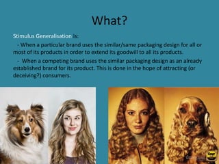
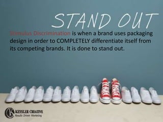
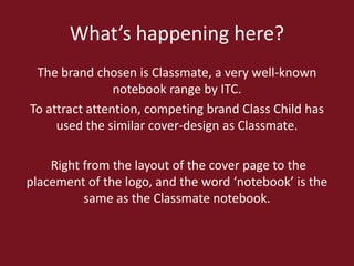
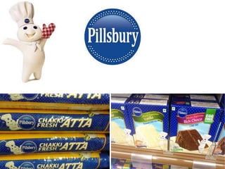
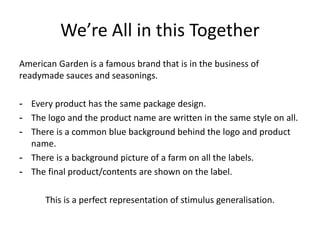
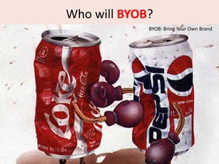
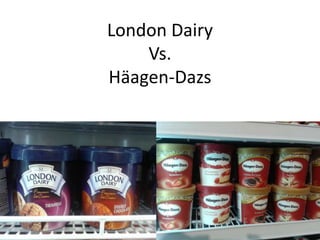
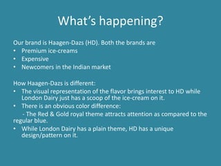
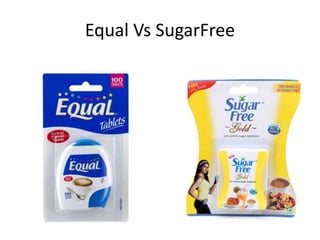
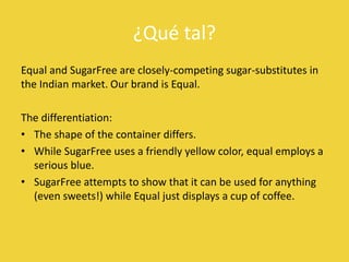
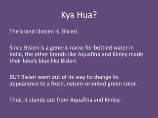
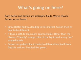
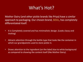
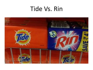
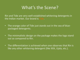
Batch 2015
Course Code: 50121310
Course Name: Consumer Behaviour
Roll # 869, 904

Assignment # 322
CONSUMER BEHAVIOUR

Stimulus Generalisation
Vs.
Stimulus Discrimination
What?
Stimulus Generalisation is:
- When a particular brand uses the similar/same packaging design for all or
most of its products in order to extend its goodwill to all its products.
- When a competing brand uses the similar packaging design as an already
established brand for its product. This is done in the hope of attracting (or
deceiving?) consumers.
Stimulus Discrimination is when a brand uses packaging
design in order to COMPLETELY differentiate itself from
its competing brands. It is done to stand out.
Stimulus Generalization
Classmate Vs Class Child
What’s happening here?
The brand chosen is Classmate, a very well-known
notebook range by ITC.
To attract attention, competing brand Class Child has
used the similar cover-design as Classmate.
Right from the layout of the cover page to the
placement of the logo, and the word ‘notebook’ is the
same as the Classmate notebook.
What’s up here?
Pillsbury is well-established food (baking mainly) brand in India.
-All products have blue (+ white polka dots) on the packaging.
-Have the presence of the Pillsbury Doughboy (icon/mascot) on
all. He is usually shown presenting the finished product.
This enables easy identification of the brand’s products as the
brand is highly trusted.
Nutella Vs. Hintz
¿Qué tal?
Nutella has been established as a Chocolate hazelnut
spread for years now.
- Hintz is trying to ape Nutella’s packaging (right from
the shape, logo color) in order to attract consumers
who may pick it up due to its presence on the same
shelf as Nutella and other factors such as price.
- Even the position of the hazelnuts is the same.
Parle Marie Vs. Britannia Marie Gold
What’s happening?
Parle and Britannia are both well established biscuit brands in
India. Our brand is Britannia.
This is a classic case of what came first? The chicken or the egg?
- Parle has the same visual representation of the biscuits and
wheat on the packaging as Britannia.
- The logo is similarly placed.
- The SAME colors (red and yellow) are used although on
opposite sides. The only difference is the font.
Garnier Skin Products
What’s going on here?
Garnier has established itself in India as a very good skincare
brand although it is famous for its shampoo range.
The generalization here is that all Garnier Face products have
more than one thing in common.
Other than the obvious logo, product name placement and
packaging in a box, the design on the package shows the
container (tube, bottle, etc.) of the product itself.

It is not the most obvious thing, but definitely something that
your mind would take a note of.
What?
Schweppes is a well-known beverage company that has used
generalisation to extend its goodwill to all products.
- All of Schweppes products can be identified due to the
prominent logo which is a ‘swish’. It vaguely divides the
bottle/can into two halves. The top is always silver no matter
what the beverage is while the color of the bottom half varies
depending on the contents.
- Also the bottom right of the logo has tiny bubbles.
American Garden

American Garden
We’re All in this Together
American Garden is a famous brand that is in the business of
readymade sauces and seasonings.
- Every product has the same package design.
- The logo and the product name are written in the same style on all.
- There is a common blue background behind the logo and product
name.
- There is a background picture of a farm on all the labels.
- The final product/contents are shown on the label.
This is a perfect representation of stimulus generalisation.
Stimulus Discrimination
Who will BYOB?
BYOB: Bring Your Own Brand
London Dairy
Vs.
Häagen-Dazs
What’s happening?
Our brand is Haagen-Dazs (HD). Both the brands are
• Premium ice-creams
• Expensive
• Newcomers in the Indian market
How Haagen-Dazs is different:
• The visual representation of the flavor brings interest to HD while
London Dairy just has a scoop of the ice-cream on it.
• There is an obvious color difference:
- The Red & Gold royal theme attracts attention as compared to the
regular blue.
• While London Dairy has a plain theme, HD has a unique
design/pattern on it.
Equal Vs SugarFree
¿Qué tal?
Equal and SugarFree are closely-competing sugar-substitutes in
the Indian market. Our brand is Equal.
The differentiation:
• The shape of the container differs.
• While SugarFree uses a friendly yellow color, equal employs a
serious blue.
• SugarFree attempts to show that it can be used for anything
(even sweets!) while Equal just displays a cup of coffee.
Kya Hua?
The brand chosen is Bisleri.
Since Bisleri is a generic name for bottled water in
India, the other brands like Aquafina and Kinley made
their labels blue like Bisleri.
BUT Bisleri went out of its way to change its
appearance to a fresh, nature-oriented green color.
Thus, it stands out from Aquafina and Kinley.
Dettol Vs. Savlon
What’s going on here?
Both Dettol and Savlon are antiseptic fluids. We’ve chosen
Savlon as our brand.
• Since Dettol had was leading in this market, Savlon tried its
best to be different.
• It took a path to look more approachable. Other than the
obvious ‘friendly’ orange color of the liquid and a very ‘fun’
shaped bottle.
• Savlon has picked blue in order to differentiate itself from
Dettol’s serious, hospital-like green.
Soul Vs. Mother Dairy
What’s Hot?
Mother Dairy (and other pickle brands like Priya) have a similar
approach to packaging. Our chosen brand, SOUL, has completely
differentiated itself.
• It is Completely covered and has minimalistic design. (Looks classy and
inviting)
• Attracts attention through the bottle-type that looks like the container in
which our grandparents used to store pickle in.
• Draws attention to the ingredient (on the label) due to white background
as compared to showing the content itself (like Mother Dairy).
Tide Vs. Rin
What’s the Scene?
Rin and Tide are very well-established whitening detergents in
the Indian market. Our brand is Tide.
• The orange color of Tide just stands out in the sea of bluepackaged detergents.
• The minimalistic design on the package makes the logo stand
out as compared to Rin.

• The differentiation is achieved when one observes that Rin is
like any other whitening detergent (like XXX, Ujala, etc.).
The End


Consumer Behaviour - Stimulus Generalisation Vs. Stimulus Discrimination

  • 1.
    Batch 2015 Course Code:50121310 Course Name: Consumer Behaviour Roll # 869, 904 Assignment # 322
  • 2.
  • 3.
    What? Stimulus Generalisation is: -When a particular brand uses the similar/same packaging design for all or most of its products in order to extend its goodwill to all its products. - When a competing brand uses the similar packaging design as an already established brand for its product. This is done in the hope of attracting (or deceiving?) consumers.
  • 4.
    Stimulus Discrimination iswhen a brand uses packaging design in order to COMPLETELY differentiate itself from its competing brands. It is done to stand out.
  • 5.
  • 7.
  • 8.
    What’s happening here? Thebrand chosen is Classmate, a very well-known notebook range by ITC. To attract attention, competing brand Class Child has used the similar cover-design as Classmate. Right from the layout of the cover page to the placement of the logo, and the word ‘notebook’ is the same as the Classmate notebook.
  • 10.
    What’s up here? Pillsburyis well-established food (baking mainly) brand in India. -All products have blue (+ white polka dots) on the packaging. -Have the presence of the Pillsbury Doughboy (icon/mascot) on all. He is usually shown presenting the finished product. This enables easy identification of the brand’s products as the brand is highly trusted.
  • 11.
  • 12.
    ¿Qué tal? Nutella hasbeen established as a Chocolate hazelnut spread for years now. - Hintz is trying to ape Nutella’s packaging (right from the shape, logo color) in order to attract consumers who may pick it up due to its presence on the same shelf as Nutella and other factors such as price. - Even the position of the hazelnuts is the same.
  • 13.
    Parle Marie Vs.Britannia Marie Gold
  • 14.
    What’s happening? Parle andBritannia are both well established biscuit brands in India. Our brand is Britannia. This is a classic case of what came first? The chicken or the egg? - Parle has the same visual representation of the biscuits and wheat on the packaging as Britannia. - The logo is similarly placed. - The SAME colors (red and yellow) are used although on opposite sides. The only difference is the font.
  • 15.
  • 16.
    What’s going onhere? Garnier has established itself in India as a very good skincare brand although it is famous for its shampoo range. The generalization here is that all Garnier Face products have more than one thing in common. Other than the obvious logo, product name placement and packaging in a box, the design on the package shows the container (tube, bottle, etc.) of the product itself. It is not the most obvious thing, but definitely something that your mind would take a note of.
  • 18.
    What? Schweppes is awell-known beverage company that has used generalisation to extend its goodwill to all products. - All of Schweppes products can be identified due to the prominent logo which is a ‘swish’. It vaguely divides the bottle/can into two halves. The top is always silver no matter what the beverage is while the color of the bottom half varies depending on the contents. - Also the bottom right of the logo has tiny bubbles.
  • 19.
  • 20.
    We’re All inthis Together American Garden is a famous brand that is in the business of readymade sauces and seasonings. - Every product has the same package design. - The logo and the product name are written in the same style on all. - There is a common blue background behind the logo and product name. - There is a background picture of a farm on all the labels. - The final product/contents are shown on the label. This is a perfect representation of stimulus generalisation.
  • 21.
  • 22.
    Who will BYOB? BYOB:Bring Your Own Brand
  • 23.
  • 24.
    What’s happening? Our brandis Haagen-Dazs (HD). Both the brands are • Premium ice-creams • Expensive • Newcomers in the Indian market How Haagen-Dazs is different: • The visual representation of the flavor brings interest to HD while London Dairy just has a scoop of the ice-cream on it. • There is an obvious color difference: - The Red & Gold royal theme attracts attention as compared to the regular blue. • While London Dairy has a plain theme, HD has a unique design/pattern on it.
  • 25.
  • 26.
    ¿Qué tal? Equal andSugarFree are closely-competing sugar-substitutes in the Indian market. Our brand is Equal. The differentiation: • The shape of the container differs. • While SugarFree uses a friendly yellow color, equal employs a serious blue. • SugarFree attempts to show that it can be used for anything (even sweets!) while Equal just displays a cup of coffee.
  • 28.
    Kya Hua? The brandchosen is Bisleri. Since Bisleri is a generic name for bottled water in India, the other brands like Aquafina and Kinley made their labels blue like Bisleri. BUT Bisleri went out of its way to change its appearance to a fresh, nature-oriented green color. Thus, it stands out from Aquafina and Kinley.
  • 29.
  • 30.
    What’s going onhere? Both Dettol and Savlon are antiseptic fluids. We’ve chosen Savlon as our brand. • Since Dettol had was leading in this market, Savlon tried its best to be different. • It took a path to look more approachable. Other than the obvious ‘friendly’ orange color of the liquid and a very ‘fun’ shaped bottle. • Savlon has picked blue in order to differentiate itself from Dettol’s serious, hospital-like green.
  • 31.
  • 32.
    What’s Hot? Mother Dairy(and other pickle brands like Priya) have a similar approach to packaging. Our chosen brand, SOUL, has completely differentiated itself. • It is Completely covered and has minimalistic design. (Looks classy and inviting) • Attracts attention through the bottle-type that looks like the container in which our grandparents used to store pickle in. • Draws attention to the ingredient (on the label) due to white background as compared to showing the content itself (like Mother Dairy).
  • 33.
  • 34.
    What’s the Scene? Rinand Tide are very well-established whitening detergents in the Indian market. Our brand is Tide. • The orange color of Tide just stands out in the sea of bluepackaged detergents. • The minimalistic design on the package makes the logo stand out as compared to Rin. • The differentiation is achieved when one observes that Rin is like any other whitening detergent (like XXX, Ujala, etc.).
  • 35.