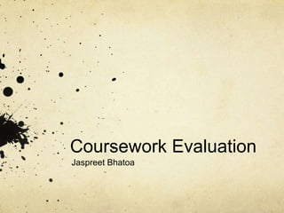
The document provides an evaluation of a magazine cover design created by Jaspreet Bhatoa, noting the typography used for the masthead, the placement of cover lines and images to draw the reader's eye, and the use of bold red, black, grey and white colors to appeal to a younger audience. Key elements of the design include the large masthead, a long shot main image in an alleyway to give an "edgy" feel, and alternating bold and plain text for the cover lines to increase noticeability and purchase inclination.


![Estou Tentando Aprender[1][1]...](https://cdn.slidesharecdn.com/ss_thumbnails/estoutentandoaprender11-1220624357897905-8-thumbnail.jpg?width=640&height=640&fit=bounds)


