Download as PDF, PPTX


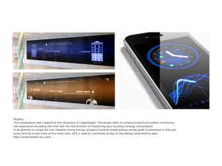


Dieter Rams outlines ten principles of good design, emphasizing innovation, usefulness, aesthetic quality, and clarity. Good design should be unobtrusive, honest, long-lasting, thorough, environmentally friendly, and minimalistic, focusing on essential aspects without unnecessary embellishments. These principles serve as a guide for creating effective and meaningful products that enhance user experience.


![Nuevas reglas de diseño [Historia del diseño - 21]](https://cdn.slidesharecdn.com/ss_thumbnails/22hd22aiprinciples-180606140547-thumbnail.jpg?width=640&height=640&fit=bounds)


