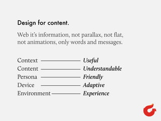
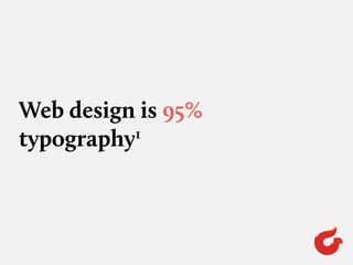
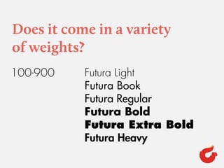
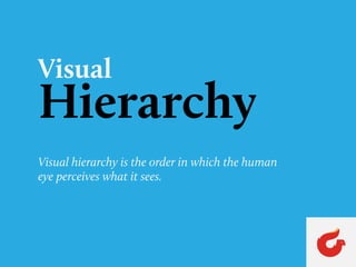
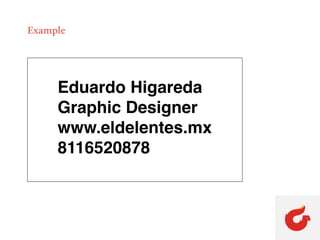
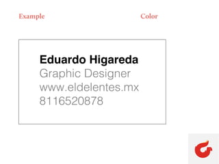
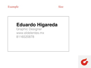
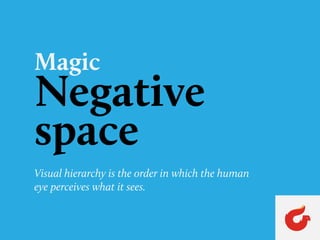
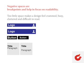
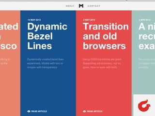
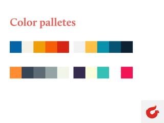
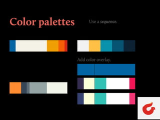
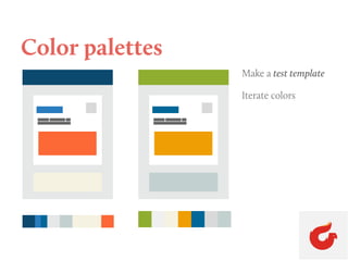
This document discusses principles of web design focused on typography and hierarchy. It recommends designing for content over animations and focusing on readability. Typefaces should have variety in weights and sizes and a nice x-height. Visual hierarchy is created through techniques like size, weight, and spacing to guide the user's eye through a design. Color palettes should be tested and iterated to find an effective sequence. Negative space helps create readability by avoiding clutter.
3. Design for content.
Web it’s information, not parallax, not flat,
not animations, only words and messages.
Context
Content
Persona
Device
Environment
Useful
Understandable
Friendly
Adaptive
Experience
5. 95% of the information on the web
is written language.
It is only logical to say that a web
designer should get good training in
the main discipline of shaping written
information, in ther words: Typography.
1
http://ia.net/blog/the-web-is-all-about-typography-period/
8. Does it come in a variety
of weights?
Futura Light
Futura Book
Futura Regular
Futura Bold
Futura Extra Bold
Futura Heavy
100-900
9. Does it have a nice x-height?
HolaHola
"Lorem ipsum dolor sit amet, consecte-
tur adipisicing elit, sed do eiusmod
tempor incididunt ut labore et dolore
magna aliqua. Ut enim ad minim
veniam, quis nostrud exercitation ulla-
mco laboris nisi ut aliquip ex ea com-
modo consequat. Duis aute irure dolor
in reprehenderit in voluptate velit esse
cillum dolore eu fugiat nulla pariatur.
Excepteur sint occaecat cupidatat non
proident, sunt in culpa qui officia dese-
"Lorem ipsum dolor sit amet, con-
sectetur adipisicing elit, sed do
eiusmod tempor incididunt ut
labore et dolore magna aliqua. Ut
enim ad minim veniam, quis nos-
trud exercitation ullamco laboris
nisi ut aliquip ex ea commodo con-
sequat. Duis aute irure dolor in rep-
rehenderit in voluptate velit esse
cillum dolore eu fugiat nulla paria-
tur. Excepteur sint occaecat cupi-
Source Sans pro Open Sans
If the x-height is too low,
the typeface will appear
smaller overall and the cap
If the x-height is way too
high, your eye won’t be able
to distinguish quickly
between caps and lowercase
10. Is it a typeface I’d want to
hang out with?
Elegance Elegance Elegance
11. If it’s a sans, is there enough
letter variety?
12. Pairing Typefaces
How Many Fonts Should I Use?
Formulas
Content
Headline
Content
Headline
Content
HEADLINE
1-4
23. Negative spaces are
breakpoints and help in focus on readability.
Too little space makes a design feel crammed, busy,
cluttered and difficult to read.
Logo U
Logo U
Button Button
Tittle
Paragraph
Tittle
Paragraph