SlideShare a Scribd company logo
THE BIG ISSUE
- COVER ANALYSIS
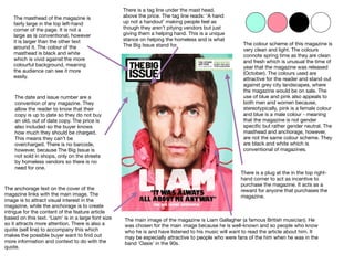
The masthead of the magazine is
fairly large in the top left-hand
corner of the page. It is not a
large as is conventional, however
it is larger than the other text
around it. The colour of the
masthead is black and white
which is vivid against the more
colourful background, meaning
the audience can see it more
easily.
The main image of the magazine is Liam Gallagher (a famous British musician). He
was chosen for the main image because he is well-known and so people who know
who he is and have listened to his music will want to read the article about him. It
may be especially attractive to people who were fans of the him when he was in the
band ‘Oasis’ in the 90s.
The anchorage text on the cover of the
magazine links with the main image. The
image is to attract visual interest in the
magazine, while the anchorage is to create
intrigue for the content of the feature article
based on this text. ‘Liam’ is in a large font size
so it attracts more attention. There is also a
quote (sell line) to accompany this which
makes the possible buyer want to find out
more information and context to do with the
quote.
The date and issue number are a
convention of any magazine. They
allow the reader to know that their
copy is up to date so they do not buy
an old, out of date copy. The price is
also included so the buyer knows
how much they should be charged.
This means they can’t be
overcharged. There is no barcode,
however, because The Big Issue is
not sold in shops, only on the streets
by homeless vendors so there is no
need for one.
There is a plug at the in the top right-
hand corner to act as incentive to
purchase the magazine. It acts as a
reward for anyone that purchases the
magazine.
There is a tag line under the mast head,
above the price. The tag line reads: ‘A hand
up not a handout’ making people feel as
though they aren’t pitying vendors but just
giving them a helping hand. This is a unique
stance on helping the homeless and is what
The Big Issue stand for. The colour scheme of this magazine is
very clean and light. The colours
connote spring time as they are clean
and fresh which is unusual the time of
year that the magazine was released
(October). The colours used are
attractive for the reader and stand out
against grey city landscapes, where
the magazine would be on sale. The
use of blue and pink also appeals to
both men and women because,
stereotypically, pink is a female colour
and blue is a male colour - meaning
that the magazine is not gender
specific but rather gender neutral. The
masthead and anchorage, however,
are not the same colour scheme. They
are black and white which is
conventional of magazines.
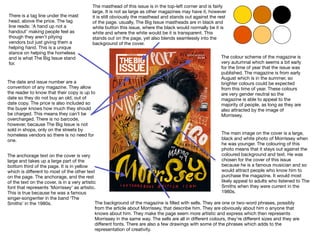
The masthead of this issue is in the top-left corner and is fairly
large. It is not as large as other magazines may have it, however
it is still obviously the masthead and stands out against the rest
of the page. usually, The Big Issue mastheads are in black and
white button this issue, where the black would normally be it is
white and where the white would be it is transparent. This
stands out on the page, yet also blends seamlessly into the
background of the cover.
There is a tag line under the mast
head, above the price. The tag
line reads: ‘A hand up not a
handout’ making people feel as
though they aren’t pitying
vendors but just giving them a
helping hand. This is a unique
stance on helping the homeless
and is what The Big Issue stand
for.
The date and issue number are a
convention of any magazine. They allow
the reader to know that their copy is up to
date so they do not buy an old, out of
date copy. The price is also included so
the buyer knows how much they should
be charged. This means they can’t be
overcharged. There is no barcode,
however, because The Big Issue is not
sold in shops, only on the streets by
homeless vendors so there is no need for
one.
The anchorage text on the cover is very
large and takes up a large part of the
bottom third of the page. It is in yellow
which is different to most of the other text
on the page. The anchorage, and the rest
of the text on the cover, is in a very artistic
font that represents ‘Morrissey’ as artistic.
This is true because he was a famous
singer-songwriter in the band ‘The
Smiths’ in the 1980s.
The main image on the cover is a large,
black and white photo of Morrissey when
he was younger. The colouring of this
photo means that it stays out against the
coloured background and text. He was
chosen for the cover of this issue
because he is a famous musician and so
would attract people who know him to
purchase the magazine. It would most
likely appeal to adults who listened to The
Smiths when they were current in the
1980s.
The colour scheme of the magazine is
very autumnal which seems a bit early
for the time of year that the issue was
published. The magazine is from early
August which is in the summer, so
brighter colours could be expected
from this time of year. These colours
are very gender neutral so the
magazine is able to appeal to the
majority of people, as long as they are
also attracted by the image of
Morrissey.
The background of the magazine is filled with sells. They are one or two-word phrases, possibly
from the article about Morrissey, that describe him. They are obviously about him o anyone that
knows about him. They make the page seem more artistic and express which then represents
Morrissey in the same way. The sells are all in different colours, they’re different sizes and they are
different fonts. There are also a few drawings with some of the phrases which adds to the
representation of creativity.
There is a tag line under the mast
head, above the price. The tag
line reads: ‘A hand up not a
handout’ making people feel as
though they aren’t pitying
vendors but just giving them a
helping hand. This is a unique
stance on helping the homeless
and is what The Big Issue stand
for.
The date and issue number are a
convention of any magazine. They allow
the reader to know that their copy is up to
date so they do not buy an old, out of
date copy. The price is also included so
the buyer knows how much they should
be charged. This means they can’t be
overcharged. There is no barcode,
however, because The Big Issue is not
sold in shops, only on the streets by
homeless vendors so there is no need for
one.
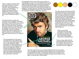
The masthead on this cover is the usual one seen on
most Big Issue covers. It is in the top-left corner and has
a black border and black text with a white background.
This is the well-known logo for The Big Issue and so
would attract customers that had previously bought the
magazine. The bold colours of the black and white stand
out against the background and the rest of the magazine
so it is obvious that this is a Big Issue magazine. The colour shame of this issue is fairly
neutral and there aren’t many bright or
vibrant colours. Instead they are quite
dull. This may be because of the time
of year that the issue was released
(January) because it was the middle of
winter. Also George Michale had
passed away only a few weeks before
the release of this issue so it wasn’t a
positive thing for him to be on the
cover. The yellow strap line adds a
pop of vibrant colour on an otherwise
dull background.
The anchorage text on this issue is
very large and is in the bottom-right
corner. The anchorage stands out as
it is in white writing on a black
background. This brings attention to
the main focus of the magazine and
links to the image like it should. It
focuses the perspective customer
on what the feature article will be
about and because George Michael
was in the news at the time and so
this would attract customers.
There is a pull quote
underneath the anchorage
that tells the customer what
the article will be about and
that it will be other people
talking about George Michael.
There is a plug underneath the
pull quote that gives an extra bit
of information about what is in
the magazine and will give more
incentive to buy the magazine.
The main image on the cover is George Michael when he was younger.
This is because the feature article was a tribute to him os a picture of his
younger self fits the story. The image fits with the colour scheme of the
rest of the cover. The image is very large and takes up the majority of the
page. It is the centre of visual interest.

More Related Content

What's hot

Codes and Conventions of Magazines
Codes and Conventions of MagazinesCodes and Conventions of Magazines
Codes and Conventions of MagazinesJordanLiddell
 
Magazine Cover Analysis
Magazine Cover AnalysisMagazine Cover Analysis
Magazine Cover AnalysisAnna Salman
 
Mojo’ magazine analysis
Mojo’ magazine analysisMojo’ magazine analysis
Mojo’ magazine analysisasmediac14
 
Media messages- Burn the witch
Media messages- Burn the witchMedia messages- Burn the witch
Media messages- Burn the witchcaitlinmitham
 
Applying theory media industries
Applying theory media industriesApplying theory media industries
Applying theory media industriesMrs Downie
 
Revising Minecraft
Revising MinecraftRevising Minecraft
Revising MinecraftTomEccles4
 
Sociology of the mass media - Marxist perspective on the media
Sociology of the mass media - Marxist perspective on the mediaSociology of the mass media - Marxist perspective on the media
Sociology of the mass media - Marxist perspective on the mediabrunogiegerich
 
Distribution Media Studies
Distribution Media StudiesDistribution Media Studies
Distribution Media StudiesLuanamaria16
 
What are pugs and puffs on magazines
What are pugs and puffs on magazinesWhat are pugs and puffs on magazines
What are pugs and puffs on magazinessophcanning
 
Assassin's creed-3---liberation
Assassin's creed-3---liberationAssassin's creed-3---liberation
Assassin's creed-3---liberationLuigiBruno12
 
Applying theory media representation
Applying theory media representationApplying theory media representation
Applying theory media representationMrs Downie
 
A Level Media Studies (Daily Mail) How to analyse newspaper front pages
A Level Media Studies (Daily Mail) How to analyse newspaper front pagesA Level Media Studies (Daily Mail) How to analyse newspaper front pages
A Level Media Studies (Daily Mail) How to analyse newspaper front pagesBryan Langley
 
Newspaper Front Cover Analysis
Newspaper Front Cover AnalysisNewspaper Front Cover Analysis
Newspaper Front Cover AnalysisAmy_Walker93
 
The generic conventions of magazines cover
The generic conventions of magazines   coverThe generic conventions of magazines   cover
The generic conventions of magazines coverJenny McNulty
 
A2 Media Studies Revision Pack
A2 Media Studies Revision PackA2 Media Studies Revision Pack
A2 Media Studies Revision PackAndy Wallis
 
Media Studies - Music Videos
Media Studies - Music VideosMedia Studies - Music Videos
Media Studies - Music VideosYvonne44
 
Tessa perkins stereotype theory
Tessa perkins stereotype theoryTessa perkins stereotype theory
Tessa perkins stereotype theoryChloe Jayde
 
Mock feedback news
Mock feedback   newsMock feedback   news
Mock feedback newsMrs Downie
 
Media Studies A Level Paper 1 The Big Issue
Media Studies A Level Paper 1 The Big IssueMedia Studies A Level Paper 1 The Big Issue
Media Studies A Level Paper 1 The Big IssueYvonne44
 

What's hot (20)

Codes and Conventions of Magazines
Codes and Conventions of MagazinesCodes and Conventions of Magazines
Codes and Conventions of Magazines
 
Magazine Cover Analysis
Magazine Cover AnalysisMagazine Cover Analysis
Magazine Cover Analysis
 
Mojo’ magazine analysis
Mojo’ magazine analysisMojo’ magazine analysis
Mojo’ magazine analysis
 
Big issue group analysis
Big issue group analysisBig issue group analysis
Big issue group analysis
 
Media messages- Burn the witch
Media messages- Burn the witchMedia messages- Burn the witch
Media messages- Burn the witch
 
Applying theory media industries
Applying theory media industriesApplying theory media industries
Applying theory media industries
 
Revising Minecraft
Revising MinecraftRevising Minecraft
Revising Minecraft
 
Sociology of the mass media - Marxist perspective on the media
Sociology of the mass media - Marxist perspective on the mediaSociology of the mass media - Marxist perspective on the media
Sociology of the mass media - Marxist perspective on the media
 
Distribution Media Studies
Distribution Media StudiesDistribution Media Studies
Distribution Media Studies
 
What are pugs and puffs on magazines
What are pugs and puffs on magazinesWhat are pugs and puffs on magazines
What are pugs and puffs on magazines
 
Assassin's creed-3---liberation
Assassin's creed-3---liberationAssassin's creed-3---liberation
Assassin's creed-3---liberation
 
Applying theory media representation
Applying theory media representationApplying theory media representation
Applying theory media representation
 
A Level Media Studies (Daily Mail) How to analyse newspaper front pages
A Level Media Studies (Daily Mail) How to analyse newspaper front pagesA Level Media Studies (Daily Mail) How to analyse newspaper front pages
A Level Media Studies (Daily Mail) How to analyse newspaper front pages
 
Newspaper Front Cover Analysis
Newspaper Front Cover AnalysisNewspaper Front Cover Analysis
Newspaper Front Cover Analysis
 
The generic conventions of magazines cover
The generic conventions of magazines   coverThe generic conventions of magazines   cover
The generic conventions of magazines cover
 
A2 Media Studies Revision Pack
A2 Media Studies Revision PackA2 Media Studies Revision Pack
A2 Media Studies Revision Pack
 
Media Studies - Music Videos
Media Studies - Music VideosMedia Studies - Music Videos
Media Studies - Music Videos
 
Tessa perkins stereotype theory
Tessa perkins stereotype theoryTessa perkins stereotype theory
Tessa perkins stereotype theory
 
Mock feedback news
Mock feedback   newsMock feedback   news
Mock feedback news
 
Media Studies A Level Paper 1 The Big Issue
Media Studies A Level Paper 1 The Big IssueMedia Studies A Level Paper 1 The Big Issue
Media Studies A Level Paper 1 The Big Issue
 

Similar to Big issue analysis

Magazine cover presntation
Magazine cover presntationMagazine cover presntation
Magazine cover presntationJack Dixon
 
Analysing cover pages
Analysing cover pagesAnalysing cover pages
Analysing cover pagesKyle150
 
The Music Magazine Industry
The Music Magazine IndustryThe Music Magazine Industry
The Music Magazine Industryizzymoore99
 
Textual analysis
Textual analysisTextual analysis
Textual analysismeganmoody
 
Music magazine analysis
Music magazine analysisMusic magazine analysis
Music magazine analysisBailey Shooter
 
The music magazine industry
The music magazine industryThe music magazine industry
The music magazine industrybasicallytricia
 
Product Research
Product ResearchProduct Research
Product Researchkatwatson96
 
Magazine analysis
Magazine  analysisMagazine  analysis
Magazine analysisElliot-ball
 
Contents pages
Contents pagesContents pages
Contents pages10lysharp
 
Music magazines
Music magazinesMusic magazines
Music magazinesA99elpula
 
Nme front cover analysis
Nme front cover analysisNme front cover analysis
Nme front cover analysisasmediae15
 
Magazine research really official [recovered]
Magazine research really official [recovered]Magazine research really official [recovered]
Magazine research really official [recovered]eleanorwaring1
 
Magazine research really official [recovered]
Magazine research really official [recovered]Magazine research really official [recovered]
Magazine research really official [recovered]Karis Hays
 
Music magazine front cover deconstructions
Music magazine front cover deconstructionsMusic magazine front cover deconstructions
Music magazine front cover deconstructionsbethivison
 

Similar to Big issue analysis (20)

Magazine cover presntation
Magazine cover presntationMagazine cover presntation
Magazine cover presntation
 
Analysing cover pages
Analysing cover pagesAnalysing cover pages
Analysing cover pages
 
The Music Magazine Industry
The Music Magazine IndustryThe Music Magazine Industry
The Music Magazine Industry
 
MOJO
MOJOMOJO
MOJO
 
Magazine anaylsis
Magazine anaylsisMagazine anaylsis
Magazine anaylsis
 
Magazine Analysis
Magazine AnalysisMagazine Analysis
Magazine Analysis
 
Textual analysis
Textual analysisTextual analysis
Textual analysis
 
Music magazine analysis
Music magazine analysisMusic magazine analysis
Music magazine analysis
 
Q analysis
Q analysisQ analysis
Q analysis
 
The music magazine industry
The music magazine industryThe music magazine industry
The music magazine industry
 
Analysis of magazines
Analysis of magazinesAnalysis of magazines
Analysis of magazines
 
Product Research
Product ResearchProduct Research
Product Research
 
Magazine analysis
Magazine  analysisMagazine  analysis
Magazine analysis
 
Contents pages
Contents pagesContents pages
Contents pages
 
Music magazines
Music magazinesMusic magazines
Music magazines
 
Nme front cover analysis
Nme front cover analysisNme front cover analysis
Nme front cover analysis
 
Magazine research really official [recovered]
Magazine research really official [recovered]Magazine research really official [recovered]
Magazine research really official [recovered]
 
Textual Analysis
Textual AnalysisTextual Analysis
Textual Analysis
 
Magazine research really official [recovered]
Magazine research really official [recovered]Magazine research really official [recovered]
Magazine research really official [recovered]
 
Music magazine front cover deconstructions
Music magazine front cover deconstructionsMusic magazine front cover deconstructions
Music magazine front cover deconstructions
 

Recently uploaded

Art Nouveau Movement Presentation for Art History.
Art Nouveau Movement Presentation for Art History.Art Nouveau Movement Presentation for Art History.
Art Nouveau Movement Presentation for Art History.rrimika1
 
PORTFOLIO FABIANA VILLANI ARCHITECTURE.pdf
PORTFOLIO FABIANA VILLANI ARCHITECTURE.pdfPORTFOLIO FABIANA VILLANI ARCHITECTURE.pdf
PORTFOLIO FABIANA VILLANI ARCHITECTURE.pdffabianavillanib
 
CA OFFICE office office office _VIEWS.pdf
CA OFFICE office office office _VIEWS.pdfCA OFFICE office office office _VIEWS.pdf
CA OFFICE office office office _VIEWS.pdfSudhanshuMandlik
 
Top 5 Indian Style Modular Kitchen Designs
Top 5 Indian Style Modular Kitchen DesignsTop 5 Indian Style Modular Kitchen Designs
Top 5 Indian Style Modular Kitchen DesignsFinzo Kitchens
 
Common Designing Mistakes and How to avoid them
Common Designing Mistakes and How to avoid themCommon Designing Mistakes and How to avoid them
Common Designing Mistakes and How to avoid themmadhavlakhanpal29
 
Transforming Brand Perception and Boosting Profitability
Transforming Brand Perception and Boosting ProfitabilityTransforming Brand Perception and Boosting Profitability
Transforming Brand Perception and Boosting Profitabilityaaryangarg12
 
Book Formatting: Quality Control Checks for Designers
Book Formatting: Quality Control Checks for DesignersBook Formatting: Quality Control Checks for Designers
Book Formatting: Quality Control Checks for DesignersConfidence Ago
 
The Evolution of Fashion Trends: History to Fashion
The Evolution of Fashion Trends: History to FashionThe Evolution of Fashion Trends: History to Fashion
The Evolution of Fashion Trends: History to FashionPixel poets
 
National-Learning-Camp 2024 deped....pptx
National-Learning-Camp 2024 deped....pptxNational-Learning-Camp 2024 deped....pptx
National-Learning-Camp 2024 deped....pptxAlecAnidul
 
Expert Accessory Dwelling Unit (ADU) Drafting Services
Expert Accessory Dwelling Unit (ADU) Drafting ServicesExpert Accessory Dwelling Unit (ADU) Drafting Services
Expert Accessory Dwelling Unit (ADU) Drafting ServicesResDraft
 
The Design Code Google Developer Student Club.pptx
The Design Code Google Developer Student Club.pptxThe Design Code Google Developer Student Club.pptx
The Design Code Google Developer Student Club.pptxadityakushalsaha
 

Recently uploaded (11)

Art Nouveau Movement Presentation for Art History.
Art Nouveau Movement Presentation for Art History.Art Nouveau Movement Presentation for Art History.
Art Nouveau Movement Presentation for Art History.
 
PORTFOLIO FABIANA VILLANI ARCHITECTURE.pdf
PORTFOLIO FABIANA VILLANI ARCHITECTURE.pdfPORTFOLIO FABIANA VILLANI ARCHITECTURE.pdf
PORTFOLIO FABIANA VILLANI ARCHITECTURE.pdf
 
CA OFFICE office office office _VIEWS.pdf
CA OFFICE office office office _VIEWS.pdfCA OFFICE office office office _VIEWS.pdf
CA OFFICE office office office _VIEWS.pdf
 
Top 5 Indian Style Modular Kitchen Designs
Top 5 Indian Style Modular Kitchen DesignsTop 5 Indian Style Modular Kitchen Designs
Top 5 Indian Style Modular Kitchen Designs
 
Common Designing Mistakes and How to avoid them
Common Designing Mistakes and How to avoid themCommon Designing Mistakes and How to avoid them
Common Designing Mistakes and How to avoid them
 
Transforming Brand Perception and Boosting Profitability
Transforming Brand Perception and Boosting ProfitabilityTransforming Brand Perception and Boosting Profitability
Transforming Brand Perception and Boosting Profitability
 
Book Formatting: Quality Control Checks for Designers
Book Formatting: Quality Control Checks for DesignersBook Formatting: Quality Control Checks for Designers
Book Formatting: Quality Control Checks for Designers
 
The Evolution of Fashion Trends: History to Fashion
The Evolution of Fashion Trends: History to FashionThe Evolution of Fashion Trends: History to Fashion
The Evolution of Fashion Trends: History to Fashion
 
National-Learning-Camp 2024 deped....pptx
National-Learning-Camp 2024 deped....pptxNational-Learning-Camp 2024 deped....pptx
National-Learning-Camp 2024 deped....pptx
 
Expert Accessory Dwelling Unit (ADU) Drafting Services
Expert Accessory Dwelling Unit (ADU) Drafting ServicesExpert Accessory Dwelling Unit (ADU) Drafting Services
Expert Accessory Dwelling Unit (ADU) Drafting Services
 
The Design Code Google Developer Student Club.pptx
The Design Code Google Developer Student Club.pptxThe Design Code Google Developer Student Club.pptx
The Design Code Google Developer Student Club.pptx
 

Big issue analysis

  • 1. THE BIG ISSUE - COVER ANALYSIS
  • 2. The masthead of the magazine is fairly large in the top left-hand corner of the page. It is not a large as is conventional, however it is larger than the other text around it. The colour of the masthead is black and white which is vivid against the more colourful background, meaning the audience can see it more easily. The main image of the magazine is Liam Gallagher (a famous British musician). He was chosen for the main image because he is well-known and so people who know who he is and have listened to his music will want to read the article about him. It may be especially attractive to people who were fans of the him when he was in the band ‘Oasis’ in the 90s. The anchorage text on the cover of the magazine links with the main image. The image is to attract visual interest in the magazine, while the anchorage is to create intrigue for the content of the feature article based on this text. ‘Liam’ is in a large font size so it attracts more attention. There is also a quote (sell line) to accompany this which makes the possible buyer want to find out more information and context to do with the quote. The date and issue number are a convention of any magazine. They allow the reader to know that their copy is up to date so they do not buy an old, out of date copy. The price is also included so the buyer knows how much they should be charged. This means they can’t be overcharged. There is no barcode, however, because The Big Issue is not sold in shops, only on the streets by homeless vendors so there is no need for one. There is a plug at the in the top right- hand corner to act as incentive to purchase the magazine. It acts as a reward for anyone that purchases the magazine. There is a tag line under the mast head, above the price. The tag line reads: ‘A hand up not a handout’ making people feel as though they aren’t pitying vendors but just giving them a helping hand. This is a unique stance on helping the homeless and is what The Big Issue stand for. The colour scheme of this magazine is very clean and light. The colours connote spring time as they are clean and fresh which is unusual the time of year that the magazine was released (October). The colours used are attractive for the reader and stand out against grey city landscapes, where the magazine would be on sale. The use of blue and pink also appeals to both men and women because, stereotypically, pink is a female colour and blue is a male colour - meaning that the magazine is not gender specific but rather gender neutral. The masthead and anchorage, however, are not the same colour scheme. They are black and white which is conventional of magazines.
  • 3. The masthead of this issue is in the top-left corner and is fairly large. It is not as large as other magazines may have it, however it is still obviously the masthead and stands out against the rest of the page. usually, The Big Issue mastheads are in black and white button this issue, where the black would normally be it is white and where the white would be it is transparent. This stands out on the page, yet also blends seamlessly into the background of the cover. There is a tag line under the mast head, above the price. The tag line reads: ‘A hand up not a handout’ making people feel as though they aren’t pitying vendors but just giving them a helping hand. This is a unique stance on helping the homeless and is what The Big Issue stand for. The date and issue number are a convention of any magazine. They allow the reader to know that their copy is up to date so they do not buy an old, out of date copy. The price is also included so the buyer knows how much they should be charged. This means they can’t be overcharged. There is no barcode, however, because The Big Issue is not sold in shops, only on the streets by homeless vendors so there is no need for one. The anchorage text on the cover is very large and takes up a large part of the bottom third of the page. It is in yellow which is different to most of the other text on the page. The anchorage, and the rest of the text on the cover, is in a very artistic font that represents ‘Morrissey’ as artistic. This is true because he was a famous singer-songwriter in the band ‘The Smiths’ in the 1980s. The main image on the cover is a large, black and white photo of Morrissey when he was younger. The colouring of this photo means that it stays out against the coloured background and text. He was chosen for the cover of this issue because he is a famous musician and so would attract people who know him to purchase the magazine. It would most likely appeal to adults who listened to The Smiths when they were current in the 1980s. The colour scheme of the magazine is very autumnal which seems a bit early for the time of year that the issue was published. The magazine is from early August which is in the summer, so brighter colours could be expected from this time of year. These colours are very gender neutral so the magazine is able to appeal to the majority of people, as long as they are also attracted by the image of Morrissey. The background of the magazine is filled with sells. They are one or two-word phrases, possibly from the article about Morrissey, that describe him. They are obviously about him o anyone that knows about him. They make the page seem more artistic and express which then represents Morrissey in the same way. The sells are all in different colours, they’re different sizes and they are different fonts. There are also a few drawings with some of the phrases which adds to the representation of creativity.
  • 4. There is a tag line under the mast head, above the price. The tag line reads: ‘A hand up not a handout’ making people feel as though they aren’t pitying vendors but just giving them a helping hand. This is a unique stance on helping the homeless and is what The Big Issue stand for. The date and issue number are a convention of any magazine. They allow the reader to know that their copy is up to date so they do not buy an old, out of date copy. The price is also included so the buyer knows how much they should be charged. This means they can’t be overcharged. There is no barcode, however, because The Big Issue is not sold in shops, only on the streets by homeless vendors so there is no need for one. The masthead on this cover is the usual one seen on most Big Issue covers. It is in the top-left corner and has a black border and black text with a white background. This is the well-known logo for The Big Issue and so would attract customers that had previously bought the magazine. The bold colours of the black and white stand out against the background and the rest of the magazine so it is obvious that this is a Big Issue magazine. The colour shame of this issue is fairly neutral and there aren’t many bright or vibrant colours. Instead they are quite dull. This may be because of the time of year that the issue was released (January) because it was the middle of winter. Also George Michale had passed away only a few weeks before the release of this issue so it wasn’t a positive thing for him to be on the cover. The yellow strap line adds a pop of vibrant colour on an otherwise dull background. The anchorage text on this issue is very large and is in the bottom-right corner. The anchorage stands out as it is in white writing on a black background. This brings attention to the main focus of the magazine and links to the image like it should. It focuses the perspective customer on what the feature article will be about and because George Michael was in the news at the time and so this would attract customers. There is a pull quote underneath the anchorage that tells the customer what the article will be about and that it will be other people talking about George Michael. There is a plug underneath the pull quote that gives an extra bit of information about what is in the magazine and will give more incentive to buy the magazine. The main image on the cover is George Michael when he was younger. This is because the feature article was a tribute to him os a picture of his younger self fits the story. The image fits with the colour scheme of the rest of the cover. The image is very large and takes up the majority of the page. It is the centre of visual interest.