
Recommended
More Related Content
Viewers also liked
Viewers also liked (20)
More from saskiarose
Recently uploaded
Recently uploaded (20)
Results for poster
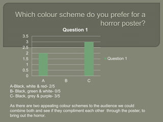
- 1. 0 0.5 1 1.5 2 2.5 3 3.5 A B C Question 1 Question 1 A-Black, white & red- 2/5 B- Black, green & white- 0/5 C- Black, grey & purple- 3/5 As there are two appealing colour schemes to the audience we could combine both and see if they compliment each other through the poster, to bring out the horror.
- 2. 0 0.5 1 1.5 2 2.5 3 3.5 A B C D Question 2 Question 2 A-1/5 B-0/5 C-3/5 D-1/5 From the results we will adapt on what the target audience have said and do not include credits on our poster and locate the title of the film in the lower centre of the page.
- 3. 0 1 2 3 4 5 6 A B C Question 3 Question 3 A-Protagonist & Antagonist- 5/5 B- Weapon & Victim- 0/5 C- Antagonist- 0/5 For the cover we will feature the protagonist and antagonist as all of our target audience that we questioned have agreed, that they would prefer to see that image the most.
- 4. 0 1 2 3 4 A B C Question 1 Question 1 A-High-angle- 0/5 B- Low-angle- 3/5 C- Eye-level- 2/5 When we take the shots for the main image we will take a variety of low- angle and eye-level shots, then decide which one fits the horror genre.
- 5. 0 0.5 1 1.5 2 2.5 3 3.5 A B C Question 5 Question 5 A-Long shot- 1/5 B- Extreme close up- 3/5 C- Mid close up- 1/5 The majority of the votes are for an extreme close up of shot, which I believes fits well with the horror genre and creates an intensity which must catch their eyes.
- 6. 0 0.5 1 1.5 2 2.5 3 3.5 A B C Question 6 Question 6 A-Bright/white- 0/5 B- Mixture/ Red& Green- 3/5 C- Dark/Black- 2/5 Out of most horror posters, ones with a mixture of colours; red and green seem to be more attractive and appealing to the audience, which we will include in our poster, to create the same effect.
- 7. 0 0.5 1 1.5 2 2.5 3 3.5 A B Question 7 Question 7 A- Credits 2/5 B- No credits- 3/5 From the results gathered, the audience prefer there to be no credits on a horror poster, which I believe our group should follow their opinion as the focus is completely drawn to the title and image; they need to be more memorable.
- 8. 0 0.5 1 1.5 2 2.5 3 3.5 A B Question 8 Question 8 A-Bottom of the poster-3/5 B- Top of the poster- 2/5 The tagline will be placed at the bottom of the poster as that position is where the audience say catches their eye the most.
- 9. 0 0.5 1 1.5 2 2.5 3 3.5 A B C D Question 9 Question 9 A-0/5 B- 3/5 C- 2/5 D-0/5 There are two main font styles that stand out in this result so I think as a group we will decide which looks better placed once all the features of the poster come together.