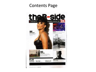
2. There are many images on the contents page that are all of very high quality but the main focus is the
main image which is very large and eye catching. The image is a medium-close up shot of a woman
dressed all in black. The look on her face represents attitude, especially because of the fact that she is
pouting her lips. The same colour scheme is used in every issue , this is a common magazine and helps
keep their audience feeling familiar with the magazine . Other than the title of 'contents' on this page,
XXL magazine have wrote this 'the B-side', which works well as this is music terminology. On the
contents page there is a great balance of pictures and text which works really well on the magazines
part and all comes together to give a very professional visual product. The font for the page numbers
and the brief overview of articles are in a larger, more bold font, which makes it stand out. The XXL logo
is at the top right of the page which shows that they are a proud brand.
XXL magazine is aimed at young males aged between 18-21 because of the several images of famous
hip hop artists including artists like of Kanye West. But I also think this because of the main image of the
girl with the brief title 'Eye candy‘. Some young males will be interested in this and it will appeal to
them, drawing attention in from the target audience XXL has established.
3.
4. The masthead for this contents page is centrally at the top of the page and it is the biggest on the page.
Having the masthead font the biggest on the page draws the attention of the customers as it is the first thing
they see.
The main image on this page is of Dr.Dre who is a well known rapper and producer. By using Dr.Dre XXL
Magazine guarantee sales as Dr.Dre is seen as the highest person in music industry so this attracts interest in
the magazine. We can also see Dr.Dre’s shadow in the background by doing this the magazine have implied
that Dr.Dre is much bigger than he may come across especially reputation wise. It also shows the high status
that he has in the music industry.
The background is a dim grey colour with Dr.Dre’s shadow. They use dim colour and not bright so the artist
stands out from the background.
The main cover story is highlighted and put above all the other features within the magazine. This is done so
the potential customer knows the main story from the other side features.
The features are listed on the right hand side of the page and takes up most of the page. They do this so as
soon as the customer opens the page they see what else is in the magazine. Only the main stories they think
will attract the customer into buying will be put on the features list.