1. Apply genre theory to your coursework
Chandlers theory that genre is made up of conventions of content is portrayed throughout my own
ancillary task in many ways. One of these is the colour scheme, for my digital pack I decided to use
the colours black and white, for the font and backgrounds. I chose these because I wanted to use
black for my backgrounds, and therefore white is the best colour to use which stands out the most.
Because of this I think it will attract the audience as it makes the text easy to read, therefore easier
to see which artist the CD is for. The font I decided to use is in the style of a newspaper, I decided on
this because it is informal and has the conventions of a street and R’n’B CD you would see in a shop,
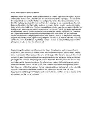
therefore I have met the genre conventions. In the photograph used on the front of the CD and the
back, again I have met the genre conventions by using colours such as gold and red suggesting
wealth and importance. The photograph on the front cover is a close up of the girl, who is wearing
lots of makeup and jewellery, again meeting the genre conventions, as women in the R’n’B industry
do this also. I have studied this in my ancillary analysis. I decided to use a plain background for the
photograph in order to make the girl stand out.
Neales theory of repetition and difference is also shown throughout my work in many different
ways. One of these is the colour scheme; I have used the same throughout the digital pack keeping a
sense of consistency. I have also used the same font throughout for the same reason. If this was not
done in this way, the piece would look unprofessional and informal, and would not be aesthetically
pleasing for the audience. The photograph used on the front is the same personal as the one used
on the back, giving the pack consistency. The effects I have used on the front photograph are the
same as what I have used for the one on the back, I used the sepia effect as this gives the photo a
light glow and a gold looking haze over the top. I decided not to use a photograph on the actual CD,
as I didn’t think this was needed because I used one for the front and the back. The same
background is used throughout the digital pack which makes the pack flow and gives it clarity as the
photographs and text can be easily seen.