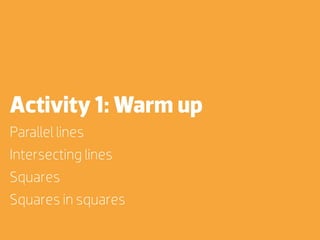
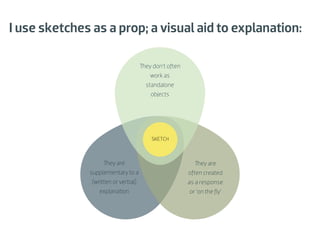
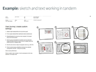
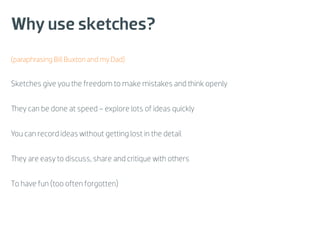
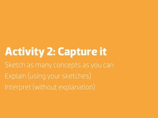
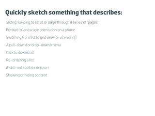
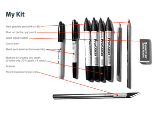
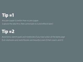
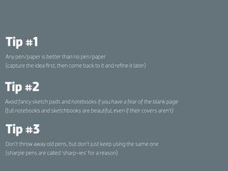
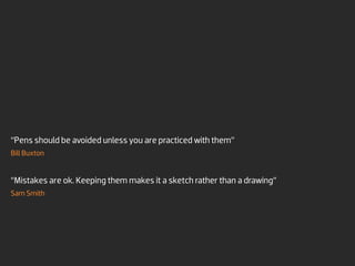
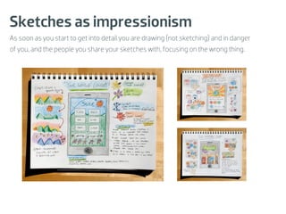
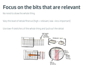
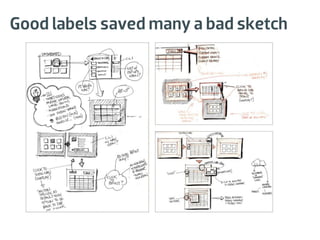
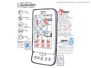
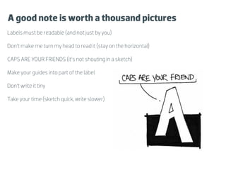
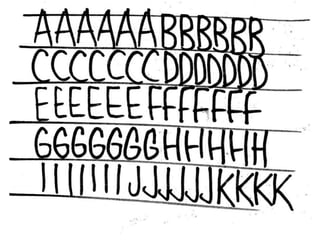
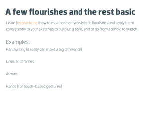
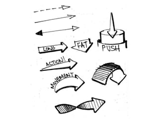
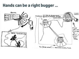
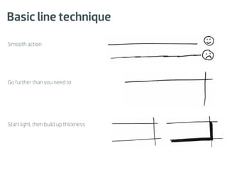
The document outlines the principles and techniques of sketching interfaces, emphasizing the importance of basic line techniques, drawing boxes, and comfortable working environments. It encourages using sketches as quick visual aids for explanations, allowing for mistakes, and fostering creativity in design. Various activities and tips are provided to enhance sketching skills and to facilitate better communication in design processes.


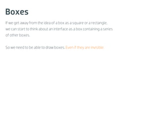
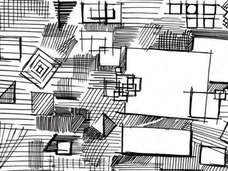
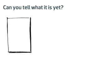
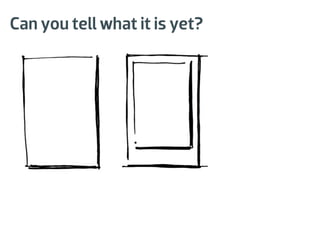
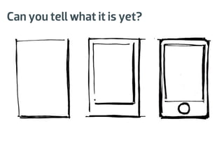
![Boxes
If we get away from the idea of a box as a square or a rectangle,
we can start to think about an interface as a box containing a series
of other boxes.
So we need to be able to draw boxes. Even if they are invisible.
[invisible box]](https://image.slidesharecdn.com/interactions12exportedversion-120201114728-phpapp01/85/Sketching-Interfaces-Workshop-Interactions12-Dublin-9-320.jpg)