4. I replaced the ‘Plus’ to ‘This
Week’, as there are too many
cover stories to make it look like
it’s justadditional content.
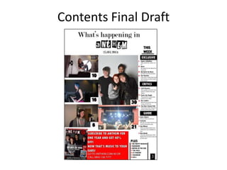
5. I then replaced the picture of Leah throwing the
guitar to a picture of the magazine, to make it
match and create Image-Text cohesion. Above I
changed the angle of the image.
6. Here I added the numbers underneath the
text using TW Cen MT Condensed Bold
and changed it to red.
7. I moved the promotion part a bit
more to the left to then make more
room for more text.
8. After adding the Plus section at the bottom right part
of the magazine, I tried to make it look like a separate
section by using the rectangle tool to create a black
line, and then right clicked the layer it was created
on, and duplicated it.
9. For the information underneath the story, I used the
Myriad Pro font at size 9pt.
10. I increased the ‘Plus’ so that it could guide the
reader and show that it is a subheading. I
increased this to 24pt. The font here for all of
this is TW Cen MT Condensed Bold.