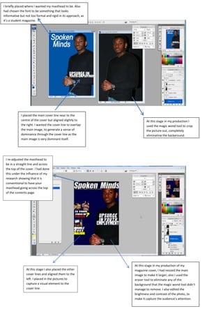
1. I briefly placed where I wanted my masthead to be. Also
had chosen the font to be something that looks
informative but not too formal and rigid in its approach, as
it’s a student magazine.
I placed the main cover line near to the
centre of the cover but aligned slightly to At this stage in my production I
the right. I wanted the cover line to overlap used the magic wond tool to crop
the main image, to generate a sense of the picture out, completely
dominance through the cover line as the eliminating the background.
main image is very dominant itself.
I re-adjusted the masthead to
be in a straight line and across
the top of the cover. I had done
this under the influence of my
research showing that it is
conventional to have your
masthead going across the top
of the contents page.
At this stage in my production of my
At this stage I also placed the other magazine cover, I had resized the main
cover lines and aligned them to the image to make it larger; also I used the
left. I placed in the pictures to eraser tool to eliminate any of the
capture a visual element to the background that the magic wond tool didn’t
cover line. manage to remove. I also edited the
brightness and contrast of the photo, to
make it capture the audience’s attention.
2. This is the outcome of the production stage of the magazine cover. I had made several changes and
adjustments from the pre-designs. In the previous caption I had used the colour red for the word
‘check’; however I changed this to yellow as I didn’t want to ruin the consistent use of the colour
yellow and white for the text. Under the influence of my research I noticed that selling lines go
either at the top, near the masthead or at the bottom near of the magazine, I decided to place the
selling line at the bottom. Through the use of feedback I adjusted my main cover line as it looked as
though the cover line was written on the main images clothing. To resolve this issue I adjusted the
size of the main cover line, leading to some of the words coming off the t shirt, making it not look as
though it was written on his t shirt. Through using various auto shapes, I created a logo to enhance
the theme of the magazine, within the auto shape it said ‘empowering youth’