
Recommended
More Related Content
What's hot
What's hot (18)
Viewers also liked
Viewers also liked (20)
Similar to Challenging Conventions
Similar to Challenging Conventions (20)
More from oliviamushigo
More from oliviamushigo (7)
Challenging Conventions
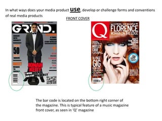
- 1. In what ways does your media product use , develop or challenge forms and conventions of real media products FRONT COVER The bar code is located on the bottom right corner of the magazine. This is typical feature of a music magazine front cover, as seen in ‘Q’ magazine
- 2. The Masthead, similar to ‘VIBE’ is positioned behind the artist. I chose to do this as it shows the dominance of the artist and tells readers that the main focus is the artist
- 3. At the top of the magazine, there is a headline to add versatility to the front cover
- 4. The Headlines surround the artist, on both sides, to segregate the artist from the rest of the magazine
- 5. CONTENTS PAGE A message from the editor is seen in some magazine but is rarely featured. It makes the magazine more personal and again mentions the main artist, ‘Jonah.k’ to add suspense and give insight into what readers can expect. However, I choose not to include a picture of the front cover as I thought it would be too repetitive
- 6. A picture followed by a short description of the article is featured on both magazines. Just including pictures, would make the contents page look bland. The captions give a taster of what lies ahead.
- 7. The large picture in both magazines shows the popularity of both the fictional and real artist. Its also a great way to add variation and fill up any blank spaces.
- 8. I used the same layout as ‘Vibe’ when designing my title because it was different from all the other magazines I researched. However, I developed it slightly by positioning ‘CONTENTS’ elsewhere and splitting up the letters differently
- 9. I drew inspiration from ‘Vibe’ on how to structure my text, but I changed it by using different the font styles and color to suit my magazine better
- 10. DOUBLE PAGE SPREAD During my research, I discovered that almost all magazines have the artists name larger then the rest of the text to inform readers about who the article is about
- 11. Articles often have a quote from the artist to make the article more personal and relatable. I was inspired by the article on the left because it was eye-catching and unique
- 12. I made sure so place a ‘G’ in the background to remind readers that they are reading ‘GRIND’ Magazines. The other article the capital ‘L’ is used to remind readers that the article is about Lady Gaga
- 13. Just like solange, the image of Jonah is repeated several times for variation.
- 14. In what ways does your media product use, develop or challenge forms and conventions of real media products FRONT COVER I’ve included a blackberry scanner to appeal to the teenage demographic seeing as blackberry’s are a popular mobile device
- 15. A quote from the artist is placed beneath the artists name, this is challenging conventions because they are usually placed on the left side of the artist. I decided to locate it there to add authenticity
- 16. The black bars help separate the different pieces of text so that the reader fousea on one headline at a time. This is an usual feature of a magazine. Also the large ‘+’ was included because I didn’t just want to use text but shapes also
- 17. CONTENTS PAGE The ‘Contents’ is placed on the right hand side of the magazine and is split into three sections
- 18. DOUBLE PAGE SPREAD The images are either in black and white or are a tanned colour. This effect was done to coincide with the overall cover scheme which is grey and orange
- 19. The style of the quote is different from conventional magazines
- 20. The artist name is placed at the centre of the images and has a ‘see-through’ effect which is different