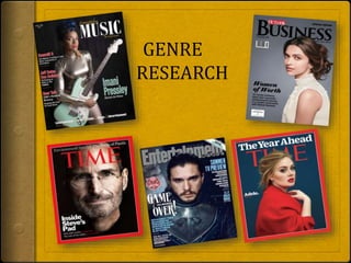
This document summarizes the key design elements of magazine covers across different genres. Teen magazines feature popular celebrities and focus on health and beauty. Music magazines prominently display famous musicians. Entertainment magazines showcase popular television and film properties and actors. Video game magazines create intrigue around new releases. Health magazines target men and feature muscular models and fitness topics. Fashion magazines center attractive models and provide style and beauty advice for women readers. Common magazine cover techniques include large mastheads, celebrity images, catchy headlines and taglines, and limited color palettes.
2. TEEN
MAGAZINE
The masthead is big and bold and is the
first thing you to notice when you look
at the magazine.
“Zendaya” is a popular actress and
singer, having her on front cover
makes the readers interested in the
story about her.
There are only 2 different colors used
in the font cover (pink and white) to
keep it simple.
“Make 2015 your healthiest, prettiest
year ever” this subject that teenage
girls (there main consumer base) as
interested in reading about.
3. MUSIC
MAGAZINE
“Ed sheeran” is a famous singer, having
his picture on the front cover will attract
more readers.
Music instrument is used to gain the
attention of music lovers.
Black and white background
Different types of font colors (red and
white) and sizes is used to make it
affective.
His name is written in the middle of the
magazine cover, to make it more
permanent sharp color (red) is used.
Barcode used
Central image
4. ENTERTAINMENTMA
GAZINE
The model used in this magazine Is emilia
clarke who is very famous actress and
playing a leading role in the most popular
TV show “Game of thrones”
“Game of thrones” is written big and bold
to attract movie lovers so that they want
to buy the magazine to read the article.
The cover line reads “serious scoop on
season 5” this may attract movie lovers.
The color scheme used on the front page
relates to the color theme used in game of
thrones.
Buzz words used “special double issue”
5. VIDEO GAME
MAGAZINE
Masthead “times” written in bold
and sharp color.
“is he alive” this code is used here
to create suspense and want there
readers to think.
“the truth behind commanders
Shepard's return rumours” this line
is used to grab more attention of
the readers.
Sheriff font is used “TIMES”
6. HEALTH
MAGAZINE
Masthead shows clearly it is a men’s
magazine and it is aimed towards men.
The color red can symbolize strength,
passion and danger. These are usually
associated to men rather than women.
“strip away money stress” Font is bold and
capital. Shows strength, toughness.
The model used for the front cover is Zac
Efron who is showing his arms and muscles
which will attract most of the audience.
Colors used are black, red, green and blue.
These are very mainly colors and are
associated with men. It appeals to the
targeted audience.
The words ‘ABS’ ‘strip’ ‘health’ ‘fitness’ are
all words which stand out as they appeal to
men and what they need to seek advice for.
7. FASHION
MAGAZINE
Scarlett Johansson is an American
actress, model, and singer. Her picture on
the front cover attracts more readers.
The background color is light same as her
skin tone.
Her dress and brand name of same color.
Red color is used to make it more
prominent and affective for the viewers.
Font is bold, capital and different color is
used to make it more interesting.
“your guide to gorgeous” “lush hair
secrets” “bright skin tricks” Information
about latest fashion in the society, new
trends and some beauty tricks/tips.
This magazines targeted audience is
women as it says “real women fess up”
“your guide to gorgeous”