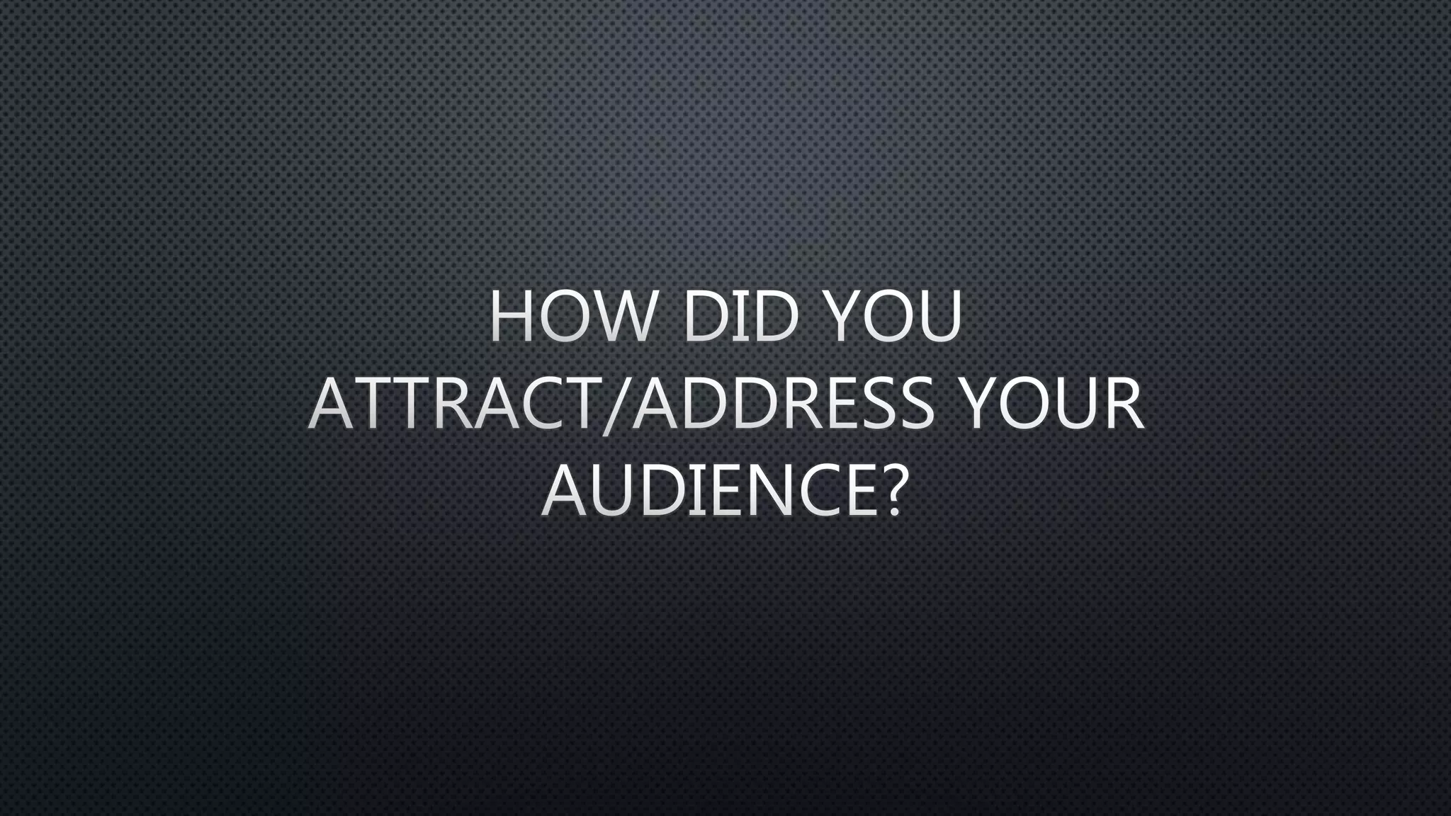
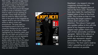
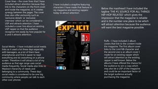
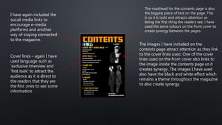
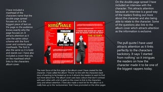
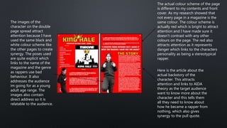
Masthead – my research into rap
magazines showed that the
masthead is the biggest piece of
text on the front cover. Therefore I
have also made the masthead the
biggest piece of text on the front
cover. This is done so that it is the
first thing the target audience
notices and it attracts their
attention. The colours I have used
are a golden yellow to link with the
genre of my magazine and how
rappers wear golden chains as a
part of their personality and being
‘gangster’. Behind the yellow is a
border of red to link to danger,
which also represents rappers
personalities with despicable
behaviour. The font used is bold to
make it appealing and attract as
much attention as possible.
Main image – the main image I have
used attracts attention because it is
the largest image on the front cover
which is what makes it the main
image. It is the first picture the target
audience looks at therefore I have
tried to make it as eye catching as
possible. I have made the picture
black & white for effect and it also
links to the genre of the magazine as
rappers tend to use a lot of black and
white on album covers and
photoshoots. The pose used is a
worshipping pose to link to the
characters background as he wants to
be looked up to by his fans. I have
highlighted the characters watch and
kept the rest black and white so that
the watch stands out and represents
the bling the character has. The
golden yellow also links to the colour
scheme of the rest of the magazine.
The use of direct address makes the
readers connect to the character and
they can relate to him.
Cover lines – the cover lines that I have
included attract attention because they
link to the characters on the front cover
and inside the magazine, so it creates
synergy between the pages. The cover
lines also offer exclusivity such as
‘exclusive details’ or ‘exclusive
interview’ which can be considered a
USP and attracts attention. I have
included a cover line about an existing
USP rapper so that the audience
recognise him easily by how popular he
is and it attracts attention.
Social Media – I have included social media
links as it used a lot these days especially
with teenagers, as a lot of them have
smartphones and find it easier to read
everything and do everything on a phone
screen. Therefore it will attract a lot of my
audience as that age range uses social
media frequently. Social media also links to
Maslow’s hierarchy of needs and
belonging to a community. These days
social media is considered to be one big
community where people can talk to each
other over phones
Puffs – I have included 2 album
covers that link to the content inside
the magazine. The first album cover
links to the Lord NB character and
the second one is an album cover I
made for an existing rapper which
will attract attention as the existing
rapper is well known. Below the
albums I have offered the chance for
the audience to win a copy which
may also be a USP of the magazine
and could be an important factor of
the target audience actually
purchasing the magazine.
Below the masthead I have included the
tagline ‘THE #1 SOURCE FOR ALL THINGS
HIP-HOP RELATED’ which gives the
impression that the magazine is reliable
and is the number one place to be which
will attract attention because the audience
will want the best magazine possible.
I have included a strapline featuring
characters I have made that feature in
my magazine and existing rappers
today to attract attention.
The masthead for the contents page is also
the biggest piece of text on the page. This
is so it is bold and attracts attention as
being the first thing the readers see. I have
used the same colours on the front cover to
create synergy between the pages.
The images I have included on the
contents page attract attention as they link
to the cover lines used. One of the cover
lines used on the front cover also links to
the image inside the contents page so it
creates synergy. The images I have used
also have the black and white effect which
remains a theme throughout the magazine
to also create synergy.
I have again included the
social media links to
encourage e-media
platforms and another
way of staying connected
to the magazine.
Cover lines – again I have
used language such as
‘exclusive interview and
‘first look’ to attract the
audience as it is direct to
the readers that they are
the first ones to see some
information.
I have included a
masthead of the
characters name that the
double page spread
focuses on. It is the
biggest piece of text on
the page so the audience
knows exactly who the
page focuses on. It
attracts attention as it
uses the same colour
scheme with the front
cover and contents page
mastheads. The font is
also the same so it is bold
and stands out. I have also
included a crown that sits
on the masthead which
links to the characters
album cover.
The main focus of the first page is the album cover I have created for the
character. I have called the album ‘Throne’ to link with the characters back
story of wanting to be looked up to so it attracts the readers to want to find
out more about him. The album cover uses basic colours that don’t contrast
with each other with a bit of gold on the crown to link to the characters
story and attract attention. I have also made a track list for the album so it
really lives up to the ‘exclusiveness’ that I have promoted on the other pages
On the double page spread I have
included an interview with the
character. This attracts attention
because an interview is a good way
of the readers finding out more
about the character and also being
able to relate to the character. Some
of the questions also link to the
album cover which attracts attention
as the information is exclusive.
The pull quote I have used
attracts attention as it links
perfectly to the characters
backstory. It says ‘I started
from nothing’ so it intrigues
the readers on how the
character made it to be one of
the biggest rappers today.
The images of the
character on the double
page spread attract
attention because I have
used the same black and
white colour scheme like
the other pages to create
synergy. The poses used
are quite explicit which
links to the name of the
magazine and the genre
as rappers use bad
behaviour. It also
addresses the audience
im going for as a young
adult age range. The
images also contain
direct address so it is
relatable to the audience.
Here is the article about the
actual backstory of the
character. This attracts
attention and links to AIDA
theory as the target audience
want to know more about the
character and this tells them
all they need to know about
how he became a rapper from
nothing, which also gives
synergy to the pull quote.
The actual colour scheme of the page
is different to my contents and front
cover. As my research showed that
not every page in a magazine is the
same colour. The colour scheme is
actually red which is bright to attract
attention and I have made sure it
doesn’t contrast with any other
colours on the page. The red also
attracts attention as it represents
danger which links to the characters
personality as being a stereotypical
rapper.

How did you attract

  • 2.
    Masthead – myresearch into rap magazines showed that the masthead is the biggest piece of text on the front cover. Therefore I have also made the masthead the biggest piece of text on the front cover. This is done so that it is the first thing the target audience notices and it attracts their attention. The colours I have used are a golden yellow to link with the genre of my magazine and how rappers wear golden chains as a part of their personality and being ‘gangster’. Behind the yellow is a border of red to link to danger, which also represents rappers personalities with despicable behaviour. The font used is bold to make it appealing and attract as much attention as possible. Main image – the main image I have used attracts attention because it is the largest image on the front cover which is what makes it the main image. It is the first picture the target audience looks at therefore I have tried to make it as eye catching as possible. I have made the picture black & white for effect and it also links to the genre of the magazine as rappers tend to use a lot of black and white on album covers and photoshoots. The pose used is a worshipping pose to link to the characters background as he wants to be looked up to by his fans. I have highlighted the characters watch and kept the rest black and white so that the watch stands out and represents the bling the character has. The golden yellow also links to the colour scheme of the rest of the magazine. The use of direct address makes the readers connect to the character and they can relate to him.
  • 3.
    Cover lines –the cover lines that I have included attract attention because they link to the characters on the front cover and inside the magazine, so it creates synergy between the pages. The cover lines also offer exclusivity such as ‘exclusive details’ or ‘exclusive interview’ which can be considered a USP and attracts attention. I have included a cover line about an existing USP rapper so that the audience recognise him easily by how popular he is and it attracts attention. Social Media – I have included social media links as it used a lot these days especially with teenagers, as a lot of them have smartphones and find it easier to read everything and do everything on a phone screen. Therefore it will attract a lot of my audience as that age range uses social media frequently. Social media also links to Maslow’s hierarchy of needs and belonging to a community. These days social media is considered to be one big community where people can talk to each other over phones Puffs – I have included 2 album covers that link to the content inside the magazine. The first album cover links to the Lord NB character and the second one is an album cover I made for an existing rapper which will attract attention as the existing rapper is well known. Below the albums I have offered the chance for the audience to win a copy which may also be a USP of the magazine and could be an important factor of the target audience actually purchasing the magazine. Below the masthead I have included the tagline ‘THE #1 SOURCE FOR ALL THINGS HIP-HOP RELATED’ which gives the impression that the magazine is reliable and is the number one place to be which will attract attention because the audience will want the best magazine possible. I have included a strapline featuring characters I have made that feature in my magazine and existing rappers today to attract attention.
  • 4.
    The masthead forthe contents page is also the biggest piece of text on the page. This is so it is bold and attracts attention as being the first thing the readers see. I have used the same colours on the front cover to create synergy between the pages. The images I have included on the contents page attract attention as they link to the cover lines used. One of the cover lines used on the front cover also links to the image inside the contents page so it creates synergy. The images I have used also have the black and white effect which remains a theme throughout the magazine to also create synergy. I have again included the social media links to encourage e-media platforms and another way of staying connected to the magazine. Cover lines – again I have used language such as ‘exclusive interview and ‘first look’ to attract the audience as it is direct to the readers that they are the first ones to see some information.
  • 5.
    I have includeda masthead of the characters name that the double page spread focuses on. It is the biggest piece of text on the page so the audience knows exactly who the page focuses on. It attracts attention as it uses the same colour scheme with the front cover and contents page mastheads. The font is also the same so it is bold and stands out. I have also included a crown that sits on the masthead which links to the characters album cover. The main focus of the first page is the album cover I have created for the character. I have called the album ‘Throne’ to link with the characters back story of wanting to be looked up to so it attracts the readers to want to find out more about him. The album cover uses basic colours that don’t contrast with each other with a bit of gold on the crown to link to the characters story and attract attention. I have also made a track list for the album so it really lives up to the ‘exclusiveness’ that I have promoted on the other pages On the double page spread I have included an interview with the character. This attracts attention because an interview is a good way of the readers finding out more about the character and also being able to relate to the character. Some of the questions also link to the album cover which attracts attention as the information is exclusive. The pull quote I have used attracts attention as it links perfectly to the characters backstory. It says ‘I started from nothing’ so it intrigues the readers on how the character made it to be one of the biggest rappers today.
  • 6.
    The images ofthe character on the double page spread attract attention because I have used the same black and white colour scheme like the other pages to create synergy. The poses used are quite explicit which links to the name of the magazine and the genre as rappers use bad behaviour. It also addresses the audience im going for as a young adult age range. The images also contain direct address so it is relatable to the audience. Here is the article about the actual backstory of the character. This attracts attention and links to AIDA theory as the target audience want to know more about the character and this tells them all they need to know about how he became a rapper from nothing, which also gives synergy to the pull quote. The actual colour scheme of the page is different to my contents and front cover. As my research showed that not every page in a magazine is the same colour. The colour scheme is actually red which is bright to attract attention and I have made sure it doesn’t contrast with any other colours on the page. The red also attracts attention as it represents danger which links to the characters personality as being a stereotypical rapper.