1. Name of movie “ETCH”
The name of the film is “ETCH”. This is not the name
which I came up with as my partner thought of the
name. I am going to use a font called “DUE DATE”
Image of Monika holding pill because it is a grunge font. The reason why I am
going to use a grunge font is because the genre of the
teaser is a horror/thriller and this font is appropriate
for that genre.
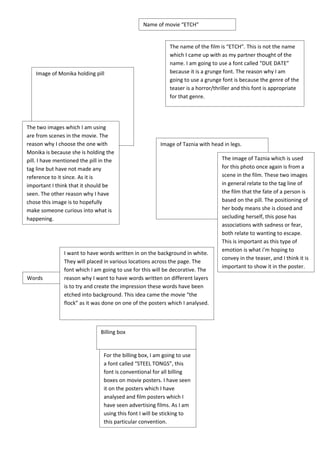
The two images which I am using
are from scenes in the movie. The
reason why I choose the one with Image of Taznia with head in legs.
Monika is because she is holding the
pill. I have mentioned the pill in the The image of Taznia which is used
tag line but have not made any for this photo once again is from a
reference to it since. As it is scene in the film. These two images
important I think that it should be in general relate to the tag line of
seen. The other reason why I have the film that the fate of a person is
chose this image is to hopefully based on the pill. The positioning of
make someone curious into what is her body means she is closed and
happening. secluding herself, this pose has
associations with sadness or fear,
both relate to wanting to escape.
This is important as this type of
emotion is what i’m hoping to
I want to have words written in on the background in white.
convey in the teaser, and I think it is
They will placed in various locations across the page. The
important to show it in the poster.
font which I am going to use for this will be decorative. The
Words reason why I want to have words written on different layers
is to try and create the impression these words have been
etched into background. This idea came the movie “the
flock” as it was done on one of the posters which I analysed.
Billing box
For the billing box, I am going to use
a font called “STEEL TONGS”, this
font is conventional for all billing
boxes on movie posters. I have seen
it on the posters which I have
analysed and film posters which I
have seen advertising films. As I am
using this font I will be sticking to
this particular convention.