1. The name of the film is “ETCH”. This is not the name which I
came up with as my partner thought of the name. I am going
to use a font called “DUE DATE” because it is a grunge font.
The reason why I am going to use a grunge font is because
the genre of the teaser is a horror/thriller and this font is
appropriate for that genre.
I am hoping to write the tag
Name of movie “ETCH” line is a white font, the
Date of release reason why I am using a
sans serif font is because it
I am thinking about placing the date is clear and bold.
Tag line for movie
of release at the side this time
instead of at the bottom. The
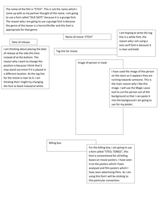
reason why I want to change the Image of person in mask
position is because I think that it
may stand out more if it is placed in
I have used the image of the person
a different location. As the tag line
on the stairs as it appears they are
for the movie is near to it, I am
running towards someone. This is
thinking that I might try changing
the main reason why I like this
the font to black instead of white.
image. I will use the Magic Lasso
tool to cut the person out of the
background so that I can paste it
into the background I am going to
use for my poster.
Billing box
For the billing box, I am going to use
a font called “STEEL TONGS”, this
font is conventional for all billing
boxes on movie posters. I have seen
it on the posters which I have
analysed and film posters which I
have seen advertising films. As I am
using this font I will be sticking to
this particular convention.