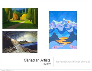
4. Ted Harrison’s artwork:
Ted Harrison’s paintings, Wilderness Wanderers and
Magnificent Yukon were painted around 1980. They both
present the colourful landscape of the Yukon. To create the
array of colour used in his pieces, Ted Harrison layers his
paints on top of one another. Within both pieces, I liked how
he used his elements of line, and value. When drawing the
skies and mountains, I liked how he painted his lines both
jagged and wavy, as to create the vibe that they were
actually there, and how each colour was a slightly different
shade from the last. In my opinion, I liked these pieces
because of the vibrant colours and interesting lines, however
it can be hard to focus on certain things due to the
overwhelming colour usage.
Thursday, 23 January, 14
6. Ross Penhall
Ross Penhall’s paintings ‘Greener Pastures’, and ‘Urban
Sculpture’ are both beautiful landscape paintings painted 2011.
Both paintings express the beauty and soothingness of nature.
Ross Penhall created both pieces by using paints, and oil on
canvas. In ‘Greener Pastures’, I enjoyed how he used dark
shades near the bottom, then lighter shades close to the top to
create a shadow effect. In my opinion, I think that where the light
is shining is what Ross Penhall wants the observer to focus on. In
Ross Penhall’s second piece, ‘Urban Sculpture’ I liked how he
used his element of colour. Like Ted Harrison, in this piece he
painted his sky a bright yellow and green. I enjoyed this because
it offered colour and gave his artwork a happy feeling to it.
Overall, I liked both pieces because they were both soothing and
happy.
Thursday, 23 January, 14
8. Emily Carr
Emily Carr’s paintings, ‘Forest Clearing’, and ‘Shoreline’ are
very different from one another. ‘Shoreline’ was painted in
1936, while ‘Forest Clearing’ was painted in 1935. Her first
piece ‘Forest Clearing’ is a blurry painting of a forest full of pale
colours, while her second piece ‘Shoreline’ presents a gloomy
and depressing beach. However, both paintings were created
by using the same kind of media, paints. In ‘Forest Clearing’, I
liked how Emily Carr used the element of texture. Especially
when painting the trees, I liked how the bark looked real. In
Shoreline, I like how Emily Carr used the element value. In the
sky and water, changing the shades added a sunny glow. In
my opinion, I disliked ‘Shoreline’ as it has an unhappy feeling
to it, however I liked ‘Forest Clearing’ because it was more
cheerful and was expressing nature.
Thursday, 23 January, 14