1. Front Cover Research
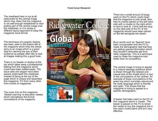
There are a small amount of plugs
The masthead here is not at all used on the FC which could mean
obstructed by the central image that the magazine is only small. Also
which may mean that the magazine they’re mainly placed on the left hand
is not well enough established to start side with a couple on the right which
putting part of the central image over is hard to look at. I think that the plug
the masthead, or it is simply a on the right side of the FC of the
different layout approach to keep the magazine should have been placed
magazine more formal. on the left alongside the others.
The technique of a graphic feature Buzz words such as ‘Special’ have
has been used in the bottom left of been incorporated onto the FC to
the magazine which links the article make the demographic feel that they
story to an image which is a good are getting special information which
idea for catching the eye of their they wouldn’t otherwise get from
audience as people often like to look other magazines. This is a technique
at images making this a good hook. used to make the magazine look
better than its competitors.
There is no header or skyline at the
top which takes away a professional
feeling from the magazine which The central image is trying to appeal
could have been added easily. The to a mature teenage audience which
issue date and slogan have been is shown through the relaxed and
placed underneath the masthead casual look of the model which is due
instead of being at the top of the to the connotations of her clothes. An
page which is unique and separates example of these connotations is the
this magazine `FC from many other green top which connotes natural and
front covers of magazines her body language which is friendly
and open. This shows that the
magazine is trying to appeal to a
specific demographic.
The cover line on this magazine
‘Global Learning’ is education related
which strengthens the formal
connotations of the magazine. A teaser has been used on the FC of
this magazine which is ‘Inside’. The
teaser is placed on the FC to tempt
the reader to buy the magazine but in
this case it looks bland and isn’t very
effective.
2. Front Cover Research
There are a small amount of plugs
The masthead here is not at all used on the FC which could mean
obstructed by the central image that the magazine is only small. Also
which may mean that the magazine they’re mainly placed on the left hand
is not well enough established to start side with a couple on the right which
putting part of the central image over is hard to look at. I think that the plug
the masthead, or it is simply a on the right side of the FC of the
different layout approach to keep the magazine should have been placed
magazine more formal. on the left alongside the others.
The technique of a graphic feature Buzz words such as ‘Special’ have
has been used in the bottom left of been incorporated onto the FC to
the magazine which links the article make the demographic feel that they
story to an image which is a good are getting special information which
idea for catching the eye of their they wouldn’t otherwise get from
audience as people often like to look other magazines. This is a technique
at images making this a good hook. used to make the magazine look
better than its competitors.
There is no header or skyline at the
top which takes away a professional
feeling from the magazine which The central image is trying to appeal
could have been added easily. The to a mature teenage audience which
issue date and slogan have been is shown through the relaxed and
placed underneath the masthead casual look of the model which is due
instead of being at the top of the to the connotations of her clothes. An
page which is unique and separates example of these connotations is the
this magazine `FC from many other green top which connotes natural and
front covers of magazines her body language which is friendly
and open. This shows that the
magazine is trying to appeal to a
specific demographic.
The cover line on this magazine
‘Global Learning’ is education related
which strengthens the formal
connotations of the magazine. A teaser has been used on the FC of
this magazine which is ‘Inside’. The
teaser is placed on the FC to tempt
the reader to buy the magazine but in
this case it looks bland and isn’t very
effective.
3. Front Cover Research
There are a small amount of plugs
The masthead here is not at all used on the FC which could mean
obstructed by the central image that the magazine is only small. Also
which may mean that the magazine they’re mainly placed on the left hand
is not well enough established to start side with a couple on the right which
putting part of the central image over is hard to look at. I think that the plug
the masthead, or it is simply a on the right side of the FC of the
different layout approach to keep the magazine should have been placed
magazine more formal. on the left alongside the others.
The technique of a graphic feature Buzz words such as ‘Special’ have
has been used in the bottom left of been incorporated onto the FC to
the magazine which links the article make the demographic feel that they
story to an image which is a good are getting special information which
idea for catching the eye of their they wouldn’t otherwise get from
audience as people often like to look other magazines. This is a technique
at images making this a good hook. used to make the magazine look
better than its competitors.
There is no header or skyline at the
top which takes away a professional
feeling from the magazine which The central image is trying to appeal
could have been added easily. The to a mature teenage audience which
issue date and slogan have been is shown through the relaxed and
placed underneath the masthead casual look of the model which is due
instead of being at the top of the to the connotations of her clothes. An
page which is unique and separates example of these connotations is the
this magazine `FC from many other green top which connotes natural and
front covers of magazines her body language which is friendly
and open. This shows that the
magazine is trying to appeal to a
specific demographic.
The cover line on this magazine
‘Global Learning’ is education related
which strengthens the formal
connotations of the magazine. A teaser has been used on the FC of
this magazine which is ‘Inside’. The
teaser is placed on the FC to tempt
the reader to buy the magazine but in
this case it looks bland and isn’t very
effective.
4. Front Cover Research
There are a small amount of plugs
The masthead here is not at all used on the FC which could mean
obstructed by the central image that the magazine is only small. Also
which may mean that the magazine they’re mainly placed on the left hand
is not well enough established to start side with a couple on the right which
putting part of the central image over is hard to look at. I think that the plug
the masthead, or it is simply a on the right side of the FC of the
different layout approach to keep the magazine should have been placed
magazine more formal. on the left alongside the others.
The technique of a graphic feature Buzz words such as ‘Special’ have
has been used in the bottom left of been incorporated onto the FC to
the magazine which links the article make the demographic feel that they
story to an image which is a good are getting special information which
idea for catching the eye of their they wouldn’t otherwise get from
audience as people often like to look other magazines. This is a technique
at images making this a good hook. used to make the magazine look
better than its competitors.
There is no header or skyline at the
top which takes away a professional
feeling from the magazine which The central image is trying to appeal
could have been added easily. The to a mature teenage audience which
issue date and slogan have been is shown through the relaxed and
placed underneath the masthead casual look of the model which is due
instead of being at the top of the to the connotations of her clothes. An
page which is unique and separates example of these connotations is the
this magazine `FC from many other green top which connotes natural and
front covers of magazines her body language which is friendly
and open. This shows that the
magazine is trying to appeal to a
specific demographic.
The cover line on this magazine
‘Global Learning’ is education related
which strengthens the formal
connotations of the magazine. A teaser has been used on the FC of
this magazine which is ‘Inside’. The
teaser is placed on the FC to tempt
the reader to buy the magazine but in
this case it looks bland and isn’t very
effective.