1. Contents Page Analysis
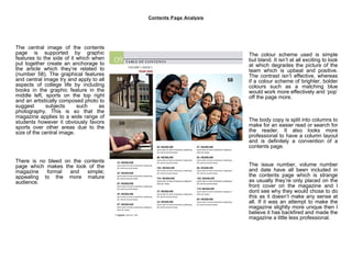
The central image of the contents
page is supported by graphic The colour scheme used is simple
features to the side of it which when but bland. It isn’t at all exciting to look
put together create an anchorage to at which degrades the picture of the
the article which they’re related to team which is upbeat and positive.
(number 58). The graphical features The contrast isn’t effective, whereas
and central image try and apply to all if a colour scheme of brighter, bolder
aspects of college life by including colours such as a matching blue
books in the graphic feature in the would work more effectively and ‘pop’
middle left, sports on the top right off the page more.
and an artistically composed photo to
suggest subjects such as
photography. This is so that the
magazine applies to a wide range of
students however it obviously favors The body copy is split into columns to
sports over other areas due to the make for an easier read or search for
size of the central image. the reader. It also looks more
professional to have a column layout
and is definitely a convention of a
contents page.
There is no bleed on the contents
page which makes the look of the The issue number, volume number
magazine formal and simple; and date have all been included in
appealing to the more mature the contents page which is strange
audience. as usually they’re only placed on the
front cover on the magazine and I
dont see why they would chose to do
this as it doesn’t make any sense at
all. If it was an attempt to make the
magazine slightly more unique then I
believe it has backfired and made the
magazine a little less professional.
2. Contents Page Analysis
The central image of the contents
page is supported by graphic The colour scheme used is simple
features to the side of it which when but bland. It isn’t at all exciting to look
put together create an anchorage to at which degrades the picture of the
the article which they’re related to team which is upbeat and positive.
(number 58). The graphical features The contrast isn’t effective, whereas
and central image try and apply to all if a colour scheme of brighter, bolder
aspects of college life by including colours such as a matching blue
books in the graphic feature in the would work more effectively and ‘pop’
middle left, sports on the top right off the page more.
and an artistically composed photo to
suggest subjects such as
photography. This is so that the
magazine applies to a wide range of
students however it obviously favors The body copy is split into columns to
sports over other areas due to the make for an easier read or search for
size of the central image. the reader. It also looks more
professional to have a column layout
and is definitely a convention of a
contents page.
There is no bleed on the contents
page which makes the look of the The issue number, volume number
magazine formal and simple; and date have all been included in
appealing to the more mature the contents page which is strange
audience. as usually they’re only placed on the
front cover on the magazine and I
dont see why they would chose to do
this as it doesn’t make any sense at
all. If it was an attempt to make the
magazine slightly more unique then I
believe it has backfired and made the
magazine a little less professional.
3. Contents Page Analysis
The central image of the contents
page is supported by graphic The colour scheme used is simple
features to the side of it which when but bland. It isn’t at all exciting to look
put together create an anchorage to at which degrades the picture of the
the article which they’re related to team which is upbeat and positive.
(number 58). The graphical features The contrast isn’t effective, whereas
and central image try and apply to all if a colour scheme of brighter, bolder
aspects of college life by including colours such as a matching blue
books in the graphic feature in the would work more effectively and ‘pop’
middle left, sports on the top right off the page more.
and an artistically composed photo to
suggest subjects such as
photography. This is so that the
magazine applies to a wide range of
students however it obviously favors The body copy is split into columns to
sports over other areas due to the make for an easier read or search for
size of the central image. the reader. It also looks more
professional to have a column layout
and is definitely a convention of a
contents page.
There is no bleed on the contents
page which makes the look of the The issue number, volume number
magazine formal and simple; and date have all been included in
appealing to the more mature the contents page which is strange
audience. as usually they’re only placed on the
front cover on the magazine and I
dont see why they would chose to do
this as it doesn’t make any sense at
all. If it was an attempt to make the
magazine slightly more unique then I
believe it has backfired and made the
magazine a little less professional.
4. Contents Page Analysis
The central image of the contents
page is supported by graphic The colour scheme used is simple
features to the side of it which when but bland. It isn’t at all exciting to look
put together create an anchorage to at which degrades the picture of the
the article which they’re related to team which is upbeat and positive.
(number 58). The graphical features The contrast isn’t effective, whereas
and central image try and apply to all if a colour scheme of brighter, bolder
aspects of college life by including colours such as a matching blue
books in the graphic feature in the would work more effectively and ‘pop’
middle left, sports on the top right off the page more.
and an artistically composed photo to
suggest subjects such as
photography. This is so that the
magazine applies to a wide range of
students however it obviously favors The body copy is split into columns to
sports over other areas due to the make for an easier read or search for
size of the central image. the reader. It also looks more
professional to have a column layout
and is definitely a convention of a
contents page.
There is no bleed on the contents
page which makes the look of the The issue number, volume number
magazine formal and simple; and date have all been included in
appealing to the more mature the contents page which is strange
audience. as usually they’re only placed on the
front cover on the magazine and I
dont see why they would chose to do
this as it doesn’t make any sense at
all. If it was an attempt to make the
magazine slightly more unique then I
believe it has backfired and made the
magazine a little less professional.