1. Contents Page Analysis
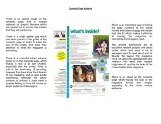
There is no central image on the
contents page and is instead
replaced by graphic features which There is an interesting way of linking
are spread out to anchor the articles the page numbers to the article
that they are supporting. names and it does engage the reader
that little bit which makes it effective
There is a bright yellow pug which at making the magazine an
has been placed in the gutter of the interesting and engaging read.
contents page in order to catch the
eye of the reader and draw their The articles themselves are all
attention to what the magazine is education related despite one about
promoting. turtles which isn’t what a lot of
teenagers want to read about and so
despite the layout, the magazine
There is a colourful colour scheme have not taken into consideration any
going on in this contents page which research into what their readers
makes it feel a bit too childish, might want to read by the looks of the
especially with the turtles. What is content within their magazine.
odd is the advertising of recycling,
however this does show the interests
of the magazine and is also subtle
advertising. Although the colour There is no bleed on the contents
scheme is childish it does have a page which makes the look of the
positive feeling to it but still misses its magazine formal and simple;
target audience of teenagers. appealing to the more mature
audience.