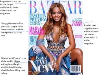
1. Large texts stand out
to the target
audience to draw
attention to the
magazine
Very girly colours like
pink and purple have Smaller text
been used on a white supplies more
background to stand information to
out. the reader
about what is
in the
magazine.
‘Best of what’s new’ is in
white and in bigger
writing to make girls
want to buy it to see
what the best things are
to buy.
2. Simple bold text stands out to
the reader. Also there is an The text gives the
outline around the text so it connotation that it is
stands out even more. This also in an informal
catches the readers eye. magazine.
White text is then laid
on to the rectangle
and in bold capitals to The background is
stand out to the black to make the
reader. Jokers white face
stand out even more.
Three rectangles that
are a complete
different colour to
the whole magazine
to make it stand out. Smaller text is used to
inform the reader a bit more
about the magazine
3. Simple bold text stands out to
the reader. Also the text is laid
onto a red background to make
the text stand out more.
The background
is black to make
the players stand
out even more.
The yellow boxes with
red text is there to fit
in with the colour
scheme of the
magazine. The headline is
black and put
inside of a white
Three squares are rectangle to
there to again inform make it stand out
the reader about
what the reader can
expect to see in the
magazine
Smaller text is used to
inform the reader what is
inside the magazine