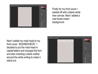
1. Firstly for my front cover I
started off with a blank white
new canvas. Next I added a
cool toned cream
background.
Next I added my mast head to my
front cover, ‘SOUNDCHECK’. I
decided to put the mast head in
capital letters and changed the font
and also including a black outline
around the white writing to make it
stand out.
2. Then I added a line using the shape tool.
I decided to add a line under my mast
head to give my magazine definition and
separate the mast head from the rest of
my magazine, giving it importance and
meaning.
Next I added the main image into
the centre of my magazine and
positioned it so it would stand out
to my target audience. Also I got
rid of the white background
behind my main image to make
my magazine more professional.
3. Next I added a circle just below my mast
head by the top right corner. I decided to
add this feature to make the information
stand out.
Next I added the text ‘Exclusive
Interview’ inside the circle. I did
this because the circle shows
special information inside and will
grab my target audiences
attention.
4. Next I added my main information on
the left hand side. This information
included sections of the magazine and
what can be expected inside, to give my
target audience a brief overview of what
is inside.
Then just below my mast head
above the line I added the text
‘Issue 1’ telling the readers that
this is the first issue of my
music magazine. Also I added
‘December 2016’ this tells the
readers the date that the
magazine got realised.
5. Next I added my main cover line to my
music magazine, ‘THEO’. I decided to
keep this short and use capital letters to
make the text stand out.
Then underneath I added the
text ‘the upcoming indie star’
telling my target audience what
my interview is about, grabbing
their attention.
6. Next I added a barcode in the
bottom right hand corner of my
music magazine. I decided to
add this as most professional
magazines have barcodes.
Then I added the price of my
barcode in black bold writing
this is so the reader knows
exactly how much my music
magazine is.
7. Next I added two lines just above the
main information of my magazine and
just below. I did this to separate the
information from the rest of the
magazine.
Finally, I added the web address
for my music magazine at the
bottom left corner. I decided to
add this in as my target audience
is mostly aimed at teenagers and
they might prefer to go online for
more information.