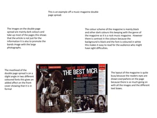
1. This is an example off a music magazine double
page spread.
The images on the double page The colour scheme of the magazine is mainly black
spread are mainly dark colours and and other dark colours this keeping with the genre of
take up most of the pages this shows the magazine as it is a rock music magazine. However
that the article is not just for the there is contrast in the colours because the
information it is also to promote the background is black and the font is coloured in white
bands image with the large this makes it easy to read for the audience who might
photographs. have sight difficulties.
The masthead of the
double page spread is on a The layout of the magazine is quite
slight angle in two different busy because the readers eyes are
coloured fonts this gives an drawn everywhere on the page
added affect on the front because there is so much going on
cover showing that it is in with all the images and the different
formal text boxes.
2. The main image on the music magazine double page spread is taking up
most of the two pages this is properly to promote the band because the
reader can see each member of the band clearly. behind the people is a
scene of industrial activity as there is cargo containers present near a set
of cranes also between the cranes and the band is a wasteland of dirt
with nothing currently growing.
This is another double page
spread on a music magazine.
The main information on the double
The masthead of the magazine page spread is in a white box and is split
front cover is present on the up into three paragraphs there is a
page in the top left hand corner masthead on the top of the information
of the first page in a blue box box and makes the information
that makes the masthead standout to the reader due to it being
standout to the reader. coloured in black and on a white
background.
3. The main image of the
magazine shows a man who
has a microphone in his left
hand and a cartoon drawing of
a bright red hand with claws The masthead of the double page spread is located
on his right arm also he has on the right hand side in a cartoon style font this
devil horns on his head this gives it an informal theme and an impression of an
might keep with the theme of old fashioned comic font style.
the magazine because it is a
heavy metal magazine for
people who have an interest
in heavy metal bands .
The information on the page is
under the masthead it is
written in white coloured font
this is in contrast with the
back ground colour which is
black this gives a dark gothic
feeling to the page as it is in
mainly dark colours. This text
will provide the reader the
information on the band and
what there next move might
be.