TỔNG ÔN TẬP THI VÀO LỚP 10 MÔN TIẾNG ANH NĂM HỌC 2023 - 2024 CÓ ĐÁP ÁN (NGỮ Â...
Coldplay Magazine Portrayal Analysis
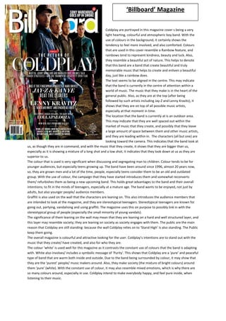
1. ‘ Billboard’ Magazine
Coldplay are portrayed in this magazine cover s being a very
light hearting, colourful and atmospheric boy band. With the
use of colours in the background, it certainly shows the
tendency to feel more involved, and also comforted. Colours
that are used in this cover resemble a Rainbow feature, and
rainbows tend to represent kindness, beauty and luck. Also,
they resemble a beautiful act of nature. This helps to denote
that this band are a band that create beautiful and truly
memorable music that helps to create and enliven a beautiful
day, just like a rainbow does.
The text seems to be aligned in the centre. This may indicate
that the band is currently in the centre of attention within a
world of music. The music that they make is in the heart of the
general public. Also, as they are at the top (after being
followed by such artists including Jay-Z and Lenny Kravitz), it
shows that they are on top of all possible music artists,
especially at that moment in time.
The location that the band is currently at is an outdoor area.
This may indicate that they are well spaced out within the
market of music that they create, and possibly that they leave
a large amount of space between them and other music artists,
and they are leading within in. The characters (all but one) are
looking toward the camera. This indicates that the band look at
us, as though they are in command, and with the music that they create, it shows that they are bigger than us,
especially as it is showing a mixture of a long shot and a low shot; it indicates that they look down at us as they are
superior to us.
The colour that is used is very significant when discussing and segregating man to children. Colour tends to be for
younger audiences, but especially teens growing up. The band have been around since 1996, almost 20 years now,
so, they are grown men and a lot of the time, people, especially teens consider them to be an old and outdated
group. With the use of colour, the campaign that they have started introduces them and somewhat reconverts
them/ refurbishes them as being a new upcoming band. This holds great advantages to the band and their overall
intentions; to fit in the minds of teenagers, especially at a mature age. The band wants to be enjoyed, not just by
adults, but also younger people/ audience members.
Graffiti is also used on the wall that the characters are leaning on. This also introduces the audience members that
are intended to look at the magazine, and they are stereotypical teenagers. Stereotypical teenagers are known for
going out, partying, vandalising and using graffiti. The magazine uses this on purpose to possibly link in with the
stereotypical group of people (especially the small minority of young vandals).
The significance of them leaning on the wall may mean that they are leaning on a hard and well structured layer, and
this layer may resemble society; they are leaning on society as society engages with them. The public are the main
reason that Coldplay are still standing: because the wall Coldplay relies on to ‘Stand High’ is also standing. The Public
keep them going.
The overall magazine is colourful and attractive looking for the user. Coldplay’s intentions are to stand out with the
music that they create/ have created, and also for who they are.
The colour ‘white’ is used well for this magazine as it contrasts the constant use of colours that the band is adapting
with. White also involves/ includes a symbolic message of ‘Purity’. This shows that Coldplay are a ‘pure’ and peaceful
type of band that are warm both inside and outside. Due to the band being surrounded by colour, it may show that
they are the ‘purest’ people/ music makers around. Also, they make society (the mixture of bright colours) around
them ‘pure’ (white). With the constant use of colour, it may also resemble mixed emotions, which is why there are
so many colours around, especially in use. Coldplay intend to make everybody happy, and feel pure inside, when
listening to their music.
2. ‘ Q’ Magazine
Similarly, colour is such a necessity which is being used again. The
text which is used is very drawing like, as though someone had
hand written it. This is used very well to identify informatlity,
therefore intorudcing that the band may be informal. This is key
as younger generations tend to be less formal than adults, so it
shows th target audience for the music and magazine campaign
that ‘Coldplay’ aspire to attract; teenagers.
With the character on the front cover jumping up in the air, it
shows a sense of ‘enthusiasm’ and ‘excitement’, and helps to
connotate that this band is an ‘exciting’ band. Also, as we can se
(as well as the general public), this person (and band) are not
considered young, not anymore. The band has been around since
1996, so they have been going for 18 years. People tend to think
of this band s being old, and possibly containing a lack of fun and
excitement that some modern day boy-bands have. This image at
the front helps to go ‘against’ stereotypes. This is due to the
character being full of energy, and also seeming to look new and
upcoming, and this truly shows that the band contains something
that must be shown to the public. Opposed to the magazine
cover that will be shown on the next page, this is very colourful
and modern to the general public and overall teenager audience.
With the use of one character on the cover, it also symbolises that this person is the main individual in the band,
especially as we all know him as the lead singer (Chris Martin). This magazine totally links in with the previous
magazine as it is colourful, energetic, and also it stands out. This benefits both the magazine but also the band, as
people would want to read it more.
An unfortunate contrasting feature would be the fact that it only shows one person/ individual from the band, and
in this case, it is the main singer. I feel that this may be an unfair ‘move’, and this is due to the band being a team,
and not just individuals. The band should be recognised for whom they all are, and not just for the person who sings.
It should all be part of a team effort.
http://www.youtube.com/watch?v=fXSovfzyx28
The magazine also makes a link in with one of ‘Coldplay’s songs (Life in Technicolor ii), and this is due to Chris Martin
jumping up in the air, and the lyrics in the song says ‘My feet won’t touch the ground’. This may be intentional or
even unintentional, but nevertheless, it shows a sense of excitement.
The type of costume that the character is wearing is very casual looking clothes, trousers and trainers. They are also
very informal looking, showing that this band doesn’t want to be seen as being formal, but mainly intend to look as
modern and young as possible.
Opposed to the previous magazine, difference may also include the layout of text. For example, it tends to be more
on the side for this magazine, but for the first, it is in the centre, and looks a little bit neater, but they both have
unique styles to them. Also, similarly, they both interact with the ‘Masthead’. In the first one, they are standing in
front of it, whereas with the second one, the character is putting his arm through the gap of the ‘Q’. Once again,
both magazines have graffiti in the background. This shows that both Magazine campaigns are tying to show
‘Coldplay’ as being a modern day band, and in a sense, ‘refurbished’. When I say ‘refurbished’, I am referring that
the band was once considered old, but now have been (in a sense) remade into something looking ‘NEW’. Both
magazines have graffiti in the background. The portrayal of the character and overall representation of the band (as
shown by one individual) is shown trough costume, settings (background) and overall colour scheme as being very
energetic, modern and seeming to be upcoming and new. The magazines do not use any props, and this may be
purposely used to input possible relevance that this band uses themselves to create music, and nothing else. It
symbolises uniqueness within a market of music.
3. ‘ NME’ Magazine
This magazine cover is completely different to the other/
previous two shown before. This is due to the colour of the
magazine being much more simplistic and plain, but
nevertheless, intriguing to see and look at.
Similarly to the first magazine cover, the text is once again in the
centre. This is laid out in a better fashion in my opinion as it
seems much less confusing and in depth, opposed to the
previous magazine that had text from left-to-centre.
This magazine cover seems to look much more sophisticated and
formal compared to the previous ones, not just due to simple
colour use, but also due to the costumes worn and the
presentation of the band as a whole. The costumes worn are very
smart and formal looking, and help to link in with the band
(known at that time) as being grown and mature men, whereas
the other magazines portray them as looking younger, and
growing into men. Even though they are still the same people,
the style of music has changed, as have the use of formal
clothing, now shown as informal. The plain white background is used to show the shadowing of the band and so see
their somewhat intense NVC (non verbal communication), and also to show their expressions. Similarly to the first
magazine cover, all but one of the band members are looking at the camera. This may be used as a pattern, or just
for the conventional look and overall front cover design of a traditional magazine cover.
The main symbolic/ predominant colours that are used are black and white. These colours signify a mixture of
opinion, and also two sides; this shows that you either like the band, or you don’t. This design helps identify that the
band are ‘easy to love’, which links in with the other magazine covers, as colour is used to signify ‘happiness’ and
‘energy’, which is what teenagers love when listening to music (stereotypically), and teenagers tend to be the main
listeners to the music that ‘Coldplay’ create, especially the modern songs/ song choice.
There is much less text in this magazine cover, maybe to help link in with the background of ‘plain’. As the
background is in ‘Black and White’, it looks simple, as does the linking/ appropriate text. The other magazine covers
were much more informative and engaging in my opinion, so maybe it helps to link in with the fact that ‘Coldplay’
are currently at their highest they’ve ever been, and that they are attracting more people, in this modern age.
Ironically, it has a statement from the lead singer ‘Chris Martin’ saying that this album should be ‘the last album’,
which is a huge contrast to how they have been portrayed and presented in the modern magazine cover. They have
achieved so much more than they thought.
Other contrasts could be the overall look and style of the ‘artists’, in a sense of fashion. The older their music was,
the more formal they looked, opposed to now where they are much more colourful. I feel that the magazine covers
(previous pages) are purposely colourful to show and present ‘Coldplay’ as being new and transformed into
something loveable, again.
The magazine cover is similar to the first one as it shows them as a group/ band, and overall a team. It shows and
demonstrates that they stick together throughout the times, and will always stay together. They will adapt and
change together. The magazines also help to portray the band as though they can ‘adapt’ to the time; from the early
2000’s, they were more adult looking, but know are much more trendy and link in with today’s fashion.
Similarly, the band also interacts with the ‘Mast Head’, showing interactivity and leadership to stand in front of
others. Overall, the band is represented as being a strong and very energetic band. This magazine cover doesn’t
show this, whereas the other ones do. It shows how much the band has changed since the very start.
At this time, ‘Coldplay’ weren’t as popular and well-known as they are today, and the cover’s text helps to identify
this; at the early stages of the band, there wasn’t as much text on the cover pages, therefore showing that there
wasn’t as much going on for them, whereas in contrast, the newer magazines have much more information at the
front, therefore to help lure the customer to hear more about the band, as now, they are global stars.