High Profile Escorts Nerul WhatsApp +91-9930687706, Best Service
Masthead presentation
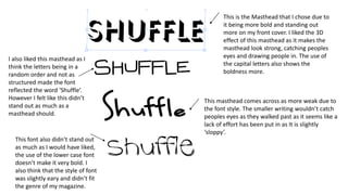
1. This is the Masthead that I chose due to
it being more bold and standing out
more on my front cover. I liked the 3D
effect of this masthead as it makes the
masthead look strong, catching peoples
eyes and drawing people in. The use of
the capital letters also shows the
boldness more.
I also liked this masthead as I
think the letters being in a
random order and not as
structured made the font
reflected the word ‘Shuffle’.
However I felt like this didn’t
stand out as much as a
masthead should.
This masthead comes across as more weak due to
the font style. The smaller writing wouldn’t catch
peoples eyes as they walked past as it seems like a
lack of effort has been put in as It is slightly
‘sloppy’.
This font also didn’t stand out
as much as I would have liked,
the use of the lower case font
doesn’t make it very bold. I
also think that the style of font
was slightly eary and didn’t fit
the genre of my magazine.