DevEX - reference for building teams, processes, and platforms
Masthead designs
1. Lydia Platts
Masthead Designs
The name/ masthead for my magazine will be Vibes, I have chosen this name as it is relevant to the
genre of my magazine as it is a music magazine. I have also chosen Vibes to be the name of my
magazine because it sounds very current and as the young generation is my target audience, being
current is relevant and appeals to this generation. Now I have decided the name of my magazine I
now need to choose a specific font type that is appropriate to the style of my magazine. To find a
font I have used the website www.dafont.com .
The first font I sampled was M12 Match Biker, the reasons for me choosing this font was that it
stood out and caught my eye. However once I sampled it I felt that it wasn’t appropriate for my style
of magazine as to me it looks quite quirky and techno and this is not appropriate for an R’N’B
magazine so I continued to search for a font.
This is the second font I decided to sample, the font name is Mabella. At first I really liked this font as
it was formal, however I then realised that this wasn’t appropriate to my magazine because I want to
appeal to younger generations therefore an informal style would be more appropriate.
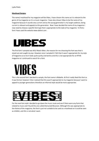
For the next font style I decided to go down the music route and see if there were any fonts that
related to music and I found this one called Distracted Musician. Although this was appropriate to
the theme of the magazine, the font is just not suitable to be used as a masthead as it could be seen
as childish, and this is not what I want.
2. Lydia Platts
As I wanted to find a formal font for my magazine I decided to sample the font Fabada Regular. The
reasons for my wanting a formal font is because my target audience is the younger generation and
informal font would not be appropriate. Although this font is formal I do not believe that it is
appropriate for a masthead because the font is too thin and wouldn’t stand out, which isn’t what
you want for a masthead, you want it to be big and bold so it stands out.
VIBES
Looking again at formal fonts I sample the font called Haettenschweiler, I sampled this font as it was
formal as well as big and bold. I found that out of all the sample fonts I did that this result was most
successful therefore I will be using it within my magazine.