Call Girl in Bur Dubai O5286O4116 Indian Call Girls in Bur Dubai By VIP Bur D...
How effective is the combination of your main product with ancillary texts
1. Question 2: How effective is the
combination of your main product
with ancillary texts?
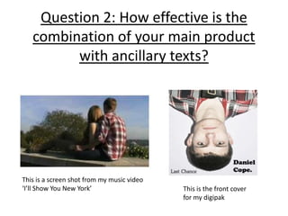
This is a screen shot from my music video
‘I’ll Show You New York’ This is the front cover
for my digipak
2. Digipak Design
Research into my Digipak:
A digipak consists of the front cover of a CD or DVD case, inside panels and a back panel for the
song titles to be displayed. In order to design my own digipak, I had to research other similar artists
(artists of the same genre) to see what type of images or photos are used, especially on their front
cover. The first aspect of the album that the target audience will notice is the front panel so for me
it had to be eye-catching and appealing to this specific audience. Therefore, I searched artists such
as Ed Sheeran, Paolo Nutini and Leonard Cohen to get a general gist of the type of images that are
on the front cover.
James Morrison’s album ‘I won’t let you go’
includes a photo of the artist playing guitar
which is a common theme throughout my
particular music video so gave me ideas on
what sort of photos to take. I decided to take
pictures of media student Thomas Block
dressed as chosen artist Daniel Cope holding
a guitar in a playing position to imitate this
strong connotation of the acoustic genre.
This is an example of some of the picture I
James Morrison’s album have taken to reinforce genre and
cover intertextuality.
Example of a photo I have
taken to emphasise genre
and close up of the artist
3. Creating my Digipak
To create my digipak I took a number of photos of the ‘artist’ to see
which one would work best or be the most interesting.
These are some of my attempts at creating a strong front panel:
Although I like these
particular photos, I didn’t
think they were strong
enough to be a front
cover. I wanted an eye
catching image which
would stand out. I
personally don’t think
these images would
intrigue me enough to
buy them.
4. Original Idea
This was my original edit for my digipak:
This was the original photo which I This was my edited version of it and as you can see
initially chose to be my front cover. there wasn’t much to edit apart from the brightness
The picture was taken with an SLR and contrast on Adobe Photoshop. I named this album
camera and a strong light focussed ‘spotlight’ as the lighting resembles a spotlight and how
on the artist to create a dramatic the artist’s popularity has increased so therefore he is
effect. very much in the spotlight. The font was plain and too
basic for me and the image on the whole wasn’t strong
enough.
5. Final Design
This is the inspiration for my final design:
This is an image of the album cover
my artist has created. It features
him with his red checked shirt and
appealed to me because its
rotation was unusual. I like the
reduction of saturation so decided
to base my digipak design on his
one.
To create this effect I
took a basic photo of
Tom’s face, upper body
and guitar.