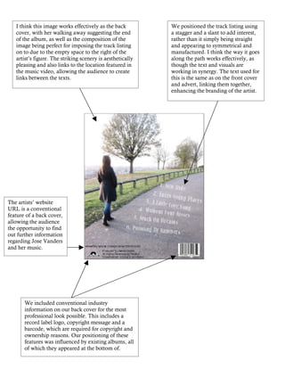
1. I think this image works effectively as the back We positioned the track listing using
cover, with her walking away suggesting the end a stagger and a slant to add interest,
of the album, as well as the composition of the rather than it simply being straight
image being perfect for imposing the track listing and appearing to symmetrical and
on to due to the empty space to the right of the manufactured. I think the way it goes
artist’s figure. The striking scenery is aesthetically along the path works effectively, as
pleasing and also links to the location featured in though the text and visuals are
the music video, allowing the audience to create working in synergy. The text used for
links between the texts. this is the same as on the front cover
and advert, linking them together,
enhancing the branding of the artist.
The artists’ website
URL is a conventional
feature of a back cover,
allowing the audience
the opportunity to find
out further information
regarding Jose Vanders
and her music.
We included conventional industry
information on our back cover for the most
professional look possible. This includes a
record label logo, copyright message and a
barcode, which are required for copyright and
ownership reasons. Our positioning of these
features was influenced by existing albums, all
of which they appeared at the bottom of.