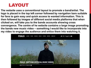
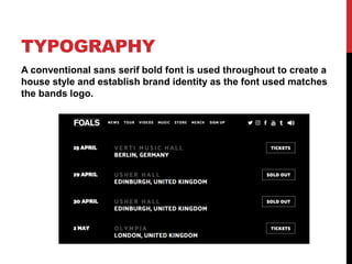
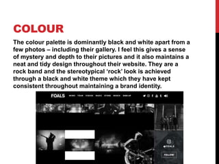
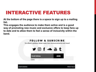
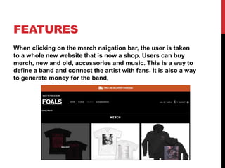
MUSIC VIDEO
RESEARCH –
TEXTUAL
ANALYSIS 3
BAND/ARTIST WEBSITE - FOALS
LAYOUT
The website uses a conventional layout to promote a band/artist. The
logo is placed in the top left corner followed by navigation bars suitable
for fans to gain easy and quick access to wanted information. This is
then followed by images of different social media platforms that when
clicked on, will take you to the bands accounts showing cross
convergence. The centre of he website contains a large image promoting
the bands new music video – something I would like to incorporate into
my video to engage the audience and entice them into watching it.
TYPOGRAPHY
A conventional sans serif bold font is used throughout to create a
house style and establish brand identity as the font used matches
the bands logo.
COLOUR
The colour palette is dominantly black and white apart from a
few photos – including their gallery. I feel this gives a sense
of mystery and depth to their pictures and it also maintains a
neat and tidy design throughout their website. They are a
rock band and the stereotypical ‘rock’ look is achieved
through a black and white theme which they have kept
consistent throughout maintaining a brand identity.
INTERACTIVE FEATURES
At the bottom of the page there is a space to sign up to a mailing
list.
This engages the audience to make them active and is a good
way of promoting new music and exclusive offers to keep fans up
to date and to allow them to feel a sense of inclusivity within the
band.
FEATURES
When clicking on the merch naigation bar, the user is taken
to a whole new website that is now a shop. Users can buy
merch, new and old, accessories and music. This is a way to
define a band and connect the artist with fans. It is also a way
to generate money for the band,

Textual analysis 3

  • 1.
    MUSIC VIDEO RESEARCH – TEXTUAL ANALYSIS3 BAND/ARTIST WEBSITE - FOALS
  • 2.
    LAYOUT The website usesa conventional layout to promote a band/artist. The logo is placed in the top left corner followed by navigation bars suitable for fans to gain easy and quick access to wanted information. This is then followed by images of different social media platforms that when clicked on, will take you to the bands accounts showing cross convergence. The centre of he website contains a large image promoting the bands new music video – something I would like to incorporate into my video to engage the audience and entice them into watching it.
  • 3.
    TYPOGRAPHY A conventional sansserif bold font is used throughout to create a house style and establish brand identity as the font used matches the bands logo.
  • 4.
    COLOUR The colour paletteis dominantly black and white apart from a few photos – including their gallery. I feel this gives a sense of mystery and depth to their pictures and it also maintains a neat and tidy design throughout their website. They are a rock band and the stereotypical ‘rock’ look is achieved through a black and white theme which they have kept consistent throughout maintaining a brand identity.
  • 5.
    INTERACTIVE FEATURES At thebottom of the page there is a space to sign up to a mailing list. This engages the audience to make them active and is a good way of promoting new music and exclusive offers to keep fans up to date and to allow them to feel a sense of inclusivity within the band.
  • 6.
    FEATURES When clicking onthe merch naigation bar, the user is taken to a whole new website that is now a shop. Users can buy merch, new and old, accessories and music. This is a way to define a band and connect the artist with fans. It is also a way to generate money for the band,