1. The contents page
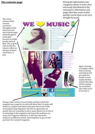
Again, showing
an imagine which
links to beauty
and fashion will
persuade the
female to look
inside and they
will feel like they
will be missing
out on fashion
tips if they were
to not buy it.
Diving the information into
categories allows it to be clear
and easily distributed to the
consumers. Information and
pages that they want to find
quickly can be done as its very
straight forward.
The colour
scheme which
remains
consistent
throughout both
the front cover
and contents page
will both appeal
to the girls
because its bright
purple and teal
blue. This is girlie
and also the fun
colours reflect on
the type of music
which here, is
pop.
Giving a wide variety of social media websites which this
magazine has a page for on each will show that it is quite well
known to a degree and show to the girls that its one of the
most popular pop magazines. We live in a generation of
people who are constantly on their smart phones ect so this is
an advantage to the magazine and means the audience can
access this magazine whenever. It will also inform the
audience on different articles attracting them to go out and
purchase the real print magazine.