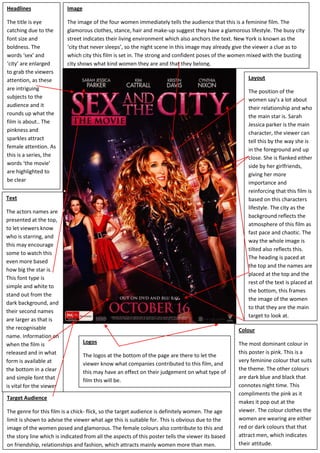
1. TextThe actors names are presented at the top, to let viewers know who is starring, and this may encourage some to watch this even more based how big the star is. This font type is simple and white to stand out from the dark background, and their second names are larger as that is the recognisable name. Information on when the film is released and in what form is available at the bottom in a clear and simple font that is vital for the viewer564515695960LogosThe logos at the bottom of the page are there to let the viewer know what companies contributed to this film, and this may have an effect on their judgement on what type of film this will be.ImageThe image of the four women immediately tells the audience that this is a feminine film. The glamorous clothes, stance, hair and make-up suggest they have a glamorous lifestyle. The busy city street indicates their living environment which also anchors the text. New York is known as the ‘city that never sleeps’, so the night scene in this image may already give the viewer a clue as to which city this film is set in. The strong and confident poses of the women mixed with the busting city shows what kind women they are and that they belong.HeadlinesThe title is eye catching due to the font size and boldness. The words ‘sex’ and ‘city’ are enlarged to grab the viewers attention, as these are intriguing subjects to the audience and it rounds up what the film is about.. The pinkness and sparkles attract female attention. As this is a series, the words ‘the movie’ are highlighted to be clearLayoutThe position of the women say’s a lot about their relationship and who the main star is. Sarah Jessica parker is the main character, the viewer can tell this by the way she is in the foreground and up close. She is flanked either side by her girlfriends, giving her more importance and reinforcing that this film is based on this characters lifestyle. The city as the background reflects the atmosphere of this film as fast pace and chaotic. The way the whole image is tilted also reflects this. The heading is paced at the top and the names are placed at the top and the rest of the text is placed at the bottom, this frames the image of the women to that they are the main target to look at.ColourThe most dominant colour in this poster is pink. This is a very feminine colour that suits the theme. The other colours are dark blue and black that connotes night time. This compliments the pink as it makes it pop out at the viewer. The colour clothes the women are wearing are either red or dark colours that that attract men, which indicates their attitude.Target AudienceThe genre for this film is a chick- flick, so the target audience is definitely women. The age limit is shown to advise the viewer what age this is suitable for. This is obvious due to the image of the women posed and glamorous. The female colours also contribute to this and the story line which is indicated from all the aspects of this poster tells the viewer its based on friendship, relationships and fashion, which attracts mainly women more than men. <br />