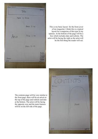
1. This is my basic layout for the front cover
of my magazine. I think this is a typical
layout for a magazine of this type in my
opinion. At the bottom of the page will be a
box which includes date and website. The
artist will be facing the right as the artist will
be the first thing the reader will see.
The contents page will be very similar to
the front page, there will be an advert at
the top of the page and website and date
at the bottom. The artist will be facing
the opposite way and the main features
will be on the left side of the page.
2. My double page spread will have a large quote and columns of writing underneath.
The image of the artist will take up the whole of the left page, and the artists name
will be located above the image.