Downloaded 80 times


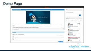
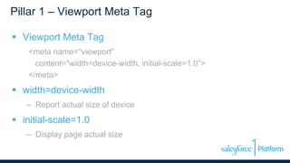

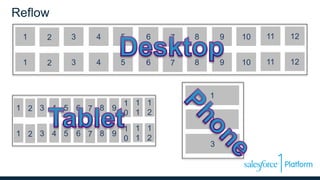
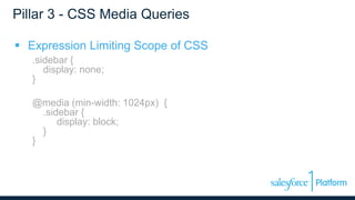
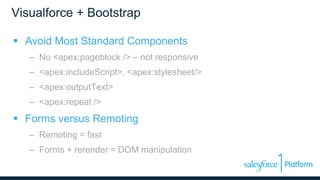
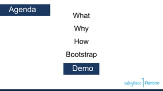


This document discusses responsive design with Visualforce pages. It begins with an introduction to responsive design and why it is important. It then covers the key pillars of responsive design, including viewport meta tags, fluid grids, and CSS media queries. Next, it discusses how to use the Bootstrap framework to build responsive pages in Visualforce. It provides examples of challenges with tables and images in responsive design. Finally, it demonstrates a responsive blog built with Visualforce and Bootstrap and discusses some solutions to common responsive design challenges.


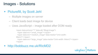
![Progressive Enhancement & Mobile [Funka 2012]](https://cdn.slidesharecdn.com/ss_thumbnails/progressiveenhancementmobile-120418173201-phpapp01-thumbnail.jpg?width=640&height=640&fit=bounds)