Download to read offline


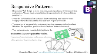

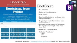


This document provides an introduction to Bootstrap 3 for developing responsive websites. It discusses responsive design patterns such as mostly fluid, column drop, shifter, and content reflow. It also introduces Bootstrap, describing it as an open-source CSS framework based on a column system using HTML, CSS, and JavaScript. The document recommends resources for learning more about responsive design patterns and Bootstrap.