Download as PDF, PPTX


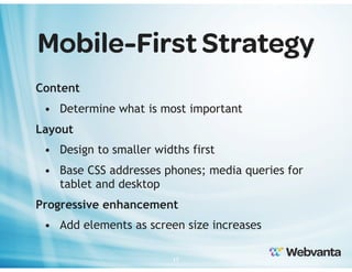
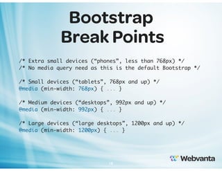
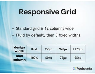
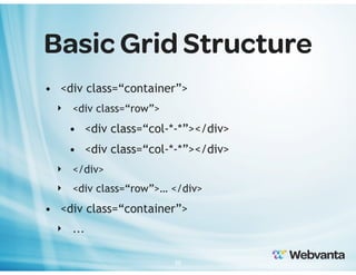


The document is a presentation on building responsive websites using the Bootstrap 3 framework, highlighting the importance of mobile-friendly design and the increasing web traffic from mobile devices. It covers responsive design principles, Bootstrap features, and provides an overview of its grid system, media queries, and customization options. Additionally, the presenters offer insights on mobile-first strategies and invite attendees to ask questions and seek further assistance from Webvanta.


![Bootstrap [part 1]](https://cdn.slidesharecdn.com/ss_thumbnails/bootstrappart-11-170208154053-thumbnail.jpg?width=640&height=640&fit=bounds)


