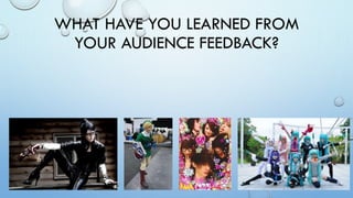
2. MY MAIN TARGET AUDIENCE
• BY USING POLL DADDY I WAS ABLE TO CONSTRUCT A QUESTIONNAIRE TO ASK MY TARGET
AUDIENCE, I MAINLY AIMED THE QUESTIONNAIRE TOWARDS MY MAGAZINE AND POSTERS, I
DID PROVIDE A LINK TO MY TRAILER HOWEVER IT WAS UP TO THE USER.
• MY MAIN TARGET AUDIENCE WAS BOTH MALE AND FEMALE IN THE TEENS TO YOUNG ADULT
AGE RANGE. (13 – 24) THE QUESTIONNAIRE WHICH I CREATED, I POSTED IT ON THE LONDON
MCM EXPO FACEBOOK GROUP PAGE WHERE THERE IS A WIDE RANGE OF PEOPLE WHO FLICK
THROUGH. I HAVE CURRENTLY RECEIVED 28 RESPONSES FROM MAINLY MY TARGET AUDIENCE
BUT ALSO SOME ANSWERS FROM A MORE MATURE AUDIENCE.
5. POSTER CONCLUSION
• THE MAJORITY OF PEOPLE SAID MY POSTER SHOWS A DIVERSE RANGE OF COSPLAYERS WHICH IS
WHAT I INTENDED, IN ADDITION TO THIS THEY SAY MY MAIN FONT WORKS WELL BUT THE
COLOURS COULD POSSIBLY BE CHANGED. ALSO THAT ON MY MAIN POSTER I COULD USE A
SMALLER SELECTION OF FONTS AS IT IS TOO BUSY. IT HAS ALSO BEEN MENTIONED THAT I HAVE
MADE GOOD USE OF SPACE ON THE POSTERS. MY MAIN CRITICISM IS THAT THE BACKGROUNDS OF
MY POSTERS ARE SLIGHTLY BORING AND COULD USE SOME COLOUR OR A PATTERN. ALSO THAT
THEIR COULD BE A BORDER AROUND EACH CHARACTER, I DID TRY THIS WITH PREVIOUS VERSIONS
OF MY POSTER HOWEVER IT LOOKED TACKY AND DIDN’T WORK VERY WELL. I COULD POTENTIALLY
CHANGE THE BACKGROUND OF THE POSTERS TO MAKE THEM MORE APPEALING TO MY TARGET
AUDIENCE, THIS WOULD HOWEVER NOT ADHERE TO THE POSTERS I HAVE RESEARCHED IN MY
RESEARCH AND PLANNING PHASE.
8. FILM MAGAZINE CONCLUSION
Many people feel that my movie magazine looks very professional and realistic however it
could do with a few improvements, for example my models look a bit 2D. This could be
helped by editing the hair with more care, by decreasing the hardness on the eraser tool I
could have possibly helped prevent this by giving it a more even and finer finish. In addition
to this like my posters people express they would prefer a more exciting background than a
black background. This would defiantly be an area I would consider more carefully if I had
the chance to do another photo-shoot for the cover, people said that a backdrop of the
convention could add a nice touch. A few people also noted that my logo looks a bit tacky
on the cover, this could possibly be because of the bright colours contrasting with the black
background. Many people liked the cover image describing it as being ‘eye-catching’ and
‘vibrant’. It was also said that the colour scheme of the text worked well, however one
person said that they thought it was too bright. There was a comment saying it would appeal
to Cosplayers, this is good!
9. CONCLUSION
• IN CONCLUSION MY TARGET AUDIENCE LIKED MY POSTER & FILM MAGAZINE BUT THEY
OFFERED A FEW SUGGESTIONS TO HELP MAKE IMPROVEMENTS ON THEM, MANY PEOPLE SAID
THAT THE MAGAZINE LOOKS PROFESSIONAL BUT CAN DO WITH A BIT MORE SPARKLE IN
RELATION TO THE BACKGROUND AND MODELS. MOST PEOPLE PREFERRED MY SINGULAR
CHARACTER POSTER IN COMPARISON TO MY MAIN POSTER, IN ADDITION IT WAS NOTED THAT
I SHOULD CHANGE THE BACKGROUND TO MAKE IT LOOK LESS PLAIN.