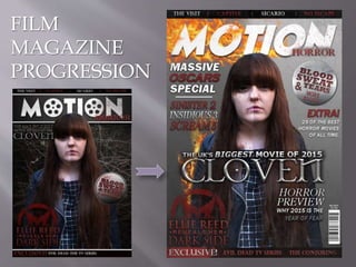
2. In my first draft, I decided to use a
background taken from the trailer itself. But
after researching into existing film magazines,
I found that they rarely use this technique.
And focus on a more studio-look background.
So I changed it to look like exactly that.
As you can see, I changed my masthead to
suit the magazine better. I feel the slanted
text has connotations with motion, and the
fire was a hit or miss with my teachers but,
after explaining that it has relevance to the
narrative (devil/hell/fire) I managed to
convince him.
3. I changed the pug when I removed the forest background
as I found that the chrome looking pug looked better when
accompanied with the monotone background.
It also aloud the “and more blood” to be more recognisable
and stand out more with the added bevel to make it look
somewhat 3D.
I also removed the blood splatter from the pug, as I didn't
want to overdo the whole horror theme. It took the attention
away from the text itself, and the connotations.
I kept the main splash
text the same as the
poster and trailer text as
it shows consistency
and reflects on the
brand itself.