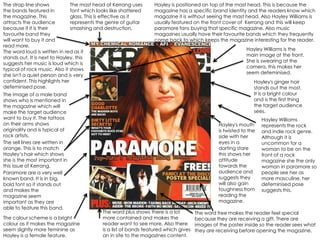
1. The strap line shows The mast head of Kerrang uses Hayley is positioned on top of the mast head. This is because the
the bands featured in font which looks like shattered magazine has a specific brand identity and the readers know which
the magazine. This glass. This is effective as it magazine it is without seeing the mast head. Also Hayley Williams is
attracts the audience represents the genre of guitar usually featured on the front cover of Kerrang and this will keep
because if it is their smashing and destruction. paramore fans buying that specific magazine. Also music
favourite band they magazines usually have their favourite bands which they frequently
will want to buy it and come back to which keeps the magazine interesting for the reader.
read more.
Hayley Williams is the
The word loud is written in red as it
main image at the front.
stands out. It is next to Hayley, this
She is swearing at the
suggests her music is loud which is
camera, this makes her
typical of rock music. Also it shows
seem defeminised.
she isn't a quiet person and is very
confident. This highlights her Hayley's ginger hair
defeminised pose. stands out the most.
The image of a male band It is a bright colour
shows who is mentioned in and is the first thing
the magazine which will the target audience
make the target audience sees.
want to buy it. The tattoos Hayley Williams
on their arms shows Hayley's mouth represents the rock
originality and is typical of is twisted to the and indie rock genre.
rock artists. side with her Although it is
The sell lines are written in eyes in a uncommon for a
orange. This is to match darting stare woman to be on the
Hayley’s hair which shows this shows her front of a rock
she is the most important in attitude magazine she the only
this issue of Kerrang. towards the woman in paramore so
Paramore are a very well audience and people see her as
known band. It is in big, suggests they more masculine, her
bold font so it stands out will also gain defeminised pose
and makes the toughness from suggests this.
magazine seem reading the
important as they are magazine.
able to feature this band.
The word plus shows there is a lot The word free makes the reader feel special
The colour scheme is a bright more contained and makes the because they are receiving a gift. There are
colour as it makes the magazine reader want to see more. Also there images of the poster inside so the reader sees what
seem slightly more feminine as is a list of bands featured which gives they are receiving before opening the magazine.
Hayley is a female feature. an in site to the magazines content.