1. EVALUATION QUESTION 5
HOW DID YOU ATTRACT/ADDRESS THE AUDIENCE?
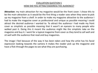
Attraction: my main attraction for my magazine would be the front cover. I chose this to
be the main attraction as it would be the first thing a reader sees when they were to pick
up my magazine from a shelf. In order to make my magazine attractive to the audience I
had to make the magazine cover as professional and unique as possible meaning I could
attract the desired audience I wanted to. To attract the audience I had made my front
cover as simplistic as possible meaning that it wasn’t an eyesore to many people who
walked past it. Doing this it meant the audience might like the simplistic take on the
magazine and buy it. I went for a typical magazine front cover as they tend to sell well and
sit well with the audience that read and buy magazines.
The image I feel because of the way it has been taken and how the artist has his facial
expression looking towards the camera it makes the reader pick up the magazine and
have a flick through the pages to see what they are purchasing.
1
2. Main image: the main image I have placed onto the front cover of my magazine front
cover is an image that connects with the audience. The way it connects with the audience
is because of the genre I have chosen and the type of magazine I am creating. This is a
good way to attract the audience because it’s a unique selling point towards the magazine
as many magazines sometimes have the front image nothing to do with the genre inside.
The artist on the front cover is seen to be facing and staring towards the audience giving a
feeling that the magazine is directed towards them and it’s personal instead of the
magazine being to a wider audience. The artist is seen to have a serious facial expression
this attracts the audience because it shows the magazine is a professional thing and not
some mess about project that has been created.
EVALUATION QUESTION 5
HOW DID YOU ATTRACT/ADDRESS THE AUDIENCE?
2
3. EVALUATION QUESTION 5
HOW DID YOU ATTRACT/ADDRESS THE AUDIENCE?
Masthead: the masthead can be seen as the most important part of a magazine and
needs to be right so the audience can remember the name and the magazine overall. I
created the masthead so that it would stand out on the front cover. The masthead I
created was an unusual text with a bright colour to it meaning it would be eye-catching
and grab the attraction of the readers and my desired audience. I made the masthead a
suitable size as well for the front cover meaning it can easily be read and understood.
3
4. EVALUATION QUESTION 5
HOW DID YOU ATTRACT/ADDRESS THE AUDIENCE?
4
Cover lines: I have tried to keep the cover lines on my front cover page as minimal and
simplistic as possible. I have attempted to do this as it adds a formal yet simplistic design
widening the audience range even further. I only have one main cover line on the cover
page and this is of the artist name to give the readers an insight of who the artist and
what the article inside would be about and who it would be about. The cover line is in the
same text as the masthead to keep a sense of professionalism and realism. This is a good
way to attract the audience as it’s unique and could help sell the magazine. These cover
lines address the audience by how they are placed, they are placed near the centre of the
page meaning it’s one of the first things the reader will see what the magazine is picked
up as well as this the colour of the cover lines is white which contrasts with the
background picture which is black and white making the cover lines stand out.
There is a smaller cover line which is placed on the right side of the magazine to give
information on the issue number and the date produced. These are a good way to attract
the audience as well as it gives another sense of professionalism again.
5. EVALUATION QUESTION 5
HOW DID YOU ATTRACT/ADDRESS THE AUDIENCE?
5
Contents page: For my contents page I ensured to use the
artists name to keep the flow of the magazine throughout
the magazine. I have also included images of other features
such as fashion this attracts the audience more as it shows
them it’s not just about music but more such as fashion and
features.
Contents images: The contents page has an image on it that
is the same artist as the front cover this has been done to
attract the audience because it keeps the professionalism
and simplistic design to the magazine. The contents page
images will have the most influential take on the readers
because it shows them what’s inside the magazine.
6. 6
EVALUATION QUESTION 5
HOW DID YOU ATTRACT/ADDRESS THE AUDIENCE?
Double page spread: The DPS has many attraction factors such as the header for the
article, because it’s not the biggest of titles on a page it allows the reader to read the
article without being distracted by the header. Also there is a quote by the artist on the
right in a different colour this addresses the reader as it feels like the artist is speaking to
the reader themselves.