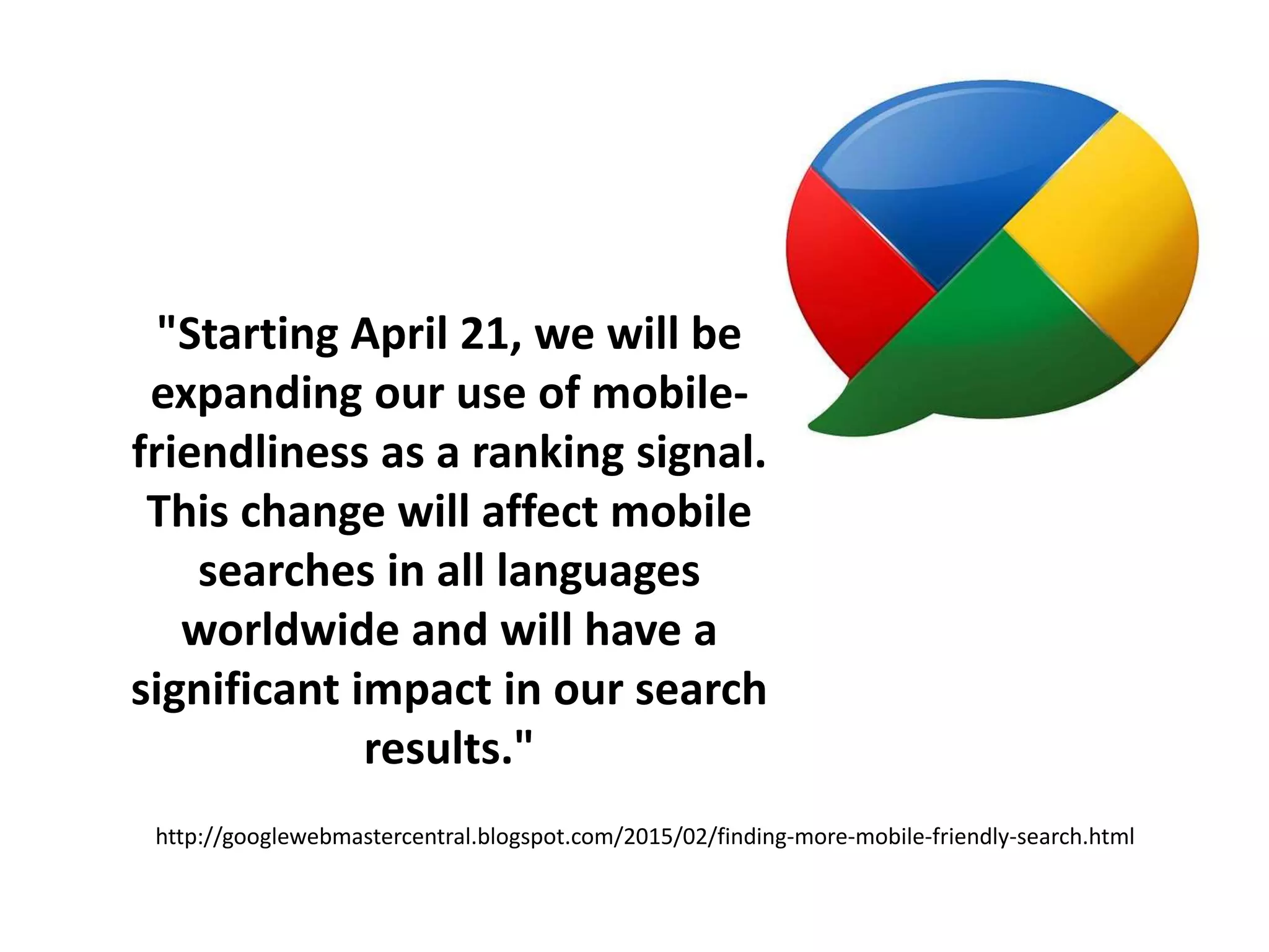
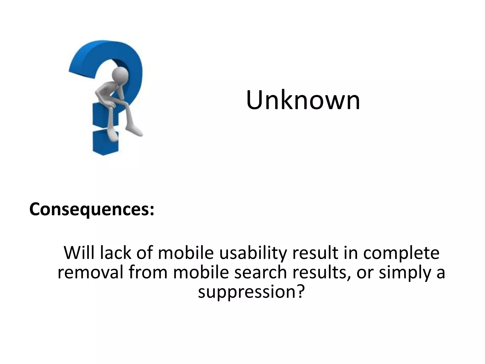
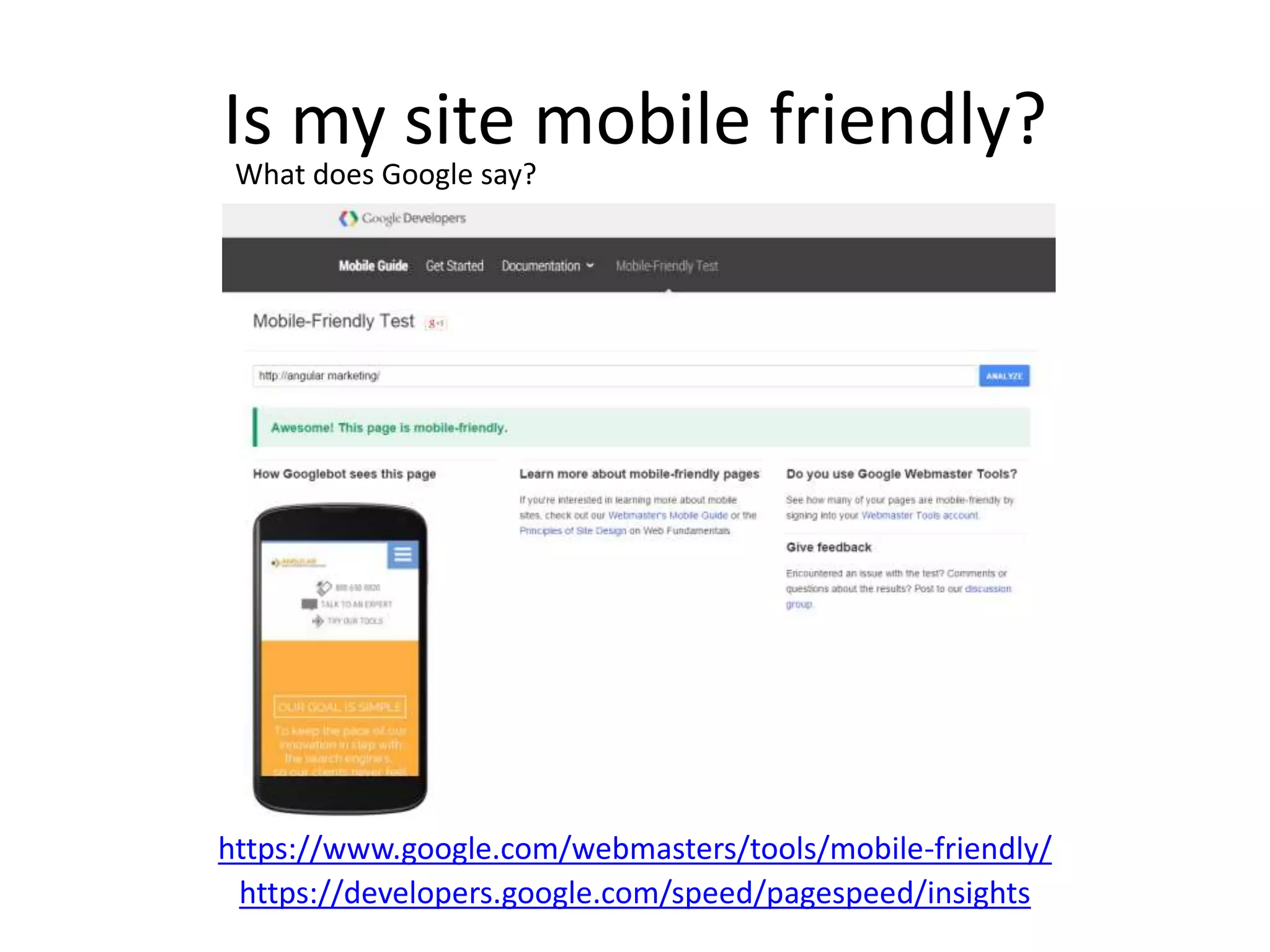
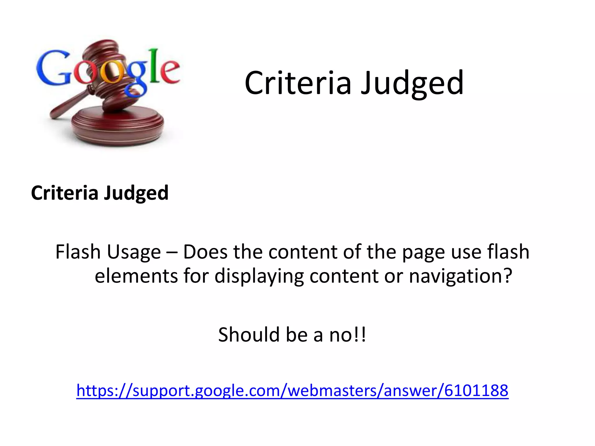
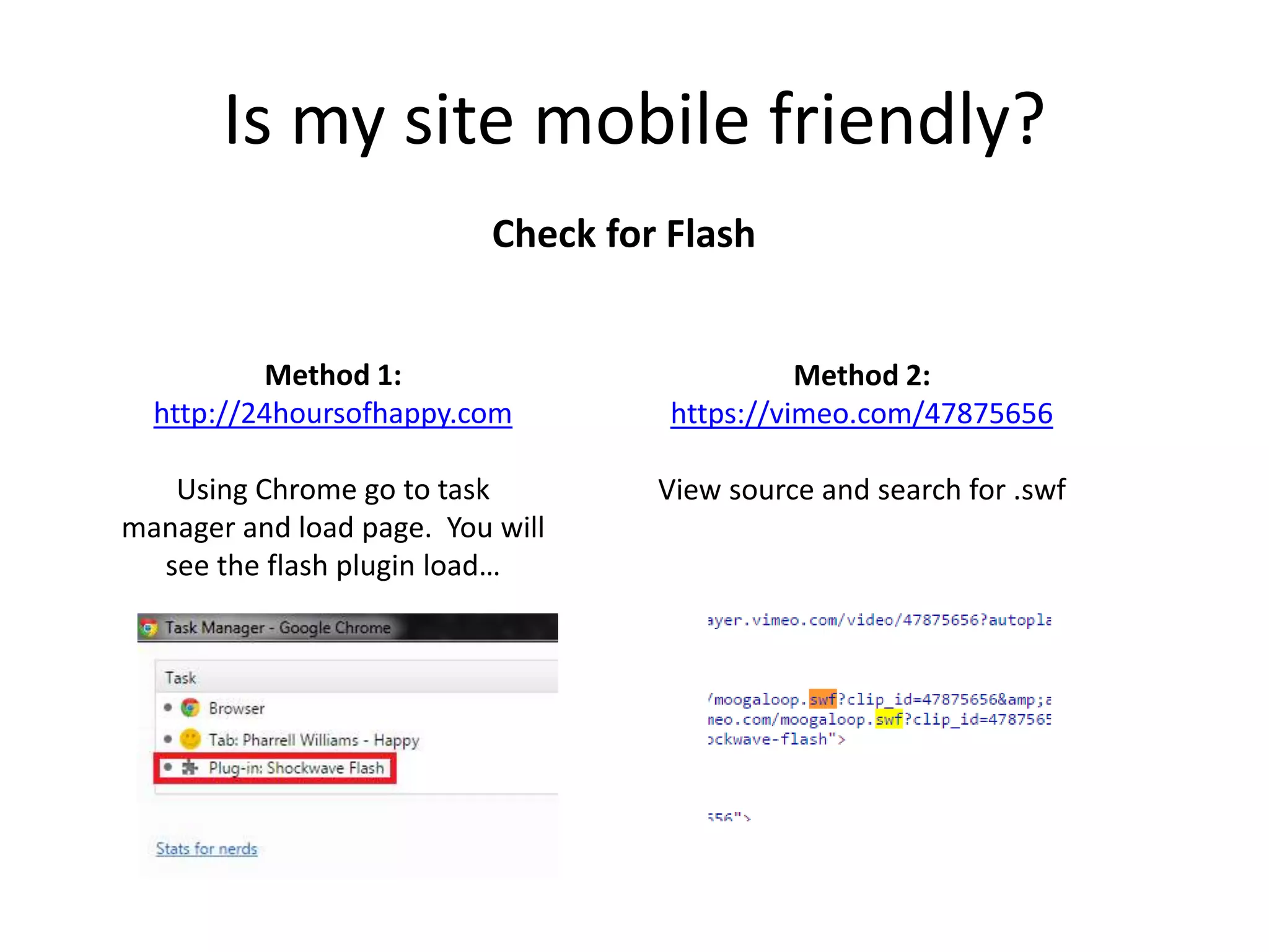
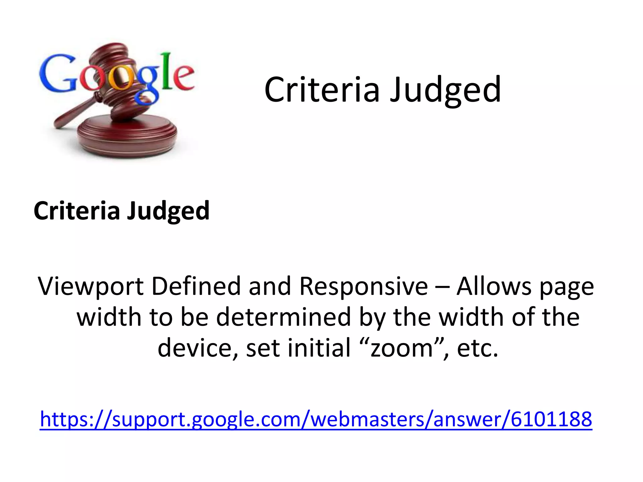
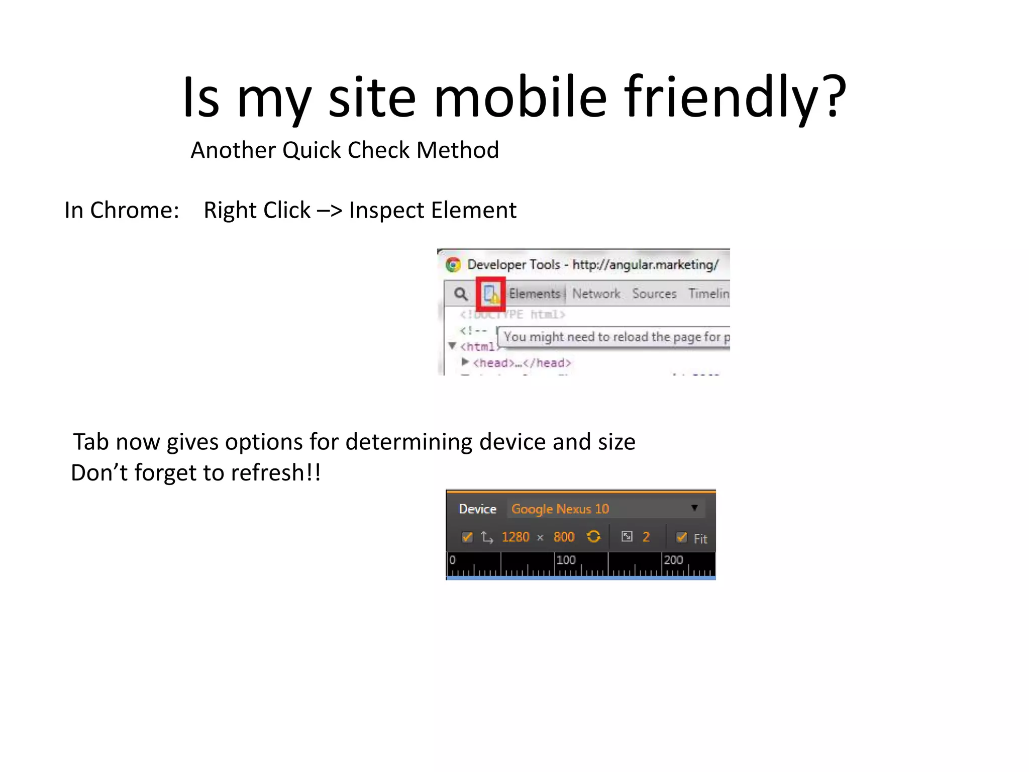
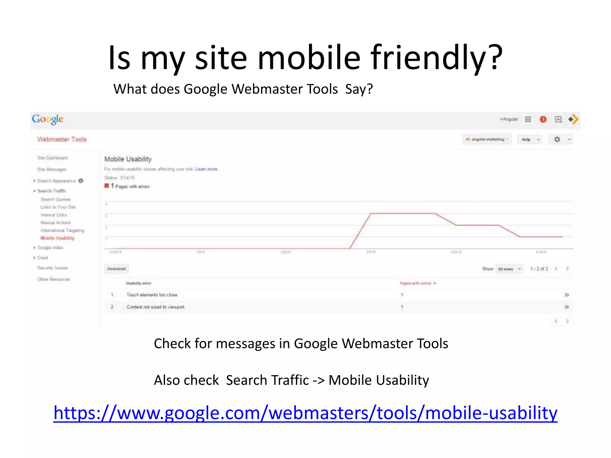
"Starting April 21, we will be
expanding our use of mobile-
friendliness as a ranking signal.
This change will affect mobile
searches in all languages
worldwide and will have a
significant impact in our search
results."
http://googlewebmastercentral.blogspot.com/2015/02/finding-more-mobile-friendly-search.html
Mobile is for mobile devices… not just cell phones!
Unknown
Consequences:
Will lack of mobile usability result in complete
removal from mobile search results, or simply a
suppression?
What do we know?
Worldwide
Will impact all searches globally
Takeaway: Google is confident in expected results.
What do we know?
Page By Page
Each page of the site will be judged separately
Takeaway: One poorly optimized section won’t
cause rankings for your whole site to tank
What do we know?
Mobile Searches
Only impacts mobile searches
(queries from a mobile device)
Takeaway: You can prioritize / isolate your focus toward those pages
where mobile search traffic is most important.
What do we know?
Real Time
Mobile friendliness is determined during crawl
Takeaway: If negatively impacted, once you fix the
issue you can recover without waiting for an update
Unknown
How Mobile Friendly:
Are there varying degrees of mobile
friendliness, or is it all-or-nothing?
Is my site mobile friendly?
https://www.google.com/webmasters/tools/mobile-friendly/
https://developers.google.com/speed/pagespeed/insights
What does Google say?
Criteria Judged
Criteria Judged
Flash Usage – Does the content of the page use flash
elements for displaying content or navigation?
Should be a no!!
https://support.google.com/webmasters/answer/6101188
Is my site mobile friendly?
Check for Flash
Method 1:
http://24hoursofhappy.com
Using Chrome go to task
manager and load page. You will
see the flash plugin load…
Method 2:
https://vimeo.com/47875656
View source and search for .swf
But… I really need flash!!
https://www.google.com/webmasters/tools/mobile-friendly/?url=24hoursofhappy.com
Make placeholder content for
flash that only appears for
mobile devices . You can do
this with CSS
Criteria Judged
Viewport Defined and Responsive – Allows page
width to be determined by the width of the
device, set initial “zoom”, etc.
https://support.google.com/webmasters/answer/6101188
Criteria Judged
Is my site mobile friendly?
Check for Viewport Settings
http://angular.marketing
View source… look for <meta name=“viewport” content=“width=device-width”
Do not want to see a fixed width, as it looks funny across devices
<meta name=“viewport” content=“width=320px” />
Horizontal scrolling on mobile = BAD BAD BAD
Criteria Judged
Small font size, Touch elements too close
https://support.google.com/webmasters/answer/6101188
Criteria Judged
Is my site mobile friendly?
http://www.responsinator.com/?url=angular.marketing
Another Quick Check Method
Is my site mobile friendly?
In Chrome: Right Click –> Inspect Element
Tab now gives options for determining device and size
Don’t forget to refresh!!
Another Quick Check Method
Is my site mobile friendly?
https://www.google.com/webmasters/tools/mobile-usability
What does Google Webmaster Tools Say?
Check for messages in Google Webmaster Tools
Also check Search Traffic -> Mobile Usability
m.MyDomain.com vs. Responsive
Please don’t do this unless absolutely
necessary
If you HAVE to do sub.domains instead of a
responsive site, you MUST have a
rel=“alternate” on the desktop site and
rel=“canonical” on the mobile site
https://developers.google.com/webmasters/mobile-sites/mobile-
seo/configurations/separate-urls
Should I Care?
https://www.google.com/analytics
Audience -> Mobile
How much traffic are you willing to lose? 10%, 30%...
You might be surprised how much organic traffic you get from mobile!

Google Mobile Usability Algorithm Update - April 21st, 2015

  • 1.
    "Starting April 21,we will be expanding our use of mobile- friendliness as a ranking signal. This change will affect mobile searches in all languages worldwide and will have a significant impact in our search results." http://googlewebmastercentral.blogspot.com/2015/02/finding-more-mobile-friendly-search.html
  • 2.
    Mobile is formobile devices… not just cell phones!
  • 3.
    Unknown Consequences: Will lack ofmobile usability result in complete removal from mobile search results, or simply a suppression?
  • 4.
    What do weknow? Worldwide Will impact all searches globally Takeaway: Google is confident in expected results.
  • 5.
    What do weknow? Page By Page Each page of the site will be judged separately Takeaway: One poorly optimized section won’t cause rankings for your whole site to tank
  • 6.
    What do weknow? Mobile Searches Only impacts mobile searches (queries from a mobile device) Takeaway: You can prioritize / isolate your focus toward those pages where mobile search traffic is most important.
  • 7.
    What do weknow? Real Time Mobile friendliness is determined during crawl Takeaway: If negatively impacted, once you fix the issue you can recover without waiting for an update
  • 8.
    Unknown How Mobile Friendly: Arethere varying degrees of mobile friendliness, or is it all-or-nothing?
  • 9.
    Is my sitemobile friendly? https://www.google.com/webmasters/tools/mobile-friendly/ https://developers.google.com/speed/pagespeed/insights What does Google say?
  • 10.
    Criteria Judged Criteria Judged FlashUsage – Does the content of the page use flash elements for displaying content or navigation? Should be a no!! https://support.google.com/webmasters/answer/6101188
  • 11.
    Is my sitemobile friendly? Check for Flash Method 1: http://24hoursofhappy.com Using Chrome go to task manager and load page. You will see the flash plugin load… Method 2: https://vimeo.com/47875656 View source and search for .swf
  • 12.
    But… I reallyneed flash!! https://www.google.com/webmasters/tools/mobile-friendly/?url=24hoursofhappy.com Make placeholder content for flash that only appears for mobile devices . You can do this with CSS
  • 13.
    Criteria Judged Viewport Definedand Responsive – Allows page width to be determined by the width of the device, set initial “zoom”, etc. https://support.google.com/webmasters/answer/6101188 Criteria Judged
  • 14.
    Is my sitemobile friendly? Check for Viewport Settings http://angular.marketing View source… look for <meta name=“viewport” content=“width=device-width” Do not want to see a fixed width, as it looks funny across devices <meta name=“viewport” content=“width=320px” /> Horizontal scrolling on mobile = BAD BAD BAD
  • 15.
    Criteria Judged Small fontsize, Touch elements too close https://support.google.com/webmasters/answer/6101188 Criteria Judged
  • 16.
    Is my sitemobile friendly? http://www.responsinator.com/?url=angular.marketing Another Quick Check Method
  • 17.
    Is my sitemobile friendly? In Chrome: Right Click –> Inspect Element Tab now gives options for determining device and size Don’t forget to refresh!! Another Quick Check Method
  • 18.
    Is my sitemobile friendly? https://www.google.com/webmasters/tools/mobile-usability What does Google Webmaster Tools Say? Check for messages in Google Webmaster Tools Also check Search Traffic -> Mobile Usability
  • 19.
    m.MyDomain.com vs. Responsive Pleasedon’t do this unless absolutely necessary If you HAVE to do sub.domains instead of a responsive site, you MUST have a rel=“alternate” on the desktop site and rel=“canonical” on the mobile site https://developers.google.com/webmasters/mobile-sites/mobile- seo/configurations/separate-urls
  • 20.
    Should I Care? https://www.google.com/analytics Audience-> Mobile How much traffic are you willing to lose? 10%, 30%... You might be surprised how much organic traffic you get from mobile!