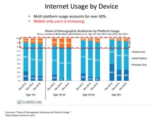
Download to read offline


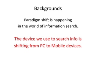
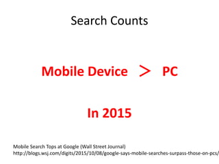
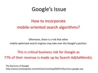
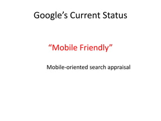
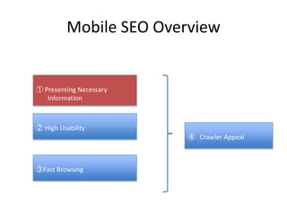
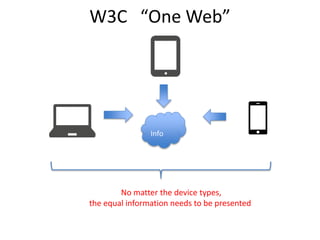
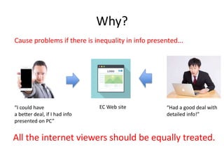
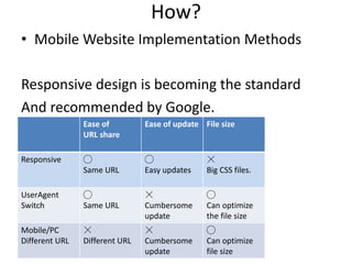
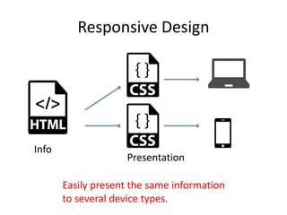
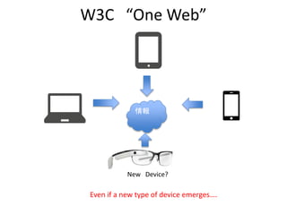
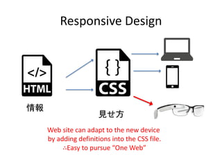
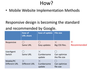
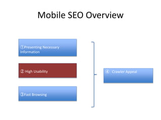


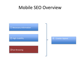


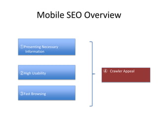


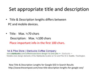


The seminar focuses on mobile SEO, highlighting the transition from PC to mobile devices for information searches and the need for website owners to adapt to mobile-friendly practices to maintain visibility and competitiveness. Key issues include Google's algorithm adjustments for mobile search, the importance of user experience through responsive design, fast browsing, and high usability, and how to implement effective mobile SEO strategies. Best practices and tools for optimizing sites for mobile accessibility are also discussed.