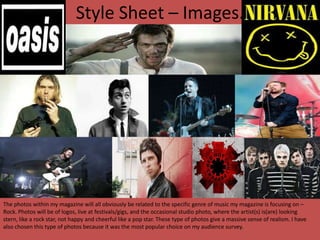
1. Style Sheet – Images.
The photos within my magazine will all obviously be related to the specific genre of music my magazine is focusing on –
Rock. Photos will be of logos, live at festivals/gigs, and the occasional studio photo, where the artist(s) is(are) looking
stern, like a rock star, not happy and cheerful like a pop star. These type of photos give a massive sense of realism. I have
also chosen this type of photos because it was the most popular choice on my audience survey.
2. Style Sheet – Fonts.
I want my font to match my images, I want it to be stern, strong and unique. These 4 fonts are all bold, clear, strong and sharp, which emphasises realism and
maturity, in comparison to lots of extremely fancy, sans serif fonts which look immature.
Also I have chosen the colour red, because it was the most popular choice in my question, and it is a regular occurrence throughout the majority of
magazines, because again it shows a sense of maturity, it isn’t a colour associated with young children, and connotates to danger, as a lot of people seem to
think lots of rock stars are crazy and evil at times. Last of all, red is the colour of blood, and artists such as Dave Grohl cover their guitar in blood after
concerts as they play the instrument that fiercely! The other colours are also colours which feature consistently in Rock magazines, so I have to include them
fairly regularly.