1. Saw Poster Analysis
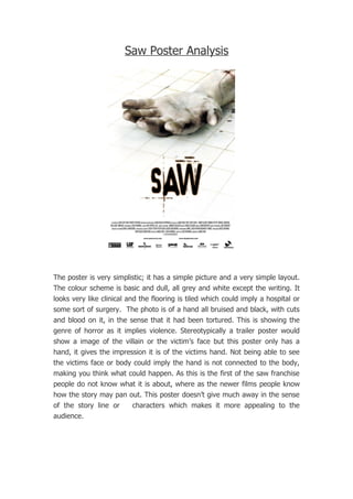
The poster is very simplistic; it has a simple picture and a very simple layout.
The colour scheme is basic and dull, all grey and white except the writing. It
looks very like clinical and the flooring is tiled which could imply a hospital or
some sort of surgery. The photo is of a hand all bruised and black, with cuts
and blood on it, in the sense that it had been tortured. This is showing the
genre of horror as it implies violence. Stereotypically a trailer poster would
show a image of the villain or the victim’s face but this poster only has a
hand, it gives the impression it is of the victims hand. Not being able to see
the victims face or body could imply the hand is not connected to the body,
making you think what could happen. As this is the first of the saw franchise
people do not know what it is about, where as the newer films people know
how the story may pan out. This poster doesn’t give much away in the sense
of the story line or characters which makes it more appealing to the
audience.