
Recommended
More Related Content
What's hot
What's hot (12)
Similar to DRAFTS Improve Album Cover Design Based on Feedback
Similar to DRAFTS Improve Album Cover Design Based on Feedback (12)
More from hannahagnew3
More from hannahagnew3 (20)
Recently uploaded
Recently uploaded (20)
DRAFTS Improve Album Cover Design Based on Feedback
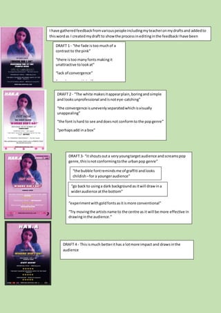
- 1. DRAFT 1 - “the fade istoo muchof a contrast to the pink” “there istoo manyfontsmakingit unattractive tolookat” “lack of convergence” “needsa recordlabel” DRAFT 2 - “The white makesitappearplain,boringand simple and looksunprofessional andisnoteye-catching” “the convergence isunevenlyseparatedwhichisvisually unappealing” “the font ishard to see anddoesnot conformto the popgenre” “perhapsadd ina box” DRAFT 3- “it shoutsouta veryyoungtargetaudience andscreamspop genre,thisisnotconformingtothe urbanpop genre” “experimentwithgoldfontsasitismore conventional” “Try movingthe artistsname to the centre as it will be more effective in drawinginthe audience.” “the bubble fontremindsme of graffiti andlooks childish –for a youngeraudience” “go back to usinga dark backgroundas itwill draw ina wideraudience atthe bottom” DRAFT 4 - This ismuch betterithas a lotmore impact and drawsinthe audience I have gatheredfeedbackfromvariouspeopleincludingmyteacheronmydraftsand addedto thiswordas I createdmydraft to show the processineditinginthe feedbackIhave been given.