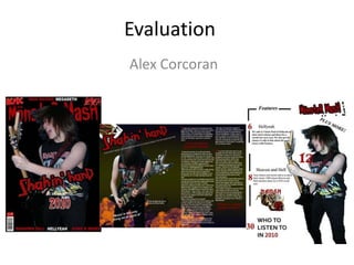
2. Front Cover I have used typical conventions of a magazine such as the large logo partly blocked by my main image. Along with that I have the main image with text referring to the image’s story. I have taken inspiration from other Rock/Metal magazines by using simple text to accompany the band logos on either side of the front cover. I have also used a barcode as well as a price tag. Contents page For the contents page I decided against the solid black background and chose white whilst keeping the red and white house style. Magazines such as Classic Rock use images in black and white to create a nostalgic feeling which I have also used to give it a different kind of feeling. The page is also balanced out with the main image balancing with contents/text almost symmetrical.
3. Double Page Spread With my double page spread I took a lot of influence from magazines such as Metal Hammer and Classic Rock. I tried my best to stick to the house style of the magazine but incorporating new ideas such as the nuclear rubble and the Jack Of Clubs playing cards.
4. My magazine is aimed at fans of Hard Rock and Metal. The larger text has connotations of aggression and because it is in red it is associated with danger and even blood. The capitals in most of the logos seem larger, more noticeable and alert which could be a reflection of Metal and Rocks aggressive and larger than life traits. The main image I chose on the front cover shows a passionate guitarist representing a passionate audience/sub-culture. When talking about positive aspects, Metal and Rock fans are usually seen as the most passionate of fans especially when it comes to live gigs which is why I think this image is appropriate for the magazine and for the cover story which is a backstage access/review of a gig by the fictional band I named Shakin’ Hand.
5. Future Publishing are responsible for publishing magazines such as Classic Rock, Metal Hammer and Total Guitar. They are also a highly popular magazine publishing company. With Future Publishing you could expect the magazine to be sold in the majority of large supermarkets/chain stores. The magazines they publish also include adverts aimed at the magazines target audience so the opportunity to make money from these adverts would make it sell in the right shops.
6. My target audience are Rock and Metal fans. They are known to be the most passionate and respectful fans when it comes to music because of the working class almost underdog image it has been associated with and the fact that it rejects mass media and conformist attitudes. There are a lot of sub genres so I’m not sure whether or not it would appeal to all of them especially as it is quite hard to appeal to audiences of genres such as Black Metal or Death Metal. Which is why I chose traditional Metal and Classic Rock such as the Metal band “Iron Maiden”. My audience research showed that the majority of Metal fans listened to Traditional Metal (which is straightforward Heavy Metal) so I felt it would be best to appeal to a larger audience and with how my main image is represented gain some new fans.
7. I reached my target audience with a number of different popular Metal bands which is what most popular magazines such as AC/DC and Iron Maiden. It may not jump out at the buyer but it means that it is being bought by the right audience who are looking for a specific magazine like that. On the other hand, the aggression and passion in the main image may appeal to new fans. The main image means that fans can associate themselves to it which may further interest.
8. For digital photography I learnt that photos depend on light and that there should be a lot of variations of images so you can be sure of the best one. I took about 50 continuous shots so I could get the best natural looking shot of a live performance as possible. As for using photoshop I found it hard to get to grips with the use of layers and various techniques to the editing of my magazine. But after the first week it became progressively easier and I made the most of the editing. For example, the technique of being able to widen parts of the photo such as eyes and teeth I used to enhance my photo. I did at first however struggle with cutting photos to the way they suited my magazine, for example cutting an image of a person so it just leaves them as the main image I couldn’t do without leaving the outline pointy and rough so I found a way to soften the way it is cut leaving my image smooth and natural.