1. Kings of Leon – Music Magazine Advertisement
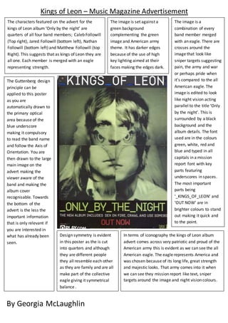
The characters featured on the advert for the
kings of Leon album ‘Only by the night’ are
quarters of all four band members; Caleb Followill
(Top right), Jared Followill (bottom left), Nathan
Followill (bottom left) and Matthew Followill (top
Right). This suggests that as kings of Leon they are
all one. Each member is merged with an eagle
representing strength.
The image is set against a
green background
complementing the green
image and American army
theme. It has darker edges
because of the use of high
key lighting aimed at their
faces making the edges dark.
The image is a
combination of every
band member merged
with an eagle. There are
crosses around the
image that look like
sniper targets suggesting
pain, the army and war
or perhaps pride when
it’s compared to the all
American eagle. The
image is edited to look
like night vision acting
parallel to the title ‘Only
by the night’. This is
surrounded by a black
background and the
album details. The font
used are in the colours
green, white, red and
blue and typed in all
capitals in a mission
report font with key
parts featuring
underscores in spaces.
The most important
parts being
‘_KINGS_OF_LEON’ and
‘OUT NOW’ are in
brighter colours to stand
out making it quick and
to the point.
In terms of iconography the kings of Leon album
advert comes across very patriotic and proud of the
American army this is evident as we can see the all
American eagle. The eagle represents America and
was chosen because of its long life, great strength
and majestic looks. That army comes into it when
we can see they mission report like text, sniper
targets around the image and night vision colours.
The Guttenberg design
principle can be
applied to this poster
as you are
automatically drawn to
the primary optical
area because of the
blue underscore
making it compulsory
to read the band name
and follow the Axis of
Orientation. You are
then drawn to the large
main image on the
advert making the
viewer aware of the
band and making the
album cover
recognisable. Towards
the bottom of the
advert is the less the
important information
that is only relevant if
you are interested in
what has already been
seen.
Design symmetry is evident
in this poster as the is cut
into quarters and although
they are different people
they all resemble each other
as they are family and are all
make part of the collective
eagle giving it symmetrical
balance .
By Georgia McLaughlin